THE CHALLENGE
After three years of publishing podcast and blog material aimed at helping creative professionals become their most creative, productive selves, it seemed that The Busy Creator itself needed an identity refresh to better adhere to its own values, and serve the audience across different media. An updated identity needs to be versatile, attractive, and practical for reproduction across digital and print media.
Business cards show the new identity system in use, starting with podcast artwork and main logo lock-up
The Solution
Rather than a full back-to-the-drawing-board approach, the new identity builds off the previous one, with a newly drawn icon of Buzz The Busy Beaver, our mascot, and simplified wordmark.
Along with an update to the logo and wordmark, the colour system has been simplified. The principal brown is deeper and less red, the gold is darker and less green.
Main Buzz icon with single-colour wordmarks
This new colour system allows for some versatility in presenting the logos against dark, light, or midtone backgrounds.
Buzz, shown in different colour combinations and complexities
Buzz himself has been redrawn, again for simplicity. The full-colour version is more restrained in the number of hues, and joined by one-colour outline versions, both for dark and light backgrounds.
Colour system for The Busy Creator's brand identity
The new logo — icon and wordmark both — are easier to read and identify compared to the predecessor. Gone are the subtle shadow effects on the type, as well as the two-tiered approach to the article “The”. Buzz now looks forward, rather than from a 3/4 perspective, creating a more iconic look from the symetrical face. Also removed is the pencil behind the ear, but we’ll see that again soon.
Previous logo lock-up with the updated version, below
Beyond the logo, the identity as a whole was simplified. The brand patterns, first created to be evocative of a beaver’s tail, are reoriented. This up-and-to-the-right orientation returns throughout the visual style, giving a sense of motion and positivity.
Previous patterns and updates, below


The new patterns are kept subtle, restricted to 2 or 3 tones, all within a related colour depth. This keeps them lo-contrast, and better suited for use on websites and other graphics as background elements.
Previous podcast artwork with the updated, simplified version
The Busy Creator Podcast artwork is also updated. Alongside the stacked typography, Buzz is replaced by the pencil, indicating the show’s connection to creativity or art. Instead of complex illustrations or photos, a striking, easily read, typographic approach helps the show stand out in podcast directories and marketplaces. The new album art can be seen on iTunes/Apple Podcasts, both on the desktop and mobile versions.
Apple Podcasts and The Busy Creator website, showing the podcast artwork
The new identity expands with application to the new website. The all-new design makes use of patterns, colours, icons, typographic styles, and layout schemes for blog articles and podcast episodes.

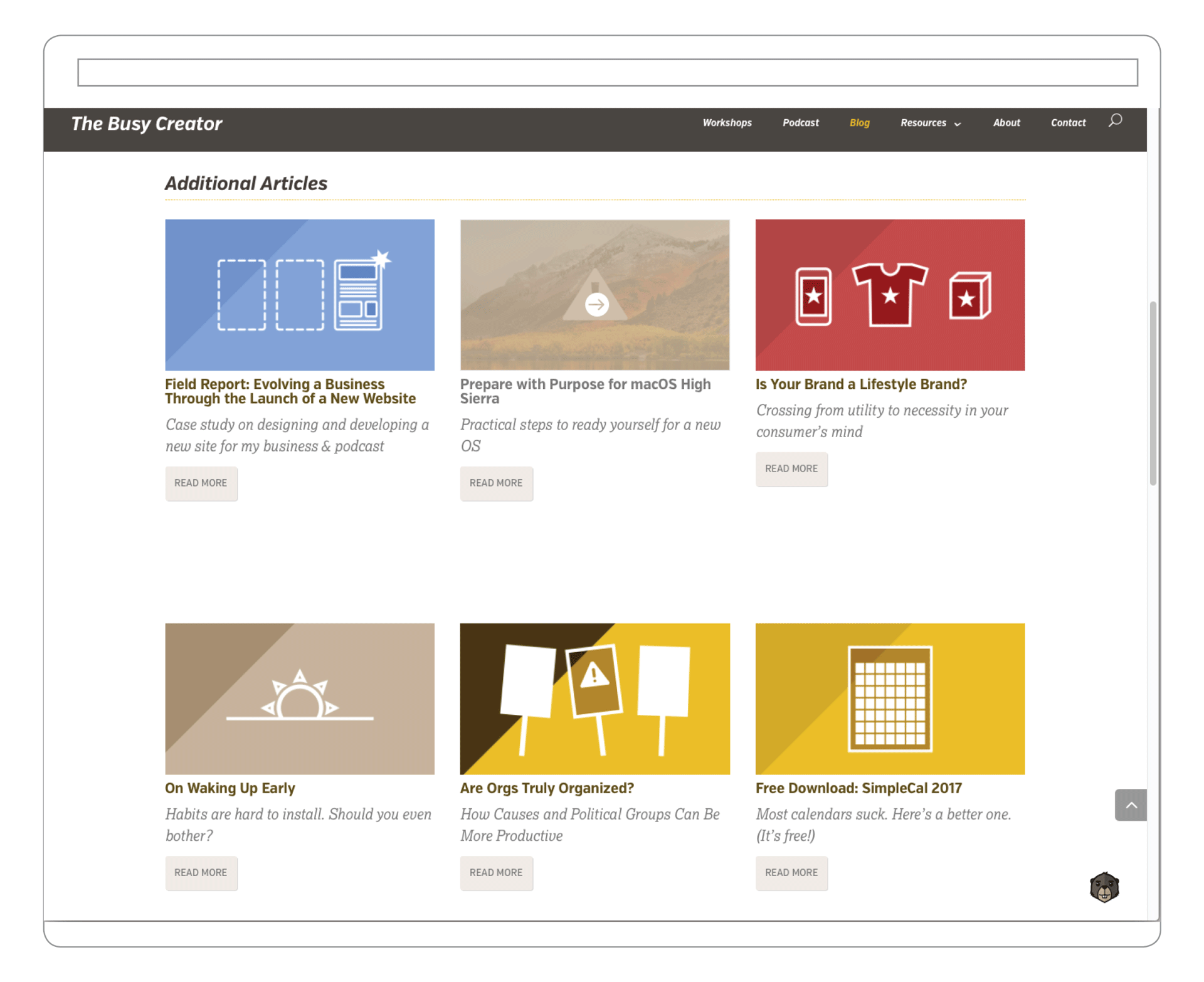
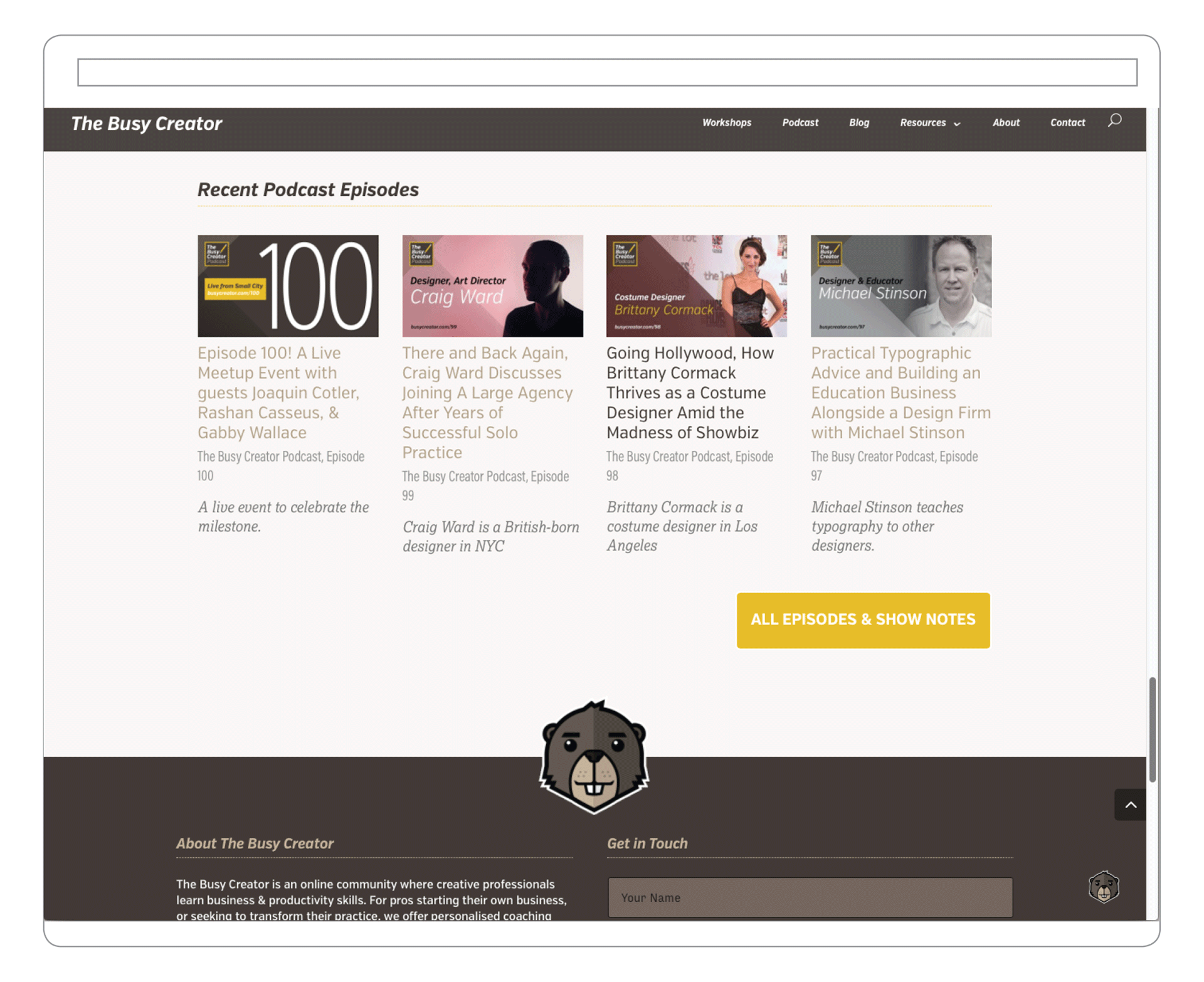
An in-depth case study about the design and production of the new website is available to read on The Busy Creator blog.
In place of photography, a system of icon-based illustrations represents each blog article. Varying the background among our brand colours, but with familiar line weights and forms, the covers reinforce The Busy Creator’s visual style, especially when glimpsed on social media and in news feeds.
Example blog entry covers, designed in the new brand visual style, featuring custom icons
Similarly, a unified visual style is used for podcast cover artwork, both for interview shows and single-topic episodes. In aggregate, the style is unmistakably ours — combining icons, type, colours, graphic devices, with a range of background colours and inset photos.
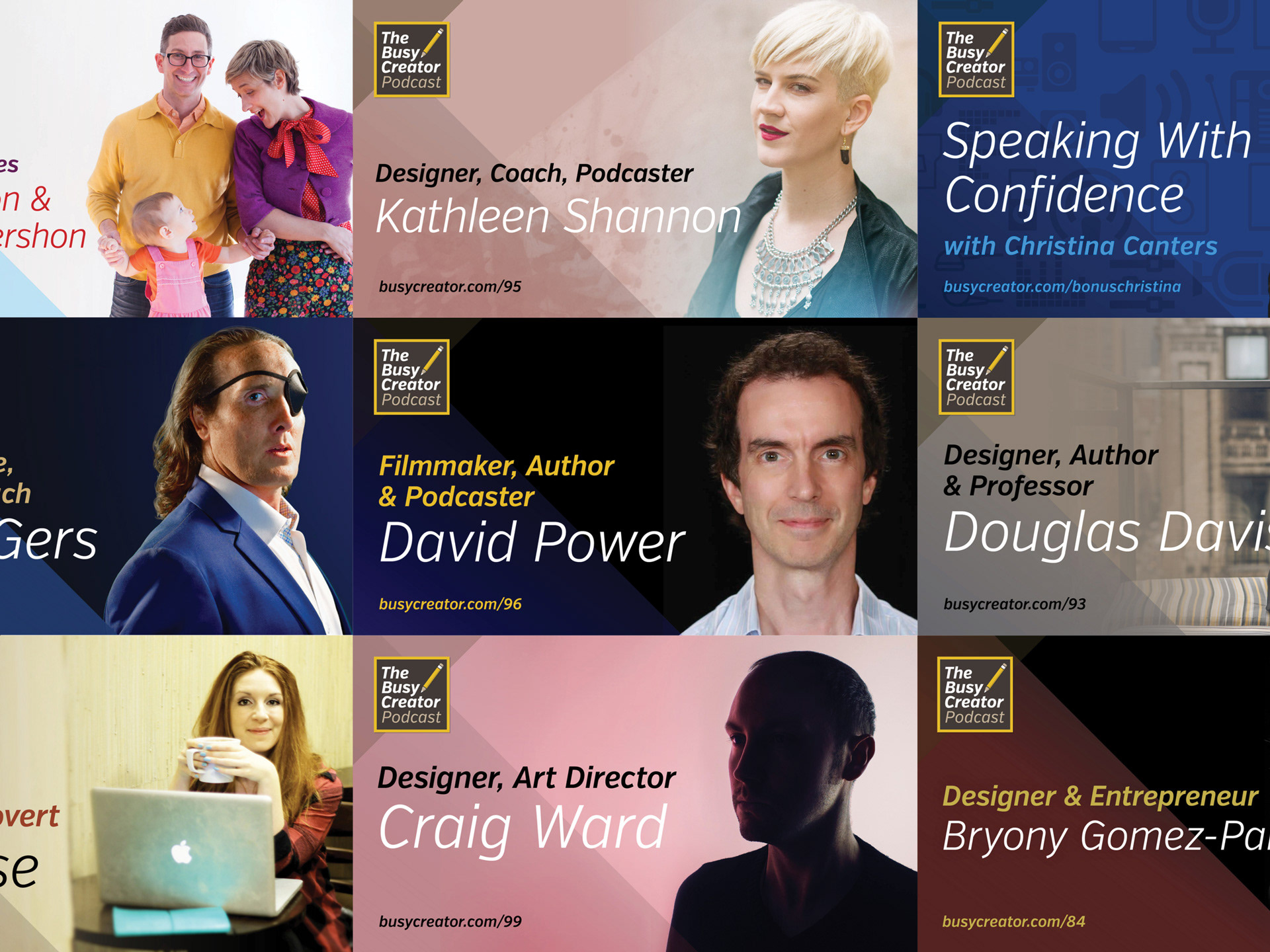
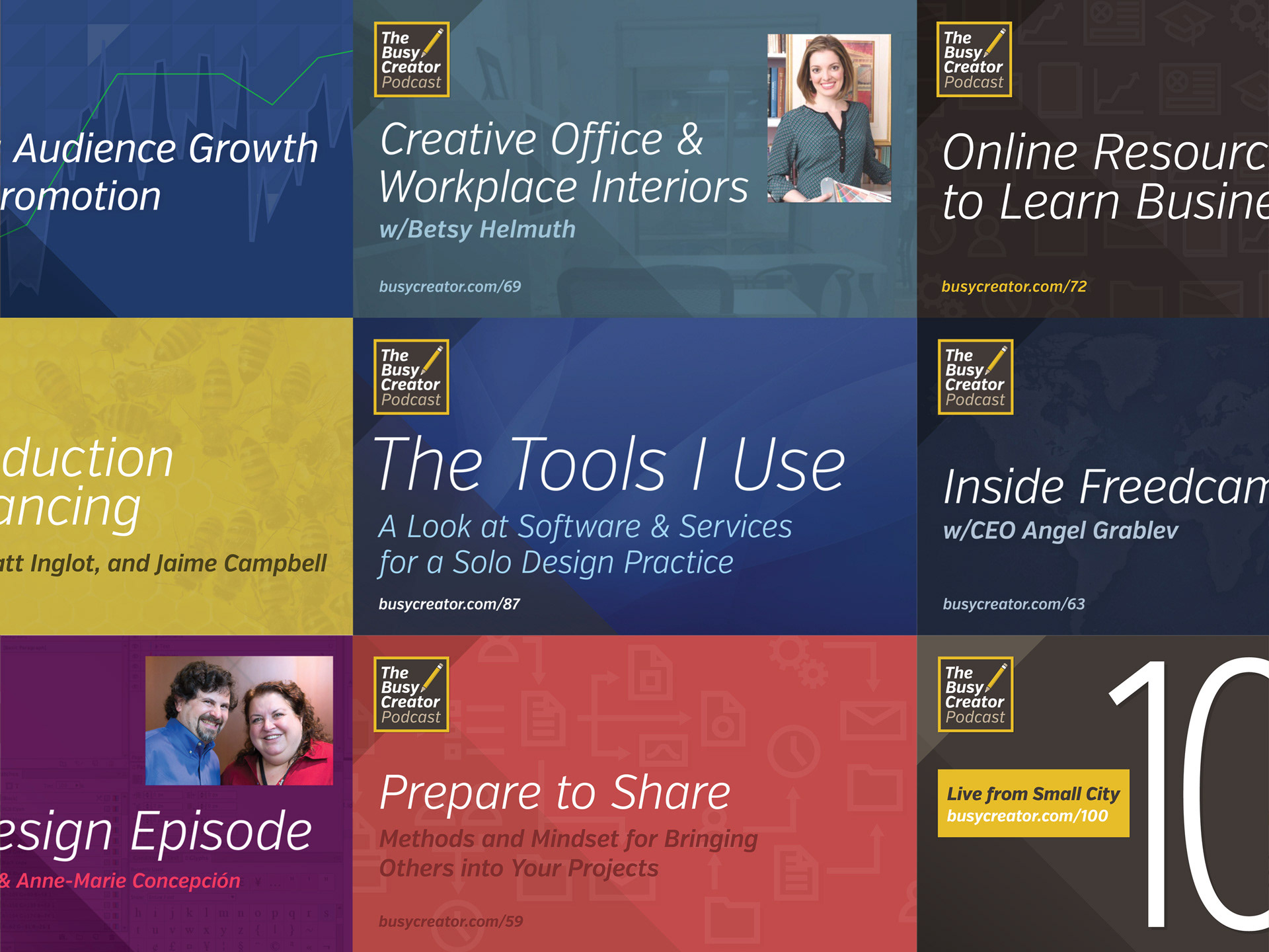
Examples of guest-featured episodes (left) and single-topic episode artwork (right), some of which also have guests shown with inset photos.
Away from the computer, The Busy Creator is expanding into workshops and other events. Printed material will follow the models of the digital projects.
Host Prescott Perez-Fox and the show's music composer, Joaquin Cotler, record a special live edition of The Busy Creator Podcast for episode 100.
The Results
Big things are happening for The Busy Creator. Check out the blog and weekly(ish) link posts here, and listen to the podcast archives here.