Overview
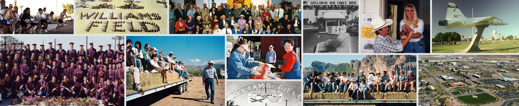
The Polytechnic Campus of Arizona State University, located in East Mesa, AZ, opened in the fall of 1996, then known as ASU East Campus and set on what was previously Williams Air Force Base. 25 years later, it is a nexus for studies in aviation, engineering, technology, and more. The Poly Campus — named after The Polytechnic School, whose academic programs are headquartered here — provides opportunities for project-based, hands-on learning within advanced laboratory spaces, flight simulators, and a print and imaging lab with comprehensive commercial printing and design services.
THE CHALLENGE
To commemorate 25 years of operation, ASU planned a series of events on Poly. The campus’ original founders, charter members, and other VIPs were invited to celebrate at a special luncheon.
The GIT Creative Agency were tasked to design an emblem or symbol to represent the 25th anniversary events. This logo would be used at the main luncheon and other celebratory events. In addition to representing Poly and its 25-year story, the emblem needed to comply with the established brand guidelines set by Arizona State University's marketing team.
Our Process
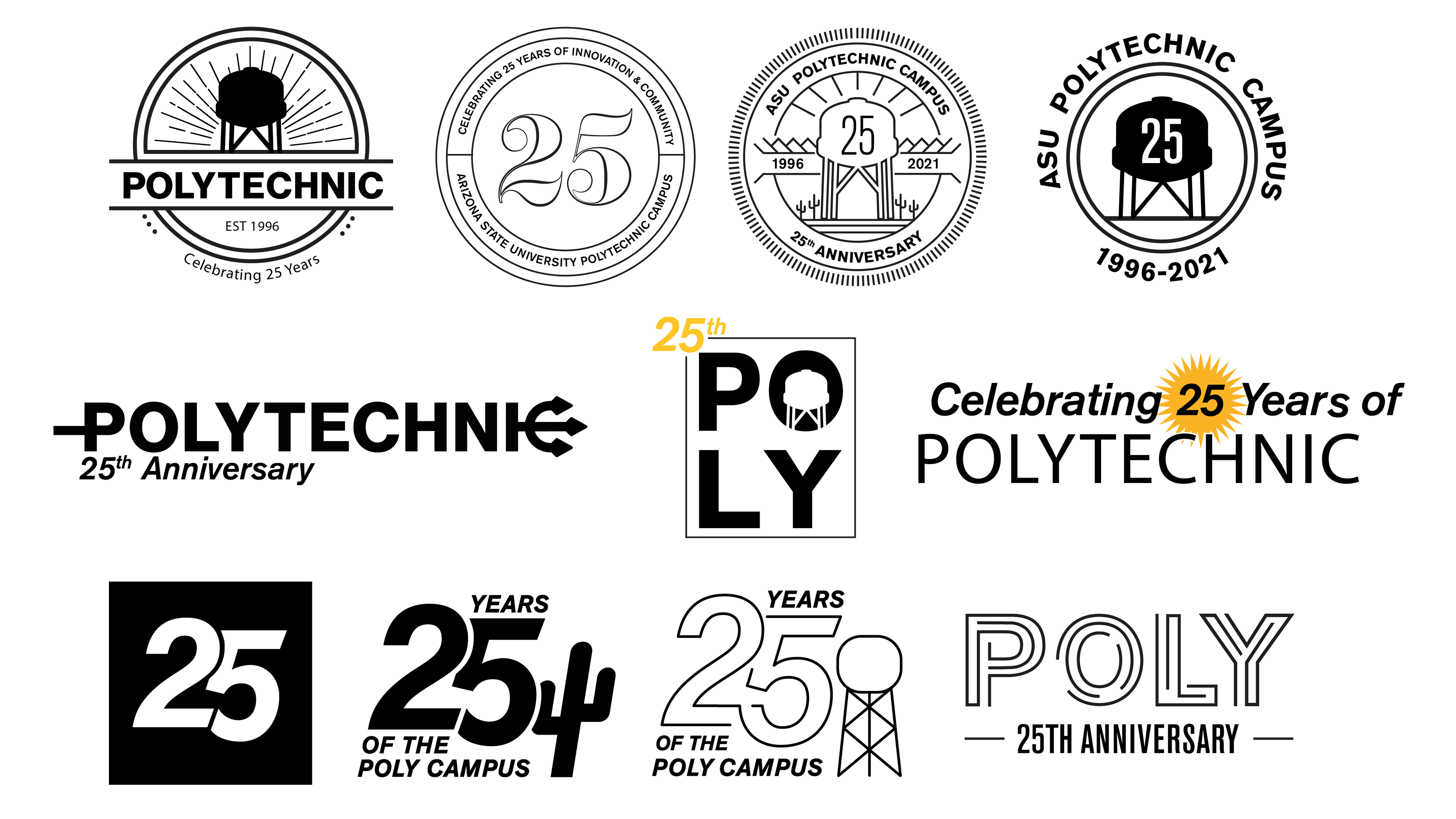
We began with visual research, searching for and analyzing several examples of anniversary emblems. We collected inspiration from existing Arizona, ASU, and flight-themed emblems and graphics. Through this research, we became familiar with common holding shapes, type placement, and graphic arrangements, discussing what is successful and what can be avoided.
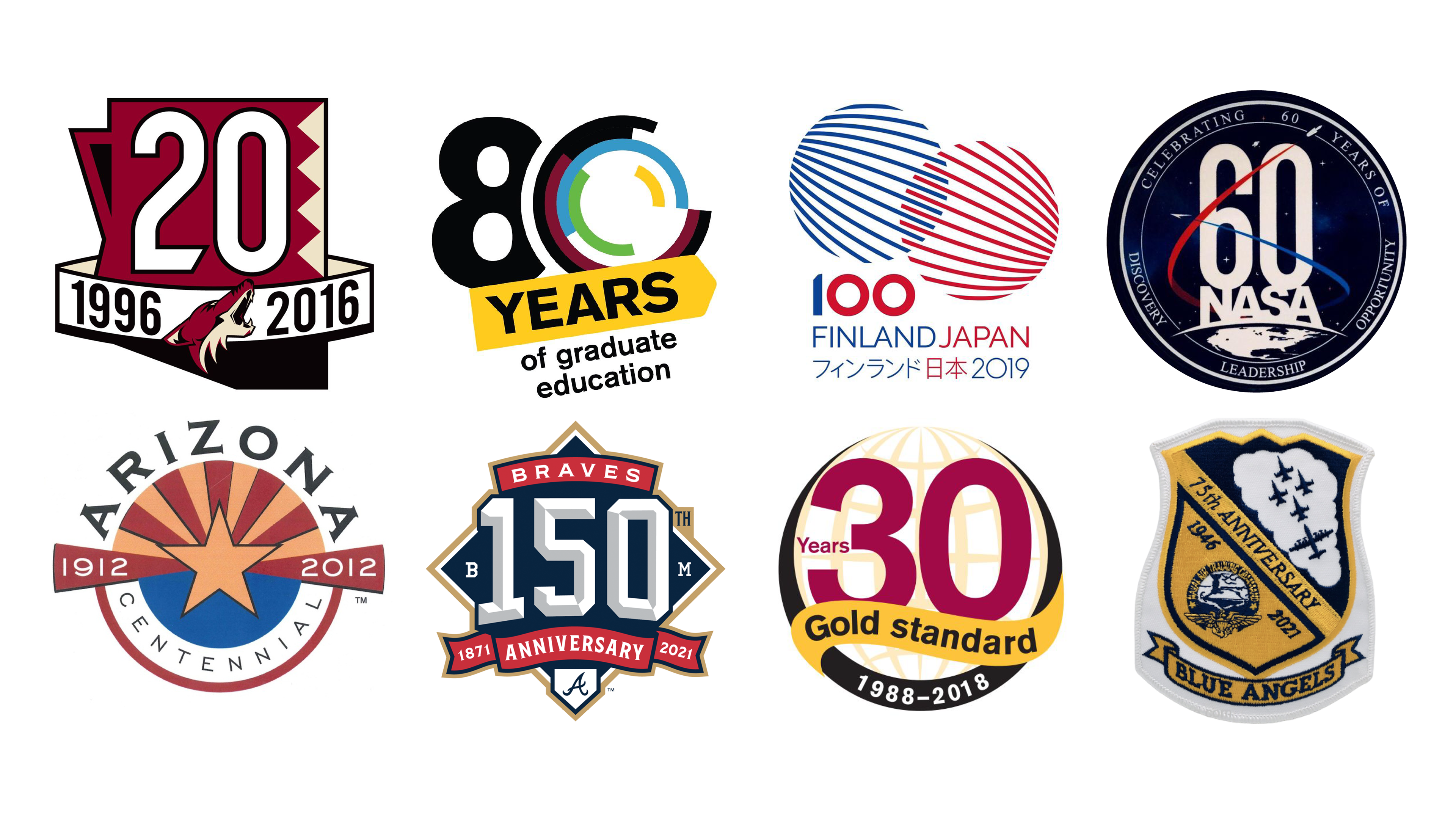
Examples of found inspiration for anniversary crests & special event logos
Next, we utilized our firsthand knowledge of the campus to assemble the unique components and characteristics that can visually represent Poly. The first thing that came to mind was the famous water tower, itself a visual landmark seen when approaching campus. Aviation was also an important component to include because that subject is one of Poly’s largest and most unique programs, because the campus sits beside a major regional airport, and because it honors Williams Air Force Base and the work done there during its history. Lastly, since the Poly campus is a more rustic and rural setting (especially compared to the urban core of ASU's Tempe campus) we wanted to incorporate Arizona’s desert environment and the Superstition Mountains which can be seen from several spots on Poly.
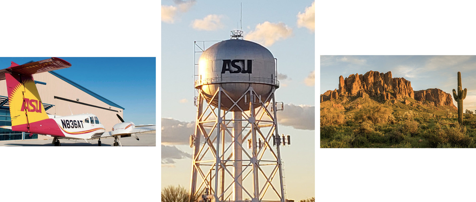
Three main visual sources for exploration: Aviation, The Water Tower, Arizona landscape
With these broad routes in mind, we moved into the sketching phase, putting pencil to paper and translating what we learned from our research into visual ideas and preliminary concepts. We then jumped into Adobe Illustrator and created concept graphics from our sketches. Although we created multiple options, some core commonalities appeared across the different designs: the water tower, airplane, big number 25, and the maroon, gold, and black colors.
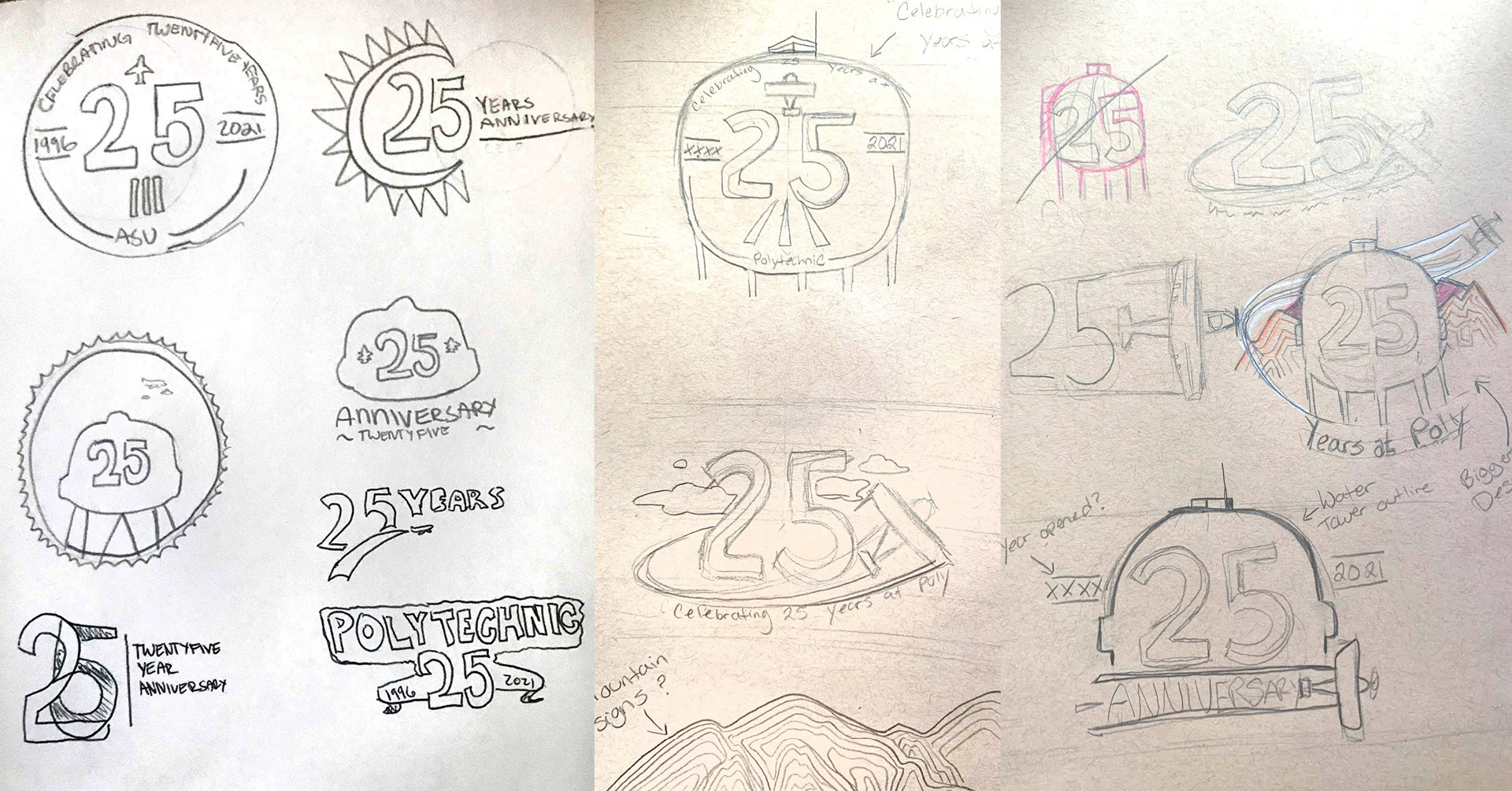
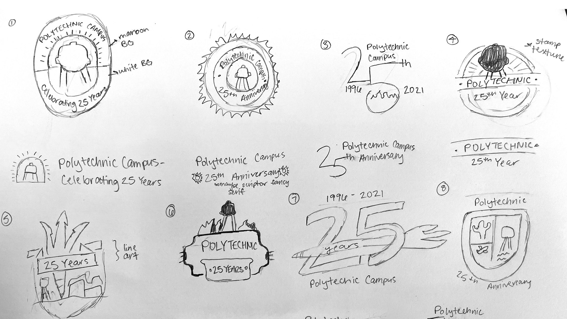
Early sketches and concept designs for the Poly25 emblem
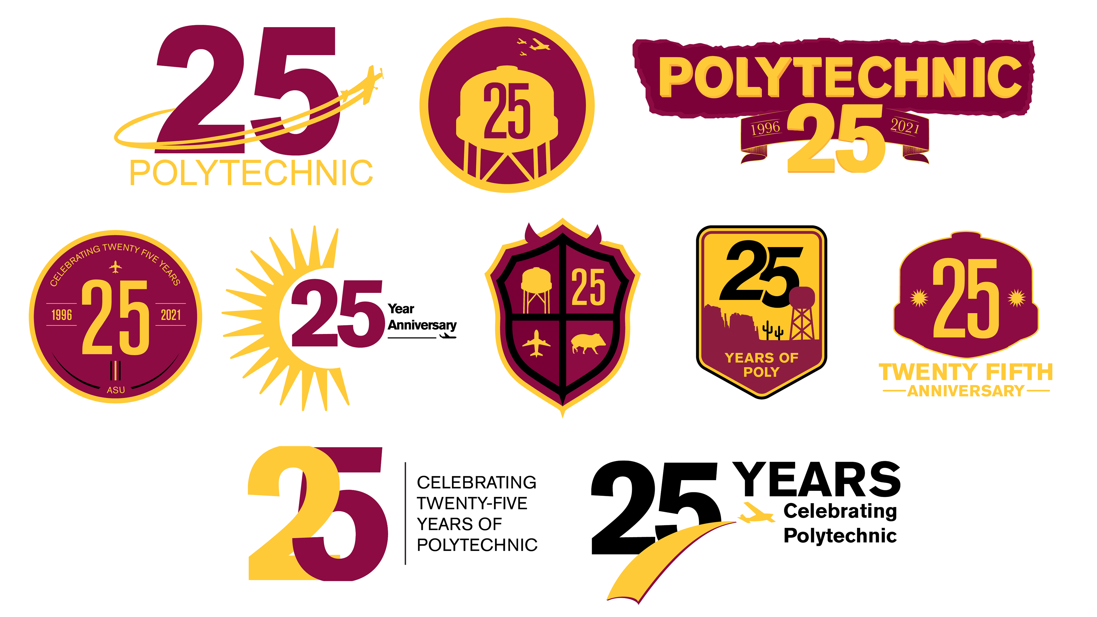
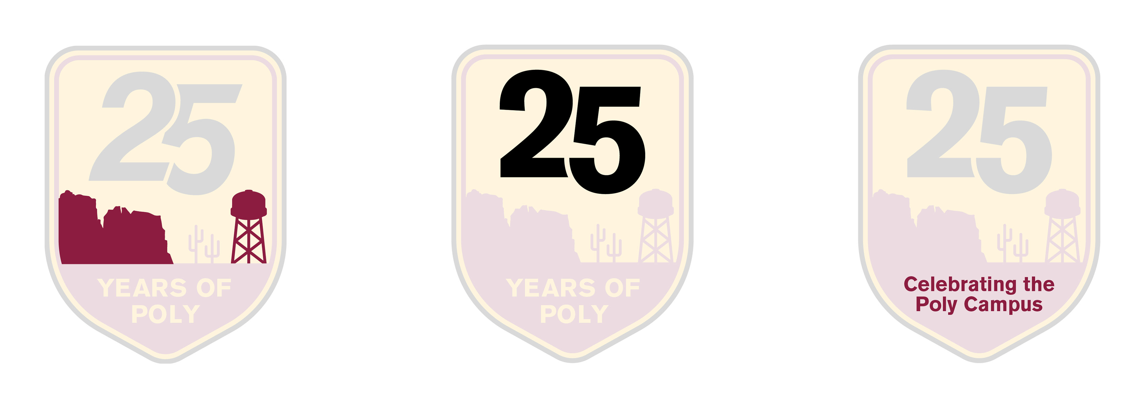
From there, we narrowed our approach, continued iterating, and presented our three strongest concepts to our internal client. After discussing the strengths of each, they chose to move forward with the flight-patch concept on the left (below.)
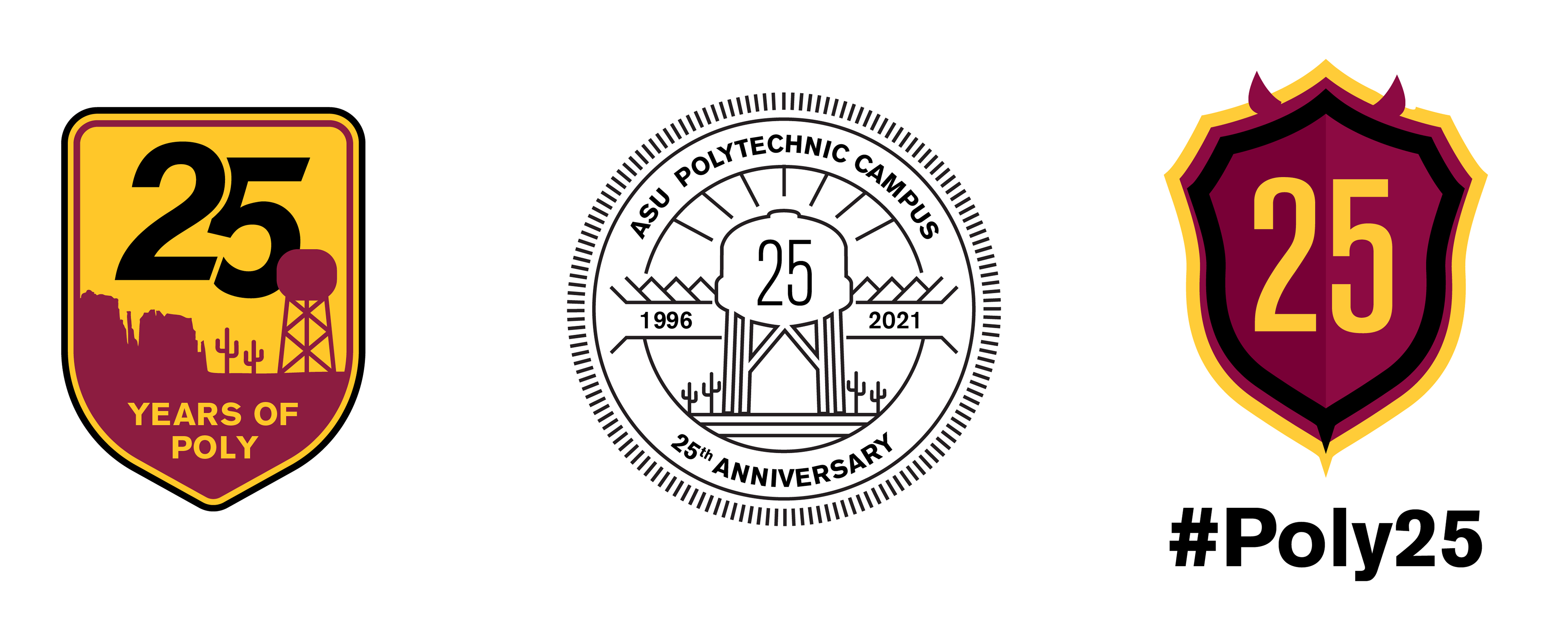
Three presented approaches: The Flight Patch, The Stamp, The Shield
We were officially in the refinement stage, working to clean and test our design. We zoomed in super close, looked at it from 10 feet away, and everything in between. We adjusted the coloring of the cacti and the overall holding shape. We tweaked the shape of the water tower and mountains, the placement of the 2 and the 5, and the exact wording at the bottom of the emblem.
In order to give our client maximum versatility, we also created four different color variations depending on the use case. In addition to the full-color version, we provided maroon, black, and white versions.
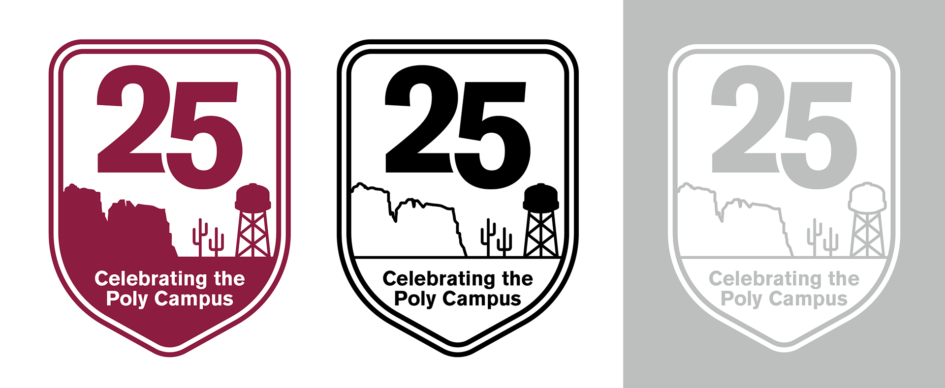
Color variations for the final emblem. Single-color, outline, and reverse.
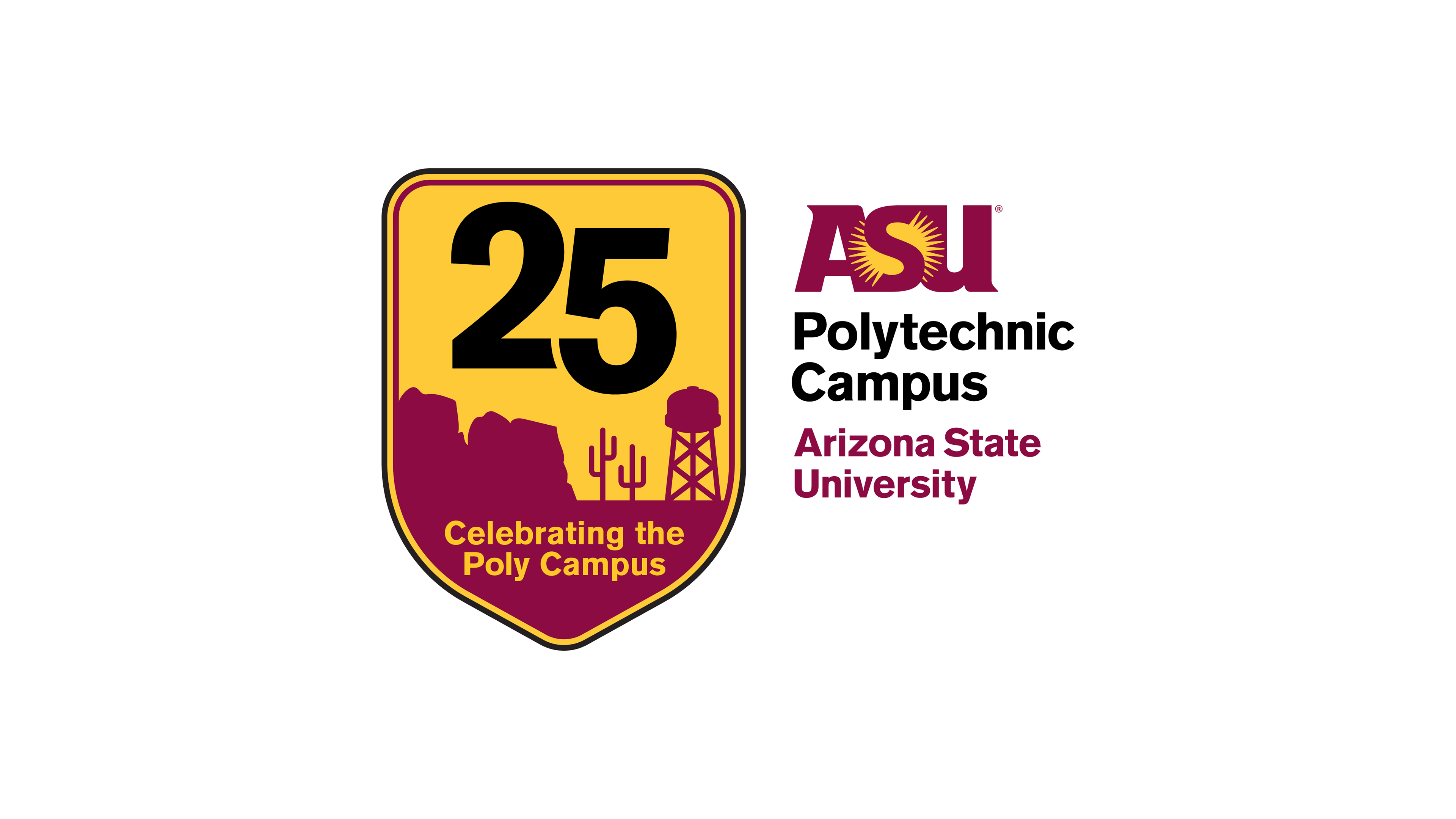
Our Solution
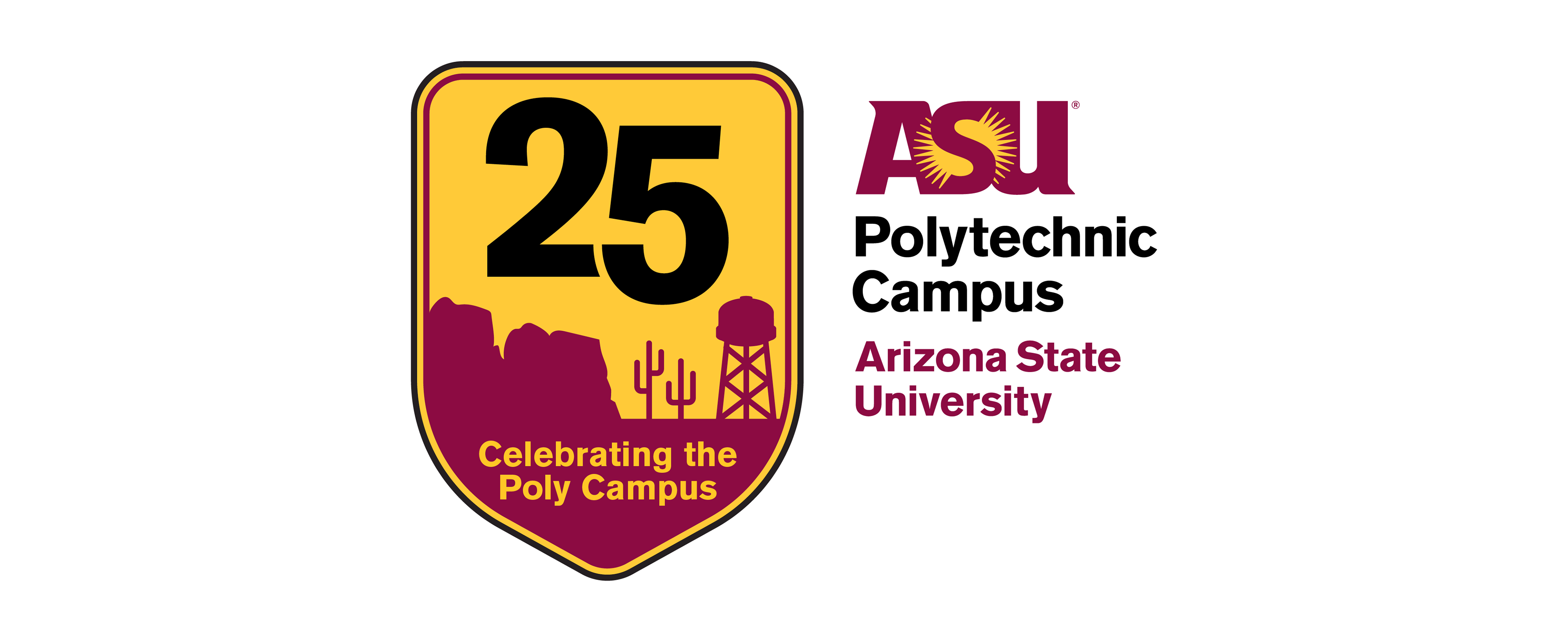
Through several stages of refinement, we developed the final, full-color emblem, which is accompanied by the Polytechnic Campus’ official ASU logo arrangement. Consistent with ASU’s brand guidelines, the emblem uses ASU Gold, ASU Maroon, and black, as well as ASU’s typeface, Akzidenz-Grotesk Standard.
Like we brainstormed in the first stage of this project, we included the famous water tower to clearly communicate its connection to the Poly Campus. We incorporated aviation through the overall holding shape, mimicking the style of flight patches and emblems. Lastly, we used a silhouette of cacti and the Superstition Mountains as a nod to the Arizona desert and Poly’s surrounding environment.
The Result
The 25th anniversary and celebratory luncheon was a great success and the emblem was front and center. The emblem was used on the physical invitations sent to the luncheon’s guests and on table centerpieces. In fact, we designed and printed the invitation on campus at the Print & Imaging Lab.
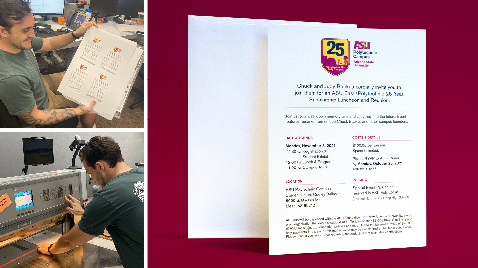
Left: Invitations being printed and cut on campus at the Print & Imaging Lab. Right: The resulting mailed invitations
In addition to the print materials, it was placed big and bold on all the screens at the actual luncheon so that it was the first thing guests saw when they entered the event.
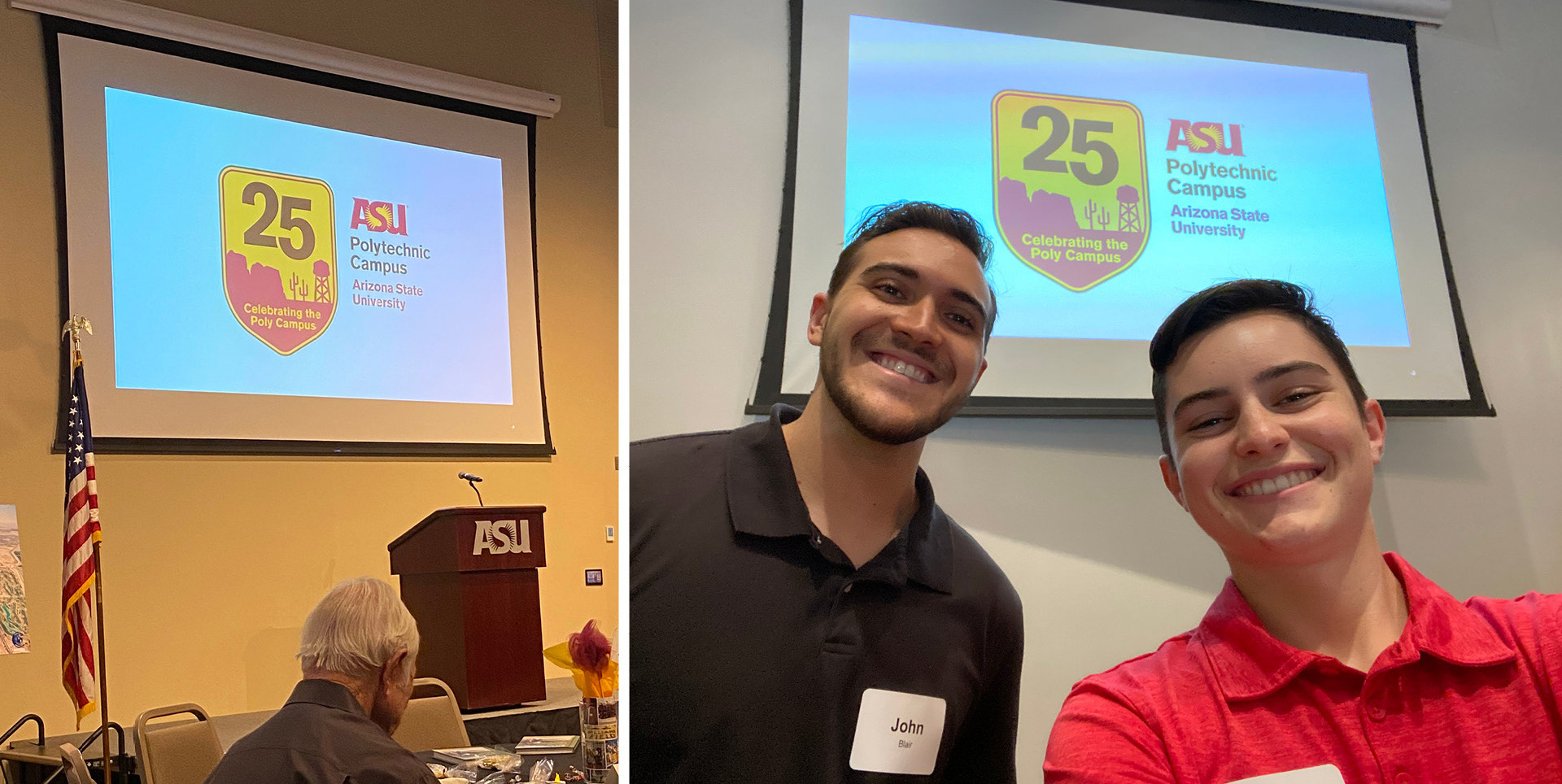
Student designers John Blair and Lauryn Armstrong (and the resulting emblem) at the poly25 Luncheon
Team
Lauryn Armstrong, John Blair, Amy Hector, Sarah Huffman, Designers
Prescott Perez-Fox, Creative Director
Prescott Perez-Fox, Creative Director