Overview
Catalyst is an award-winning PBS show run by students of the ASU Cronkite School of Journalism and Mass Communication. The show revolves around cutting-edge research at ASU and the impact it has on the world.
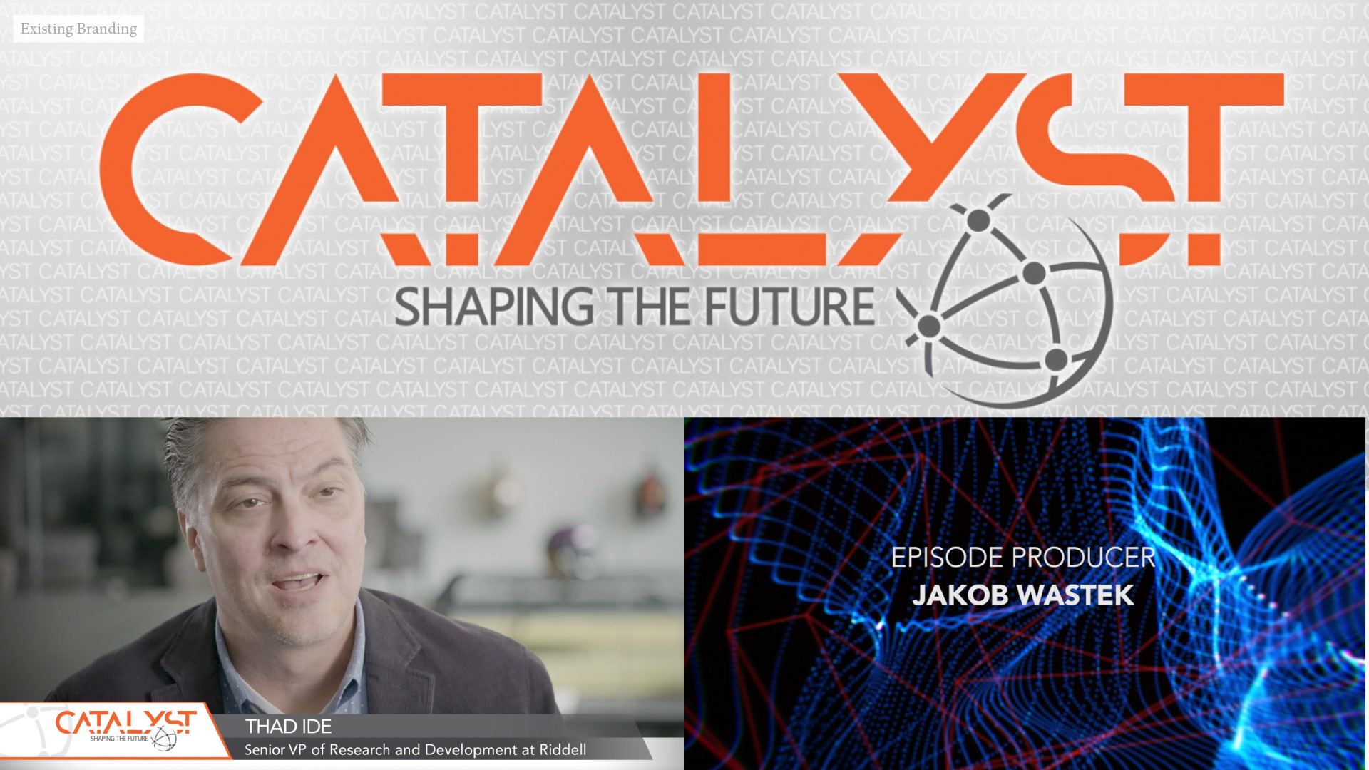
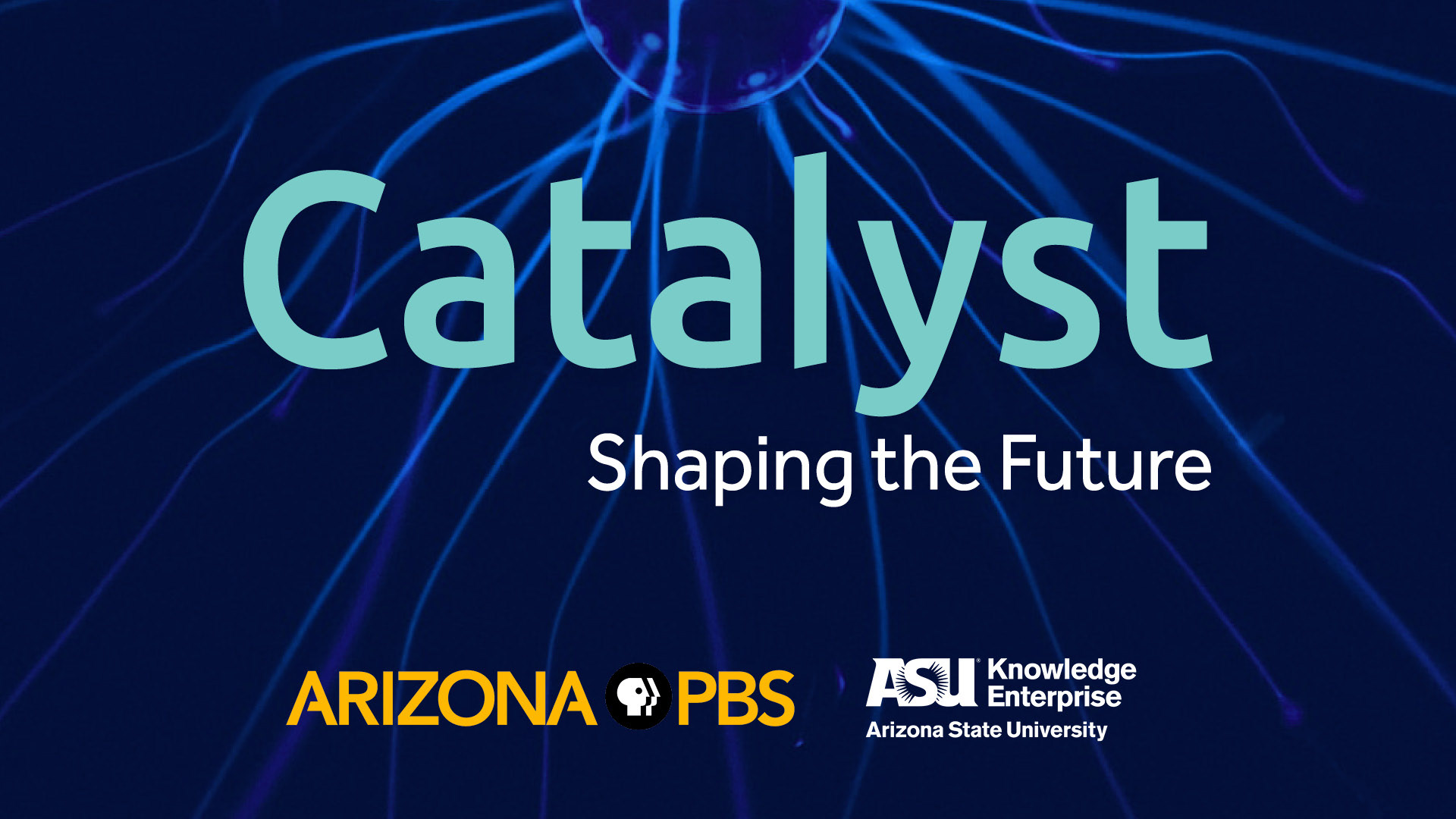
Before: Ad-hoc identity & graphics, inconsistent elements, stock animations, no cohesive brand visual style
The Challenge
Catalyst was in need of a brand refresh to better fit their audience, mission, and values. The goal of this project is to understand their desired brand image, develop a consistent brand style, and set in place new brand guidelines for the future of Catalyst.
In order to better communicate ideas to their viewers, Catalyst needed a graphic language that they can use in the future to build their own visuals and diagrams, rather than being restricted to stock images. They wanted to have a consistent brand style that can be applied to specific concepts. They needed the brand to be approachable and friendly, but also to convey what the show is all about: science and discovery.
Our Solution
By designing for Catalyst’s goals and completing multiple stages of refinements, we worked to create a multi-faceted brand where each piece would contribute to the end goal. Working with video opened the chance to have a vibrant graphic and color style, so we utilized that aspect to create an inviting look. Resulting identity reflects the brand’s energy but also feels approachable for the audience. Our solution fulfilled this point.
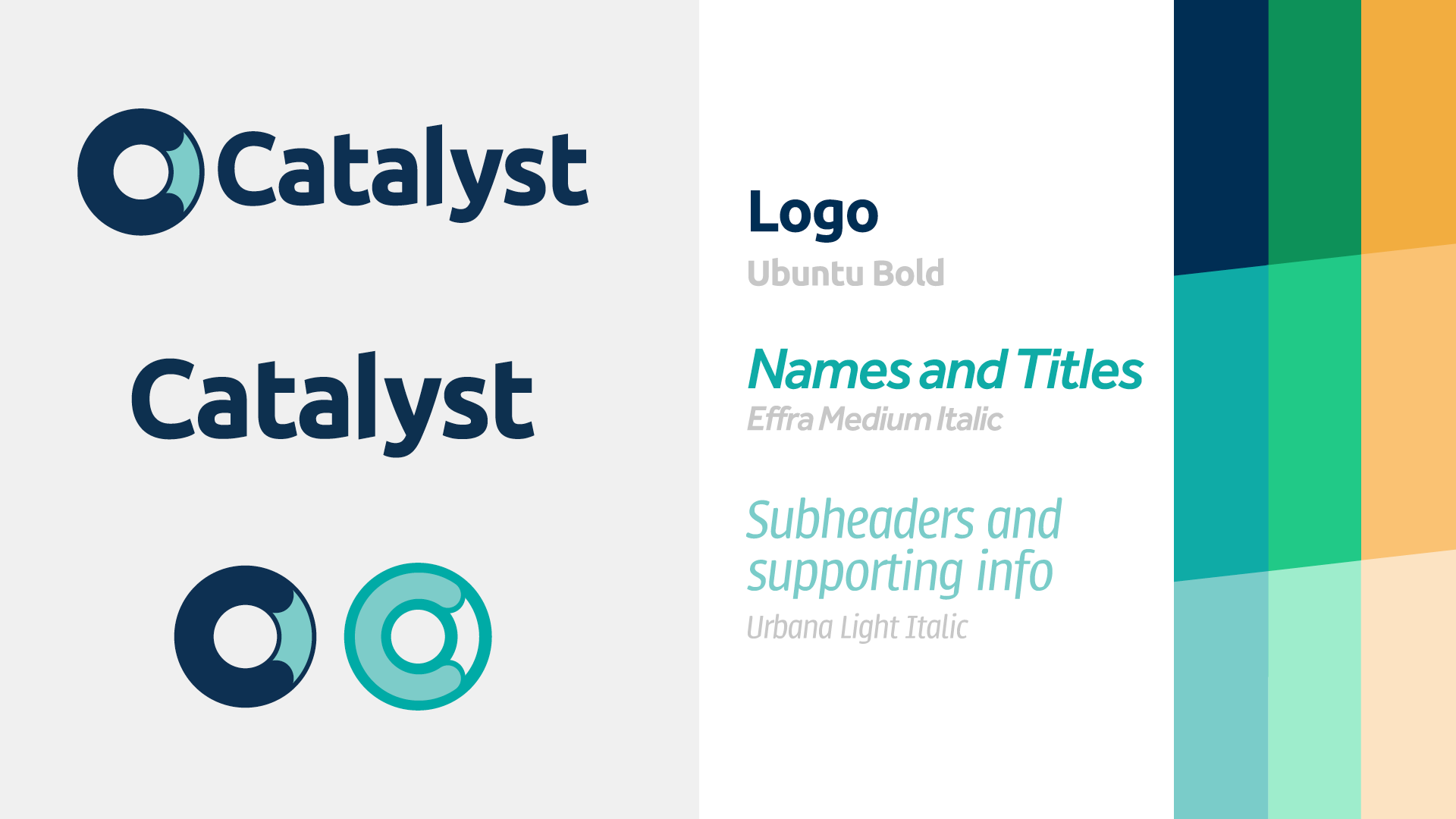
Logo system, typography, and colour family

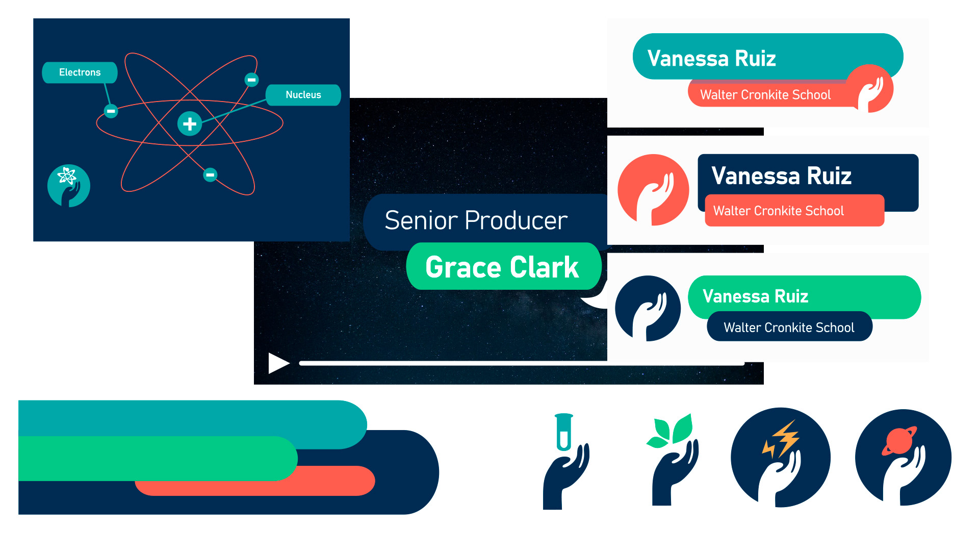
Icon system — outlined and solid, in different colour depths
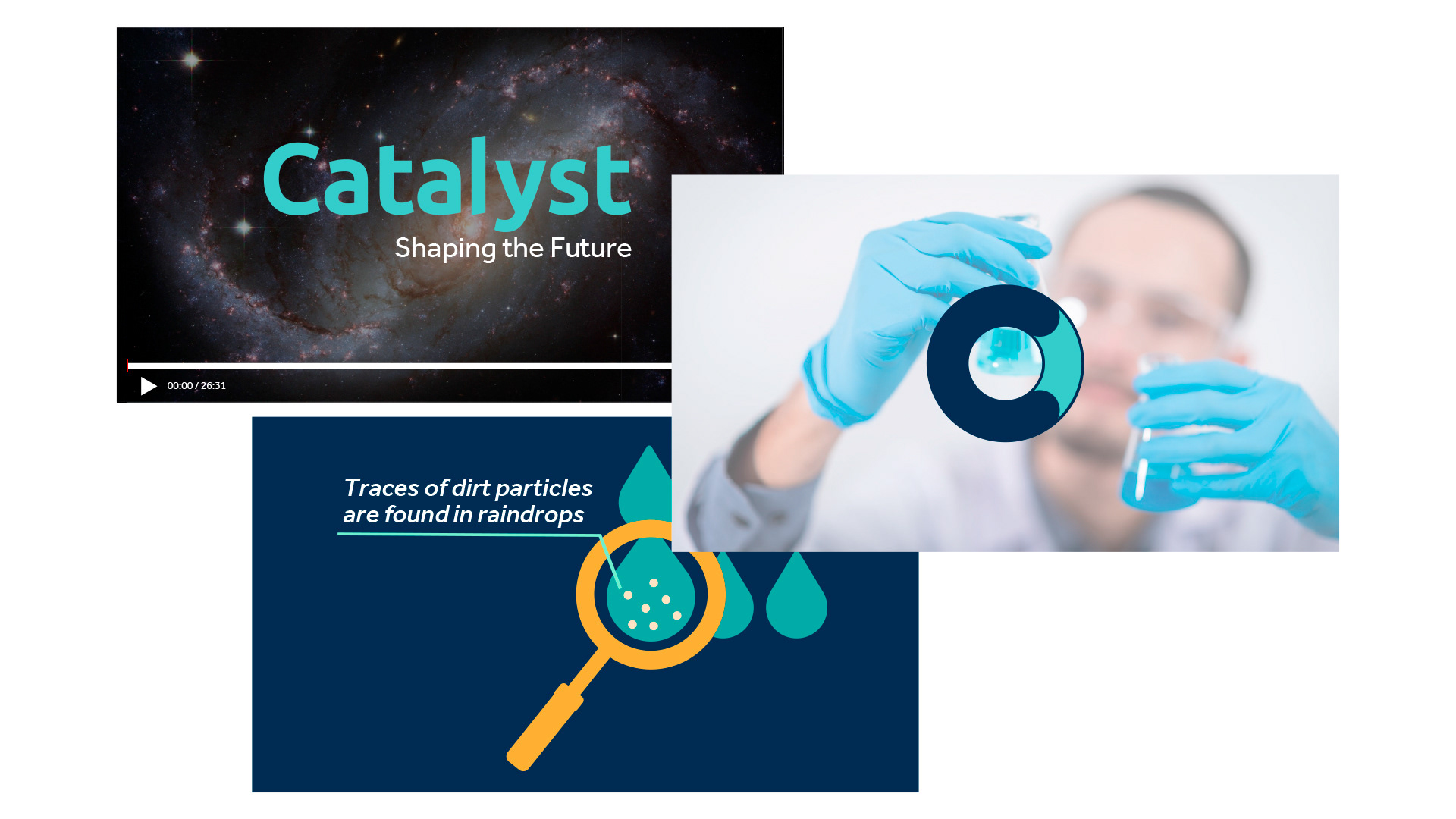
On-screen look and illustration style
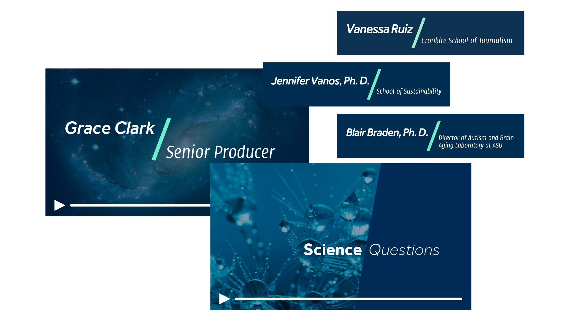
Lower thirds, interstitials, credit sequence
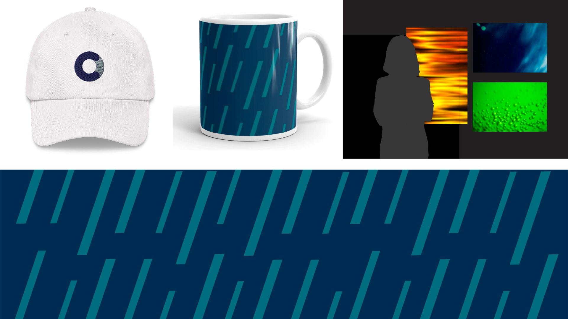
Merchandising, set graphics, and close-up of the brand pattern
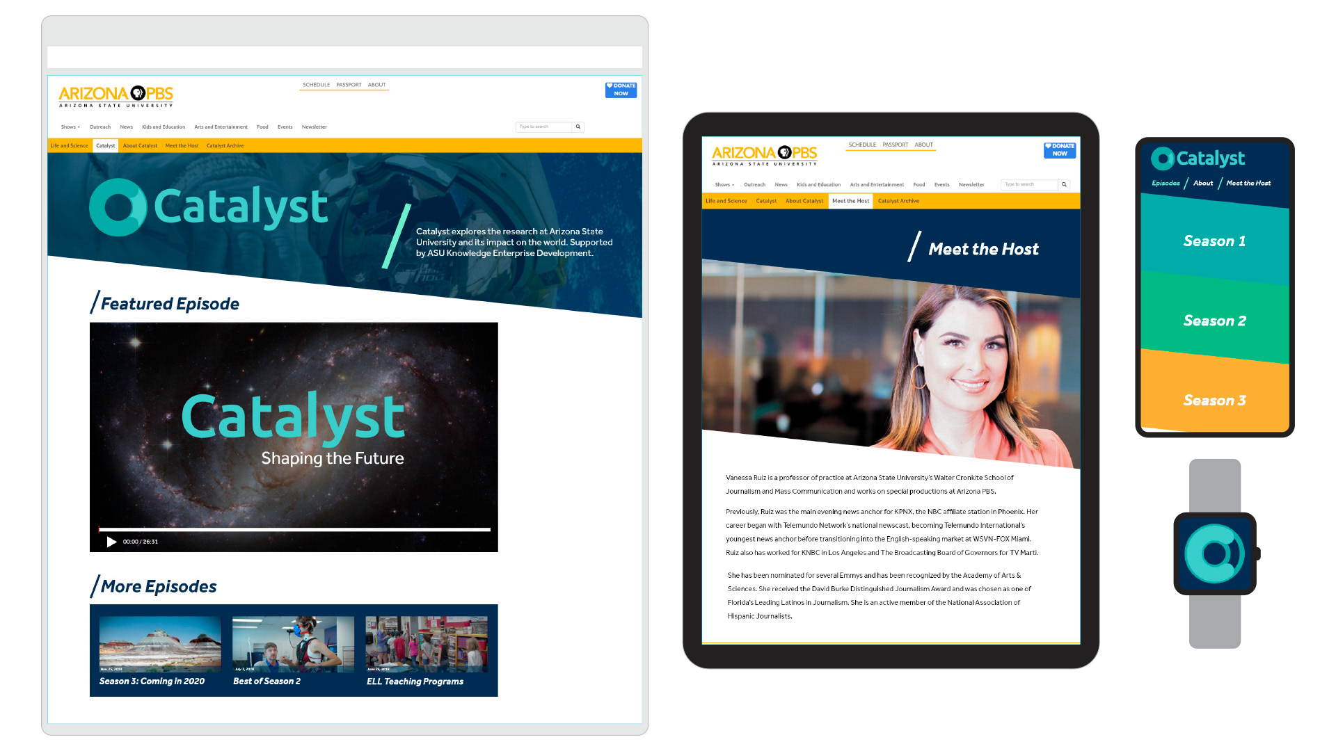
Web presence, mobile app, and future digital applications
Our Process
Our team came together to identify Catalyst’s personality, values, and brand message before diving into the design process. We explored multiple design concepts and presented them to the Catalyst team. After receiving a direction, we developed three distinct refinements, all from the same idea with different implementations.
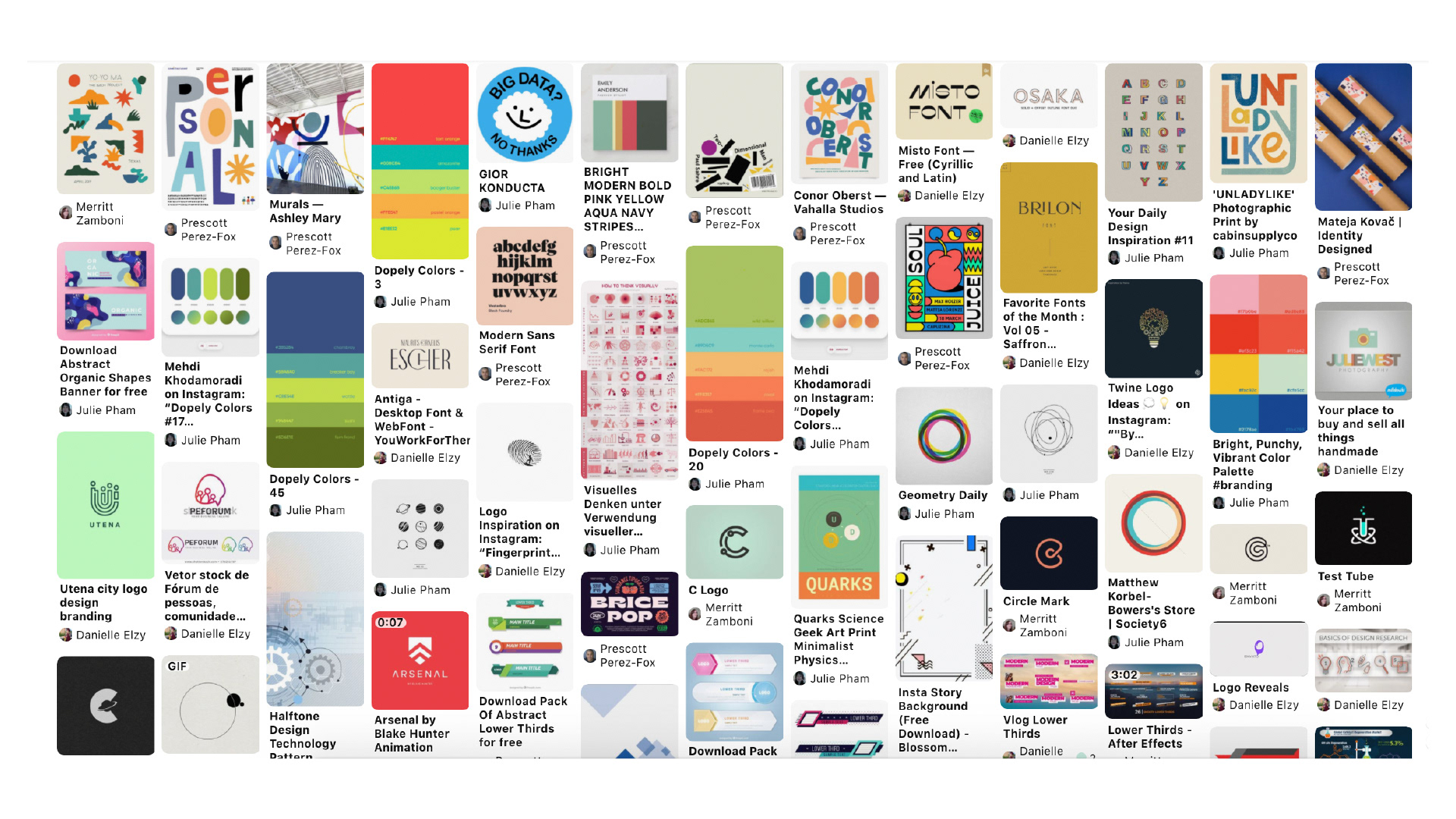
Visual research — collecting images online and assembling a Mood Board to summarise our efforts and guide our development.
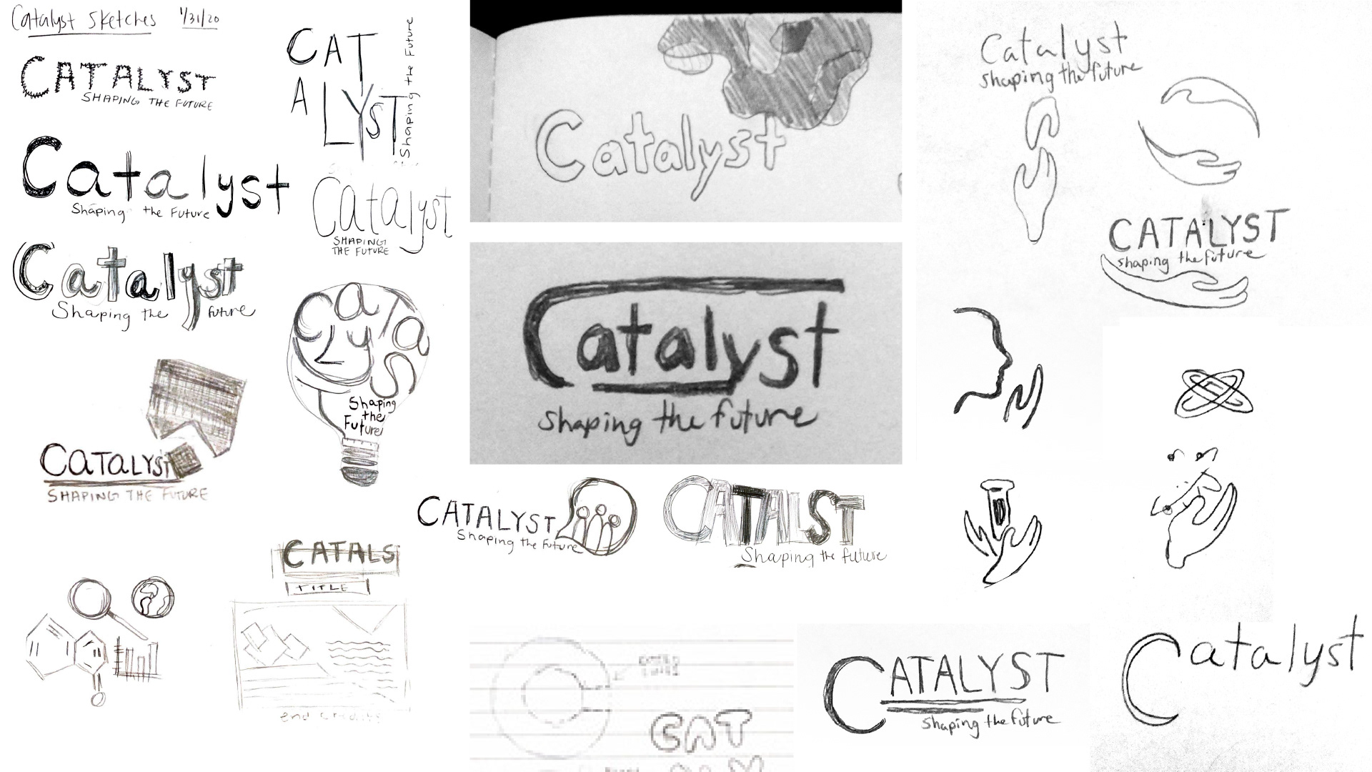
Sketches — ideas begin on paper
After presenting the distinct approaches the client gave us feedback. From the feedback we received we took the best concept and refined it. All of our continued work reflects the original message and strategy.
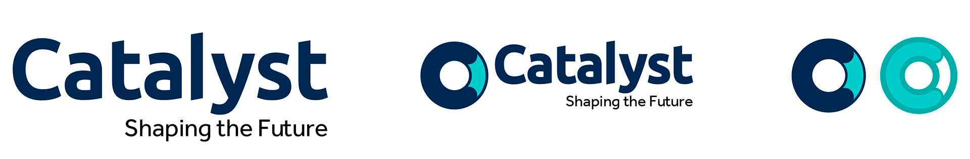
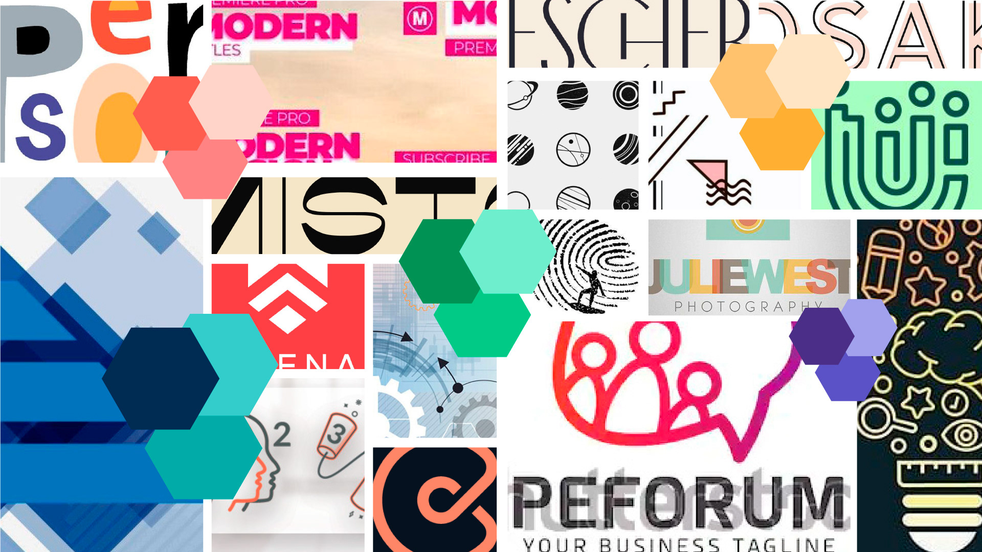
Concept development — multiple approaches to Brand Visual Style, all stemming from the same research and ideation
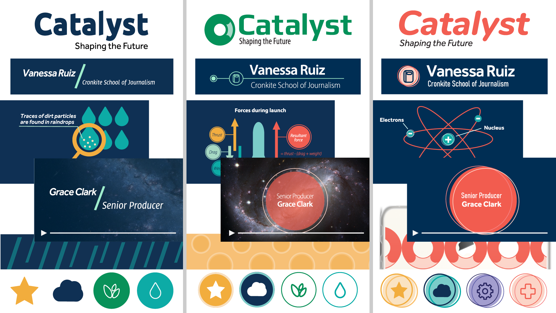
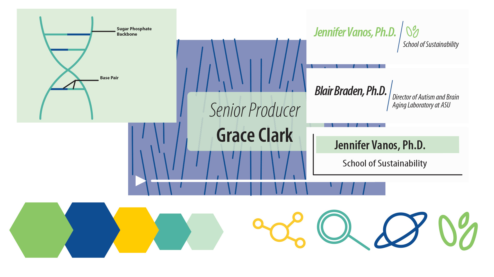
Refinements — three late variations, after conversations with the client. The one on the left became the way forward.
Team
Danielle Elzy, Merritt Zamboni, Julie Pham, Designers
Prescott Perez-Fox, Creative Director
Prescott Perez-Fox, Creative Director