

THE CHALLENGE
Established haircare brand Nexxus faced increasing competition from both high-end, niche brands, and from mass-market own-brands in the sector. Discussing the potential approaches for a design effort, we were faced with the need to maintain the equity in the brand, but also to captivate consumers with an updated look across its products.
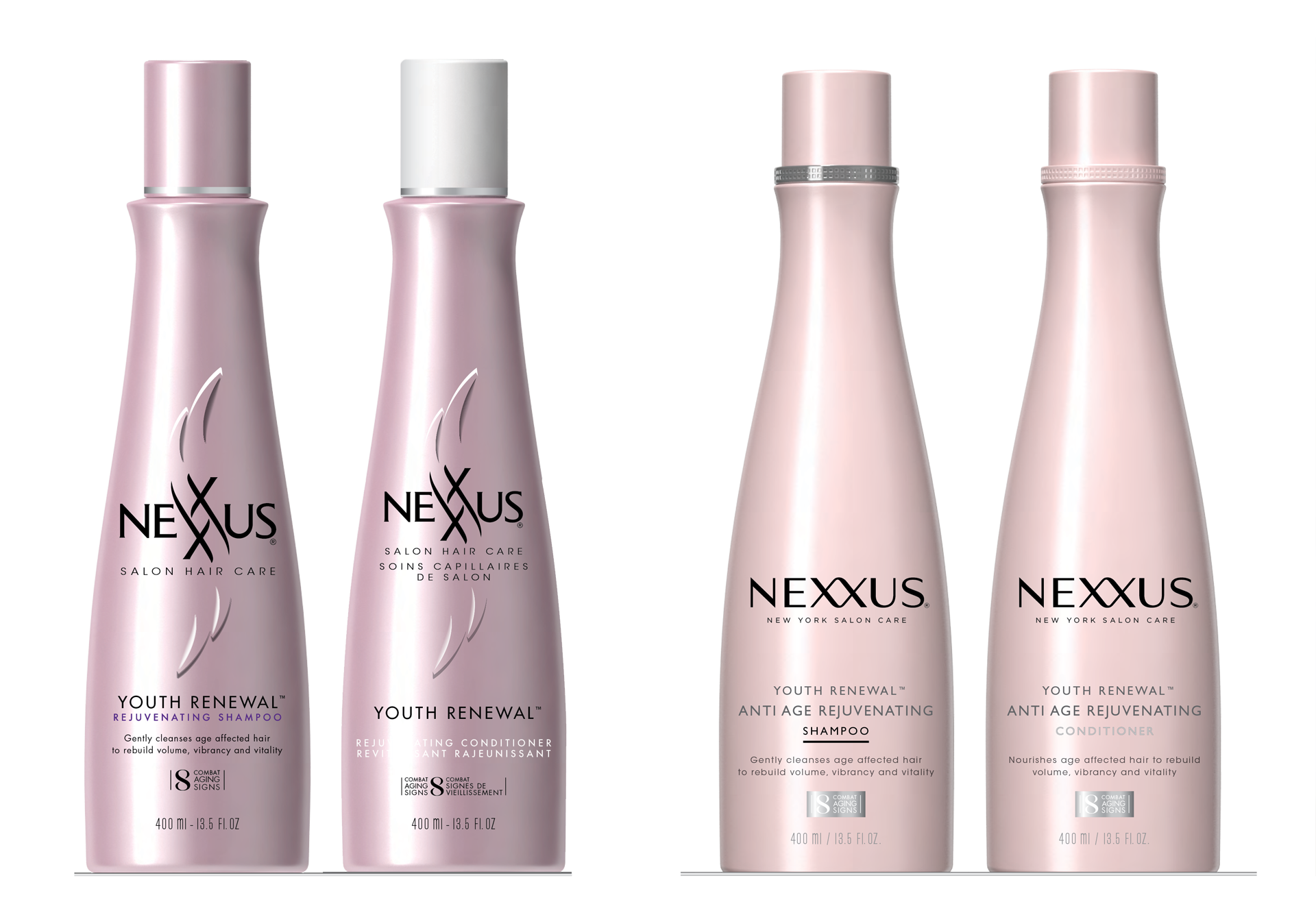
Example of the previous packaging, with previous logo (left), and the updated counterparts (right). We also updated the hierarchies of brand, sub-brand, benefit, product type, description, and promotional graphic.
Our SOLUTION
We undertook a brand refresh across their entire line, intended to regain consumer awareness and compete on their current strengths. Approaching the range systematically, we considered product type, effect, size, ingredients, and hair type. The result is a cleaner, more purposeful, and more easily read-and-understood packaging design.
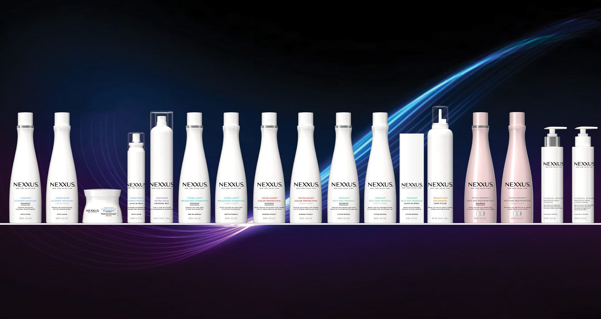
Rendering of the proposed packaging update, applied across the entire product line.
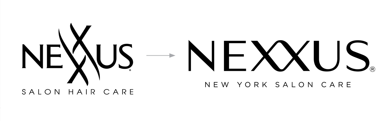
In addition to the packaging, we redesigned the principal wordmark — the first update in years. The new mark is clear, reads easier, and displays larger on a bottle while still feeling less intrusive. We retained use of a double-X ligature at the center of the word Nexxus, reworking it to read in-line with the rest of the letters, but remain symbolic on its own. This double-X is central to the brand, as part of the name and as a visual centering point.
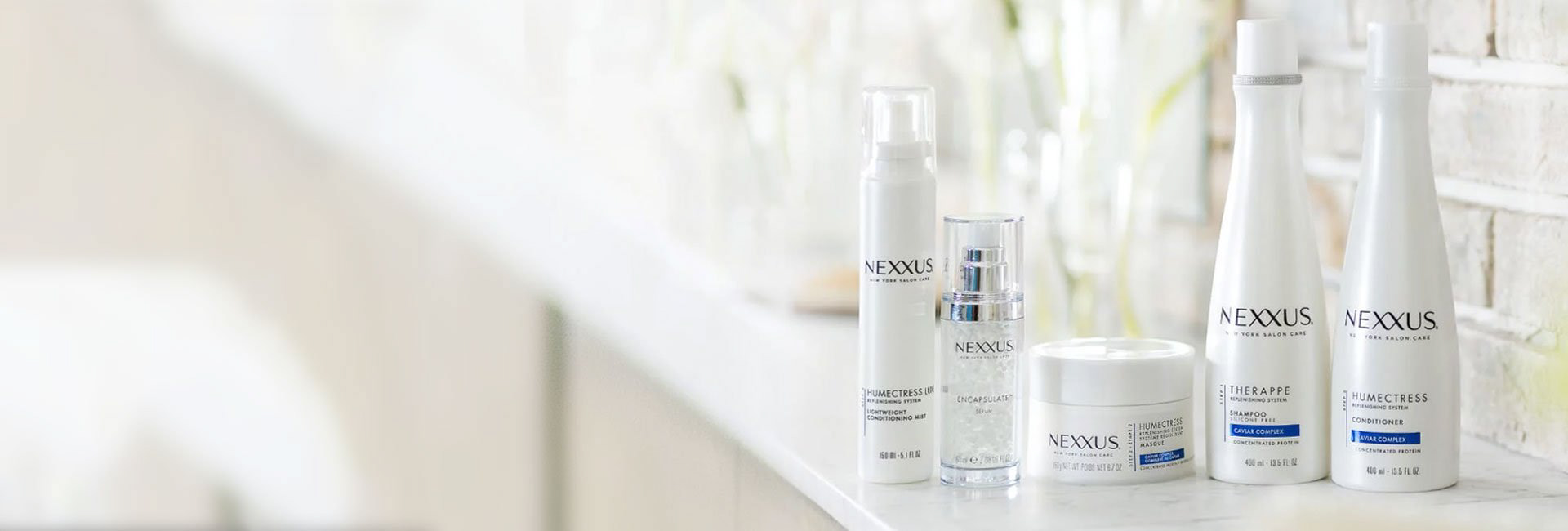
Final production packaging with updated Nexxus wordmark
OUR process
The design process was an effort of iteration, rather than radical steps and new ideas. We tested and examined hundreds of slight variations to display product information in a compelling, systematic way.
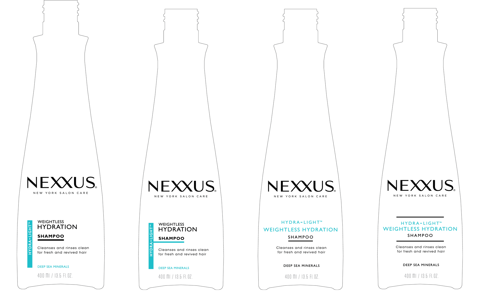
Example of two approaches for the same product line, experimenting with type hierarchy, graphic form, colour, and alignment.
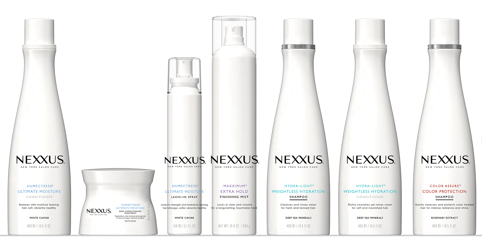
Rendering of a proposed design system applied across numerous disparate packaging types, showing consistency and versatility, as well as hierarchy and variability
Our team was fortunate to have 3D designers as well as graphic designers on board, allowing us to test bottle designs, simulate materials, and better present our ideas to clients and customers. We worked with model-makers to build full-scale mock-ups, complete with simulated material effects. When sending final designs to production, we specified all aspects of the package — bottle shape, materials, artwork, and effects.
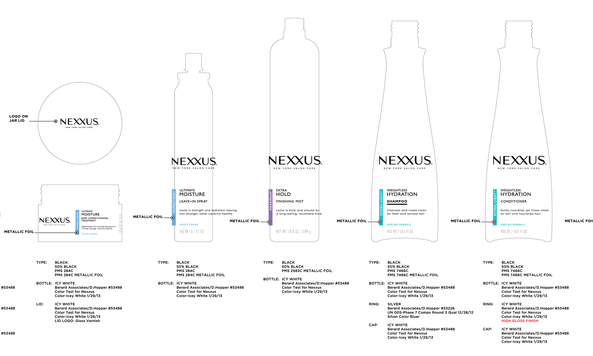
Specification document for model-makers and for fabrication