OVERVIEW
The Graphic Information Technology program (GIT) at Arizona State University’s Polytechnic School is a multifaceted major covering aspects of graphic and web design, photography, video, animation, and other media and design fields. The program originated in 1958 as the Commercial Printing course, but has evolved many times since then.
THE CHALLENGE
With a large and growing body of diverse and successful alumni, GIT needed a way to communicate with their network. In addition to keeping folks updated, the need emerged to solicit alumni donations to help fund future efforts and equipment in the program.
Emulating the success of other programs at ASU, the concept of Give a Latte is simple: invite folks to donate small amounts — a latte’s worth — which add up over time and make a big difference. This new communication program needed some clarity in its design, first in terms of business and communication concept, as well as the visual identity and main website touchpoints.
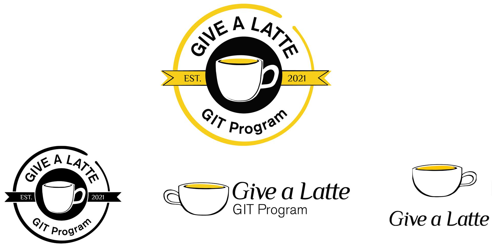
The logos come in multiple colors and complexity variations, giving us flexibility for future use cases.
OUR SOLUTION
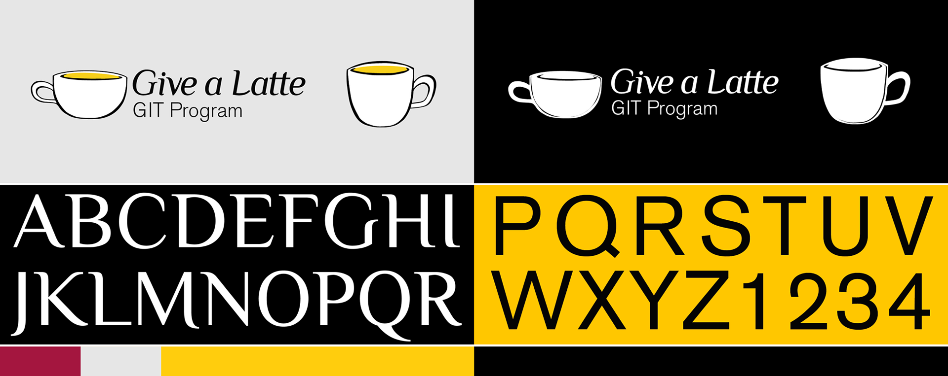
The Give a Latte Identity system breaks from the traditional university style, introducing a crest that evokes the long tradition of cafes and bistros. The main typography feels more organic and personalized than ASU’s brand typefaces alone, and connects with the illustrative feel of the larger brand visual style.
Identity elements for Give a Latte — reuses many elements from the larger ASU identity system.
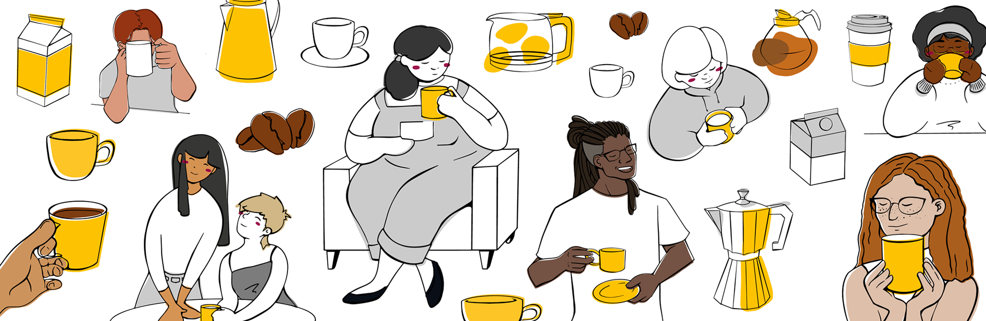
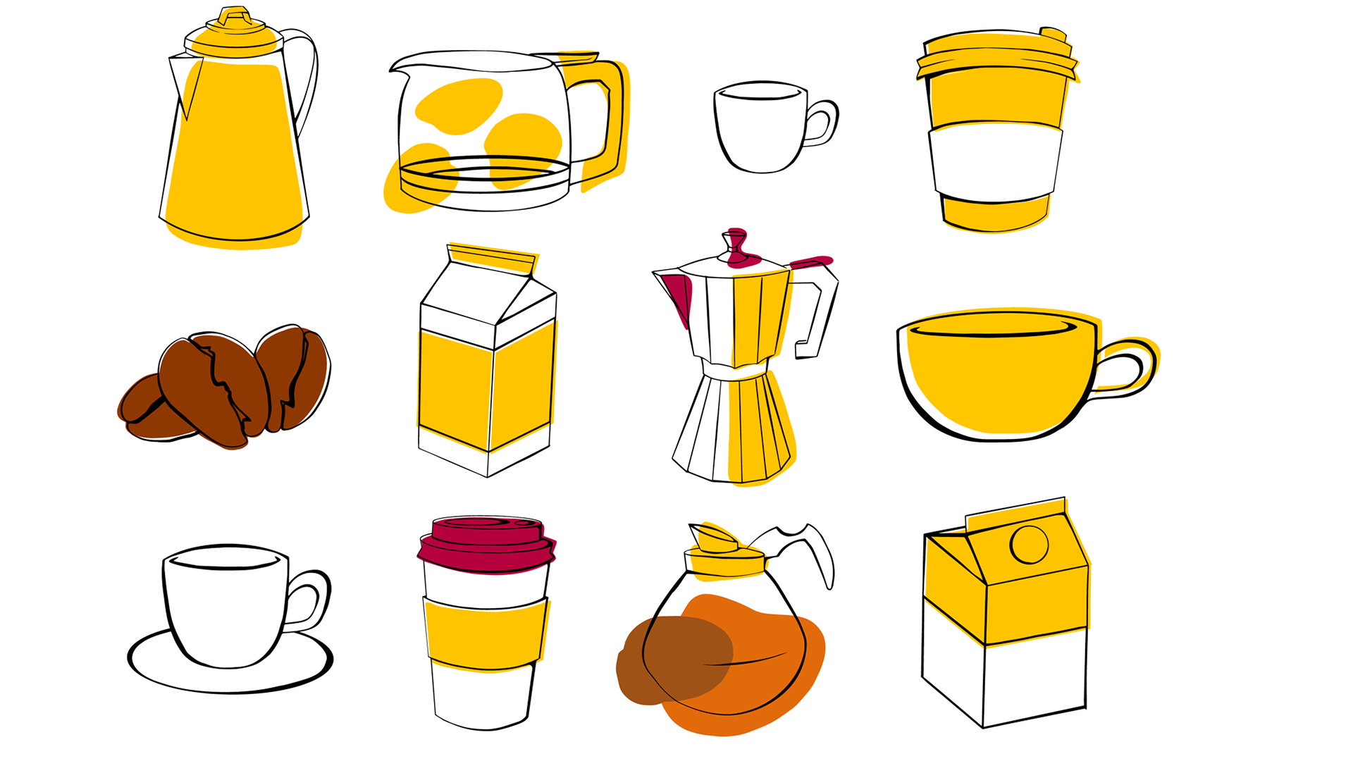
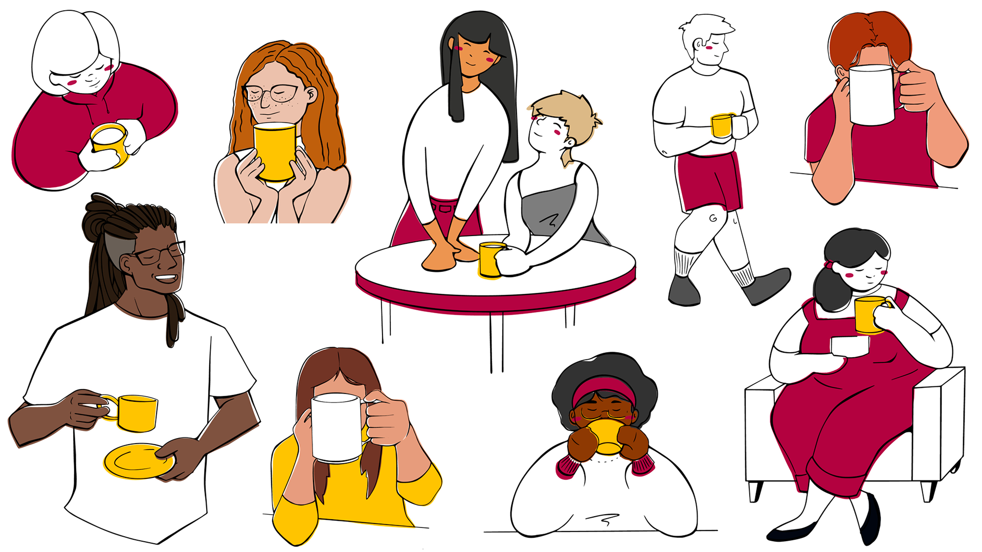
Our system centers around a series of illustrations depicting the wide world of coffee. The characters reflect our program’s diversity and energy. We also show the vast array of coffee objects, reminding us that everyone prefers their cup slightly different. GIT is an “all of the above” subject and this collectivism is shown in the illustrations.
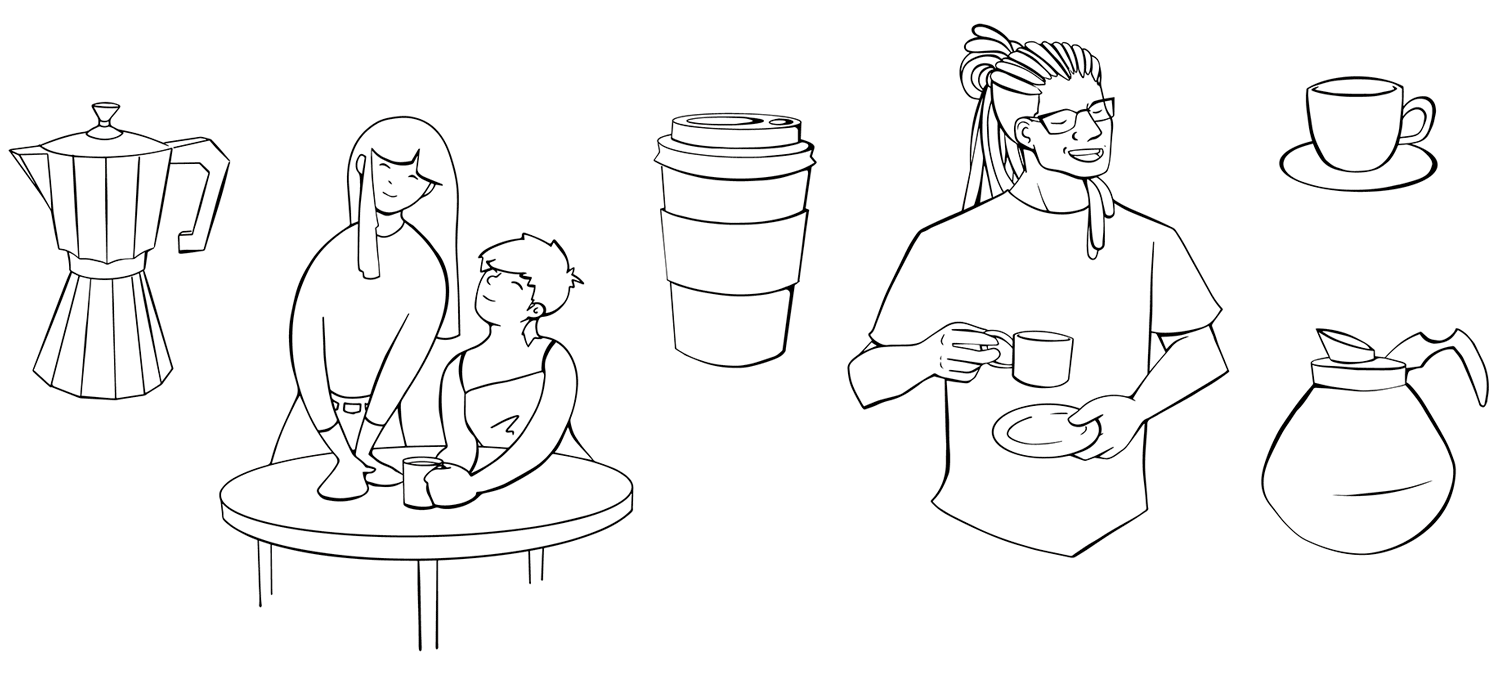
Illustration style shown in multiple color complexities. The individual pieces can be rendered in simple lines or multicolored fields, depending on the use case and surrounding elements. This flexibility makes the system more versatile for production in different media formats.
Signature illustration style for Give a Latte. The casual lines and colored fields reflect our personality and energy.
The style itself reflects the personality of the program, becoming casual and unfinished. There’s an easy elegance to the line style, as well as flexibility with color depth and numbers of people available.
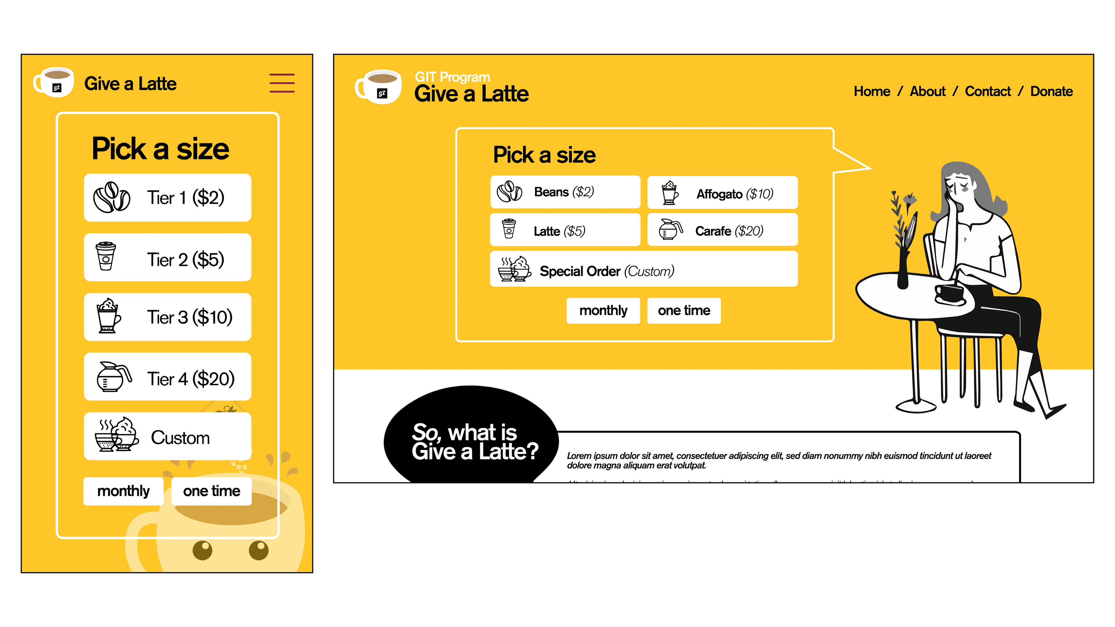
Give a Latte is a web-based program. As a donation platform, we crafted a simple one-page website which will explain the donation process and offer a friction-free electronic donation option.
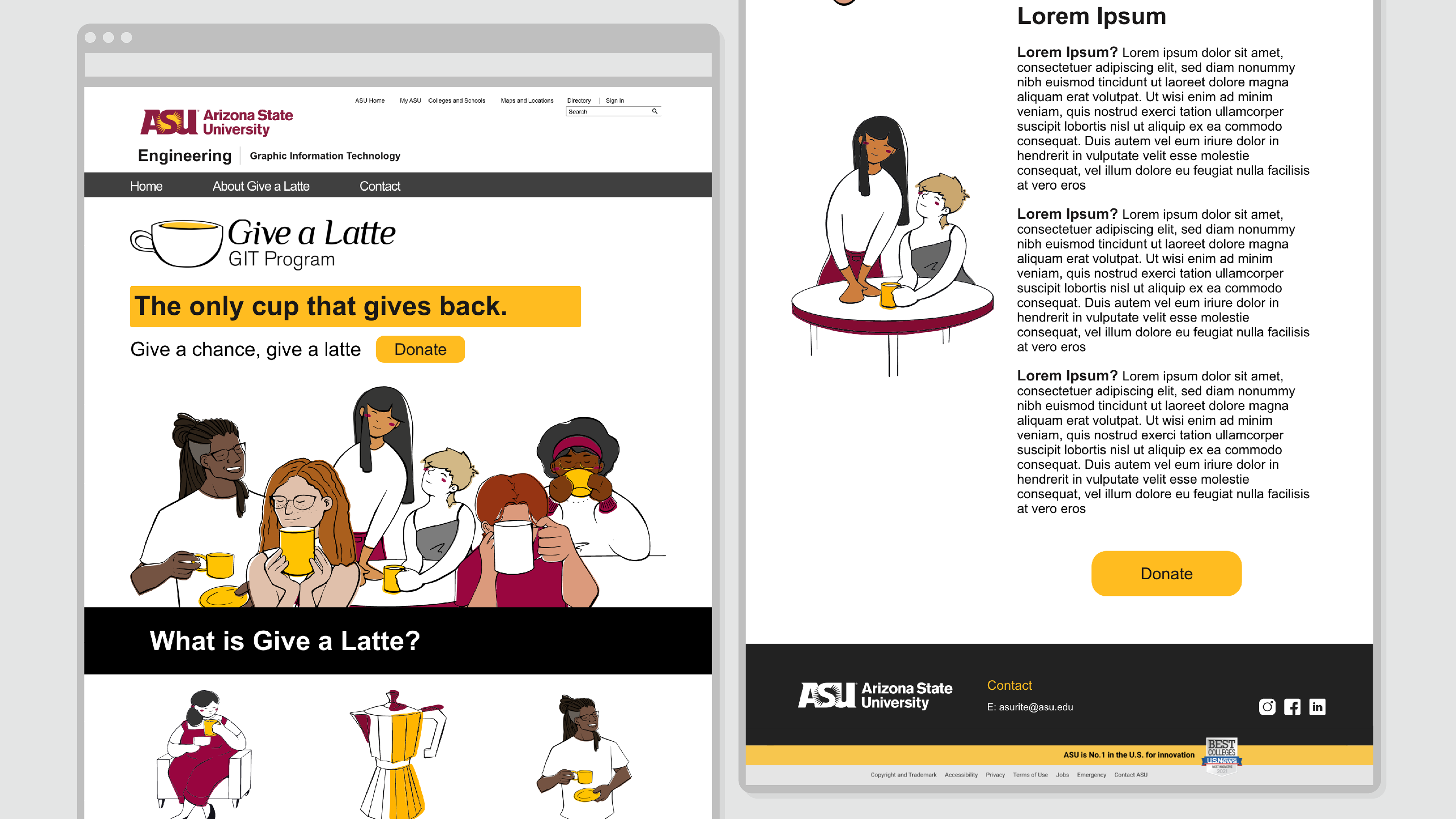
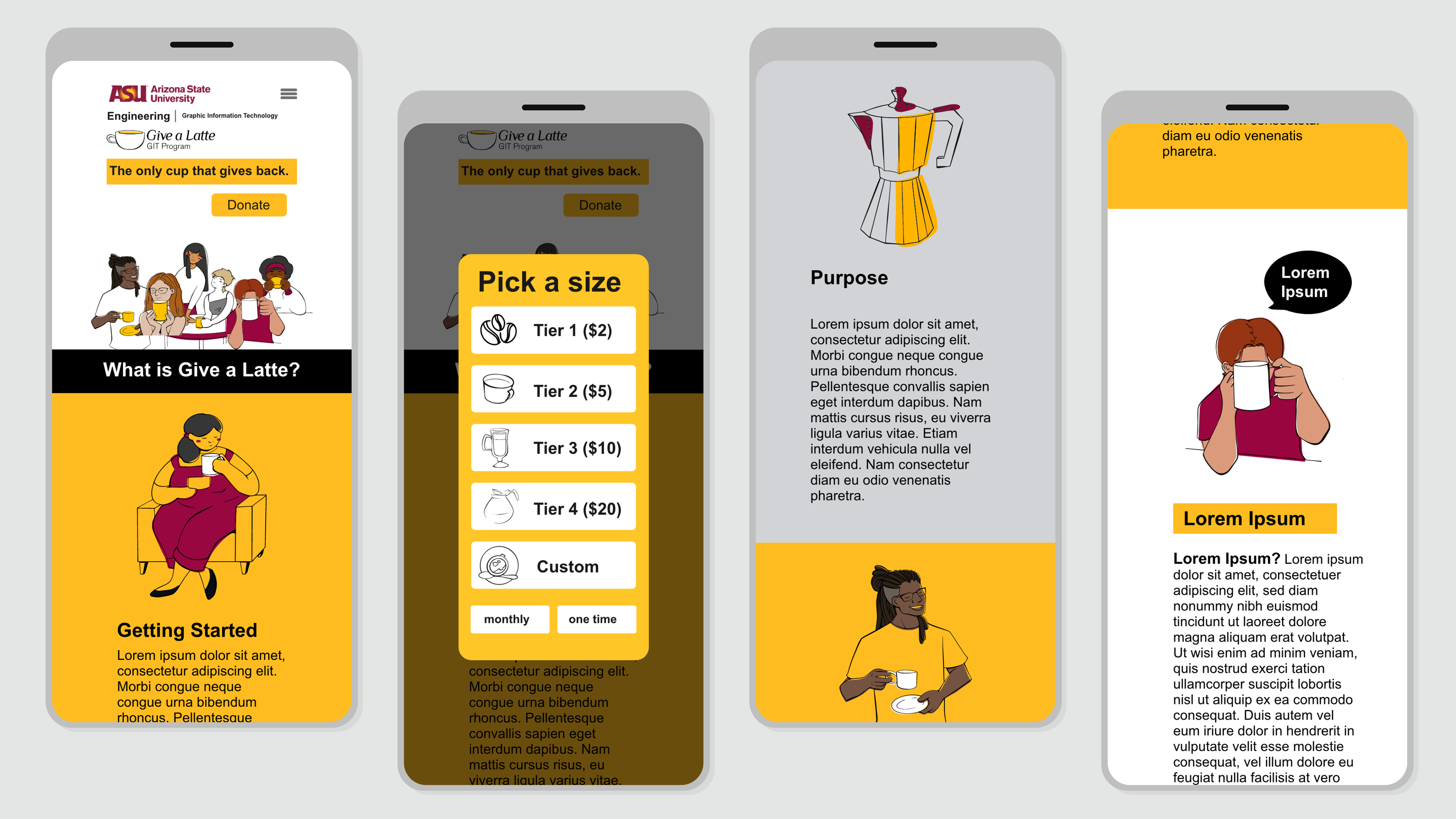
Website design for desktop and mobile using our brand visual style and illustrations. The single-page site is aimed at explaining the program and encouraging donations. Live text forthcoming, of course.
The website art direction pushes gently on the edges of the University styling. Still utilizing the main colors, Maroon, Gold, and Black, we change the proportions allowing more whitespace and leaning into the Gold more than Maroon. This grants Give a Latte an identity of its own while still confirming with brand guidelines issued for all University-hosted websites.
From the start, we considered how the web experience would be replicated across formats. This meant designing for desktop, tablet, and mobile from the start, understanding that different alumni prefer different devices and are more likely to make donations in different contexts.
OUR PROCESS
Before designing anything, we had to determine what, exactly, this program will be. Just a communication tool? Just a donation tool? Or maybe a two-part approach. Ultimately, our strategic discussions led us to create Give a Latte just as a donation platform, but the remainder of our ideas were quickly folded into a larger plan about alumni relations and ongoing communication. Long story short, the aim is to kickstart a mentoring approach that connects students and industry professionals, not merely a newsletter to fill people in.
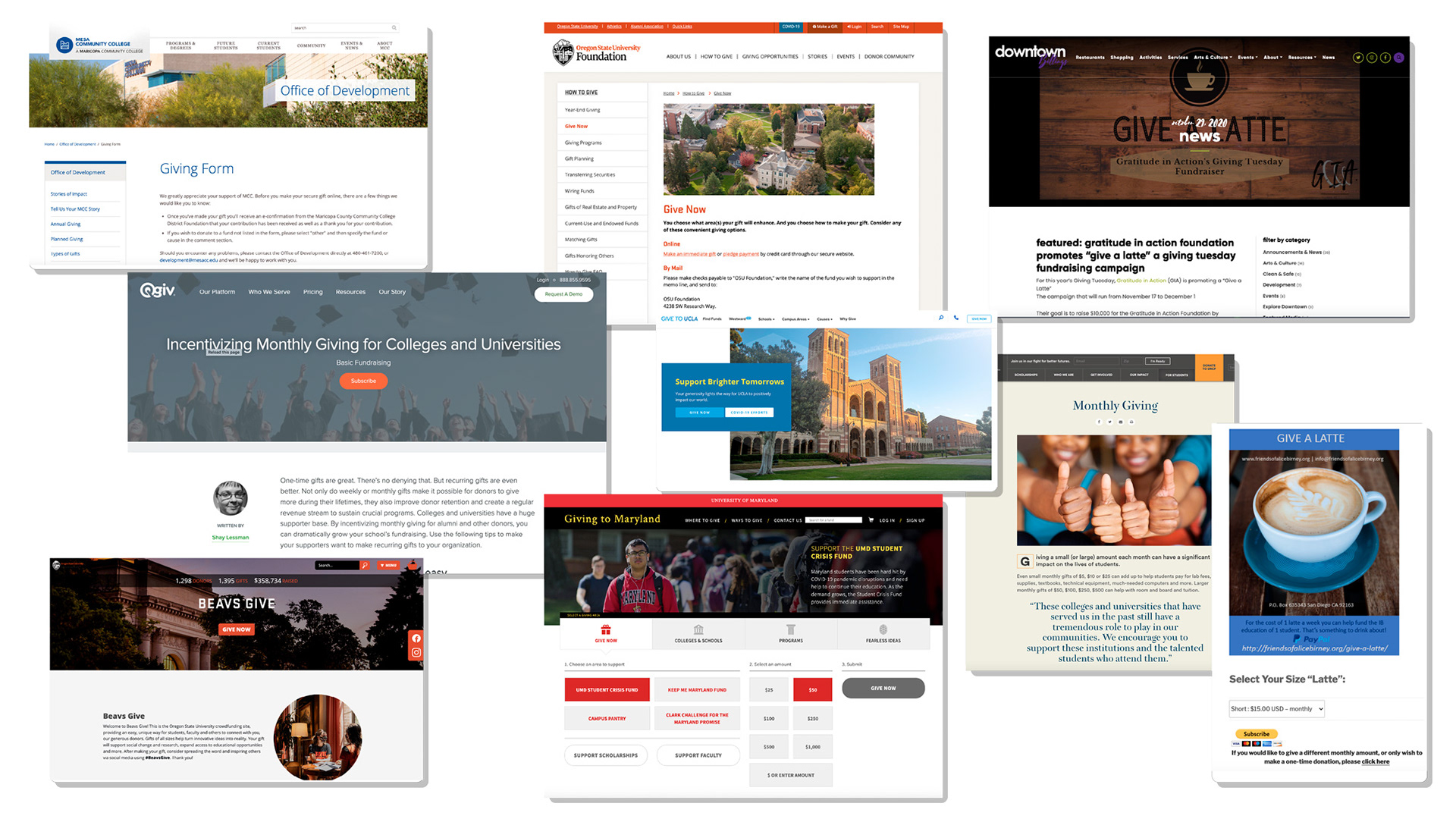
Researching similar programs at other schools. Broad-level gathering allowed us to examine brand visual style, written voice, and approach to design in general.
Along the way, we researched what other schools were doing and came to understand that there are two main ways to approach the visual identity: a traditional route which leverages the school’s own brand styling, or a more vibrant, illustrative one which bucks the trends and establishes something new.
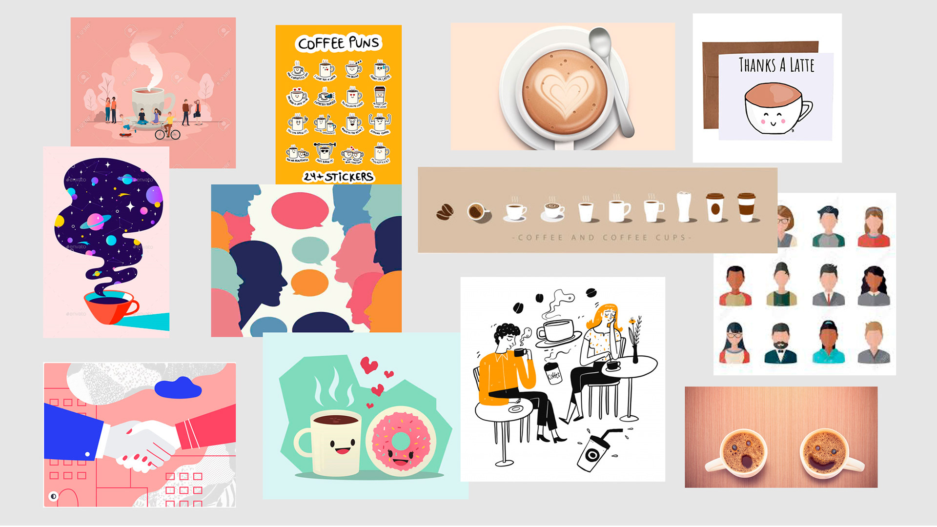
Visual research gathered to reflect the program's values. These sources set the tone for our casual, fun, and vibrant ideation and illustration to follow.
After presenting early concepts to the internal client team, it became clear that the most effective approach is a colorful, illustrative one. We refined that idea and introduced three possible illustration styles. Once the ultimate style was chosen, it came down to production; there was quite a list of coffee gear and people to depict and render in a matching style.
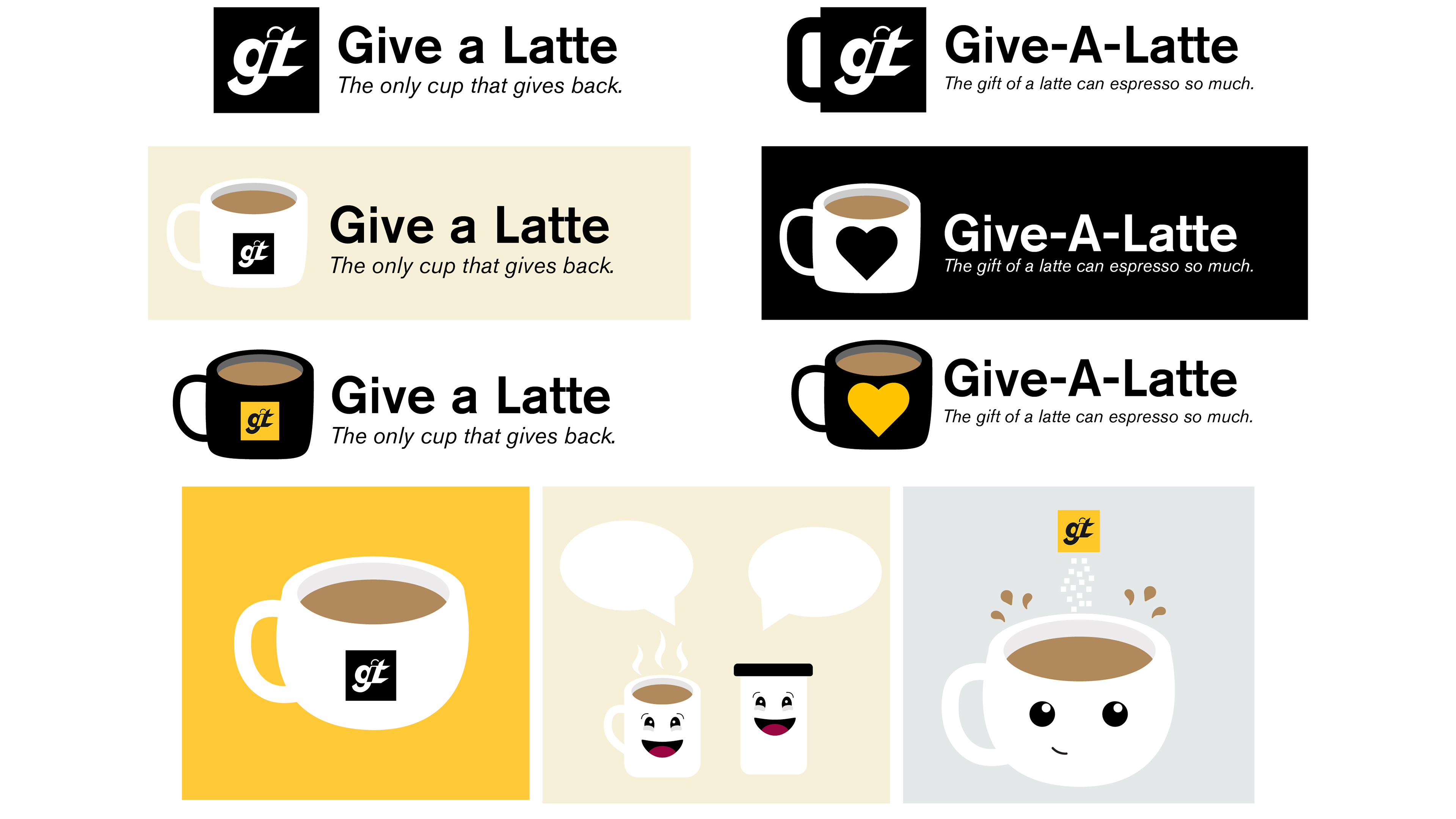
Identity ideation and steps. On the left we see simple wordmark and logo arrangements, experimenting with cups and characters. On the right the system takes shape, as does the expanding system, going from abbreviated symbol to full crest.
Meanwhile, we designed the site. Working backwards from our research, we crafted wireframes and tested the site’s content plan with alumni, students, faculty, and members of the public to make sure the language and layout was intuitive and obvious.
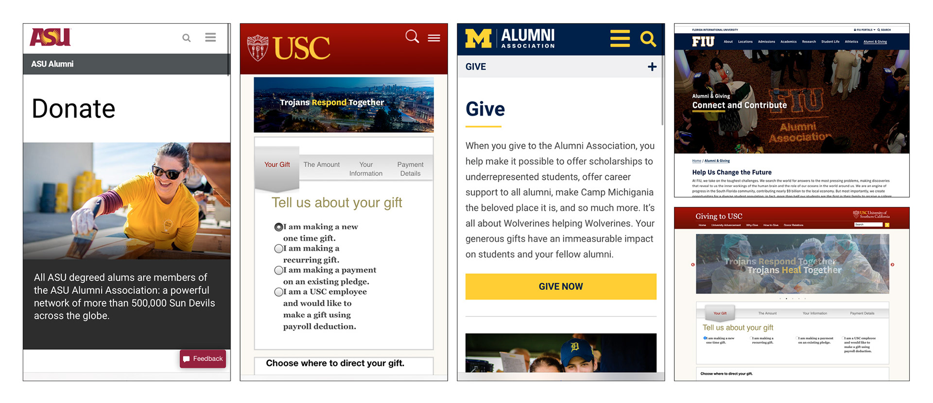
Researching donation systems, this time with a more scientific approach, examining usability, content layout, and technology options.
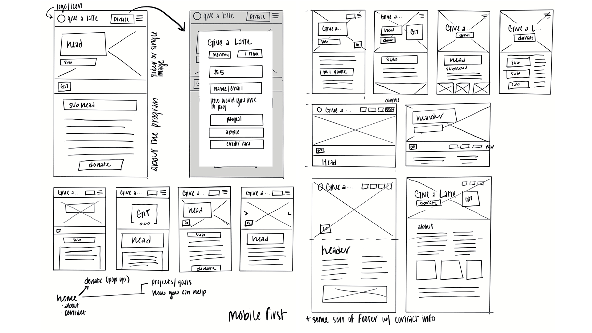
Wireframes and early site sketches
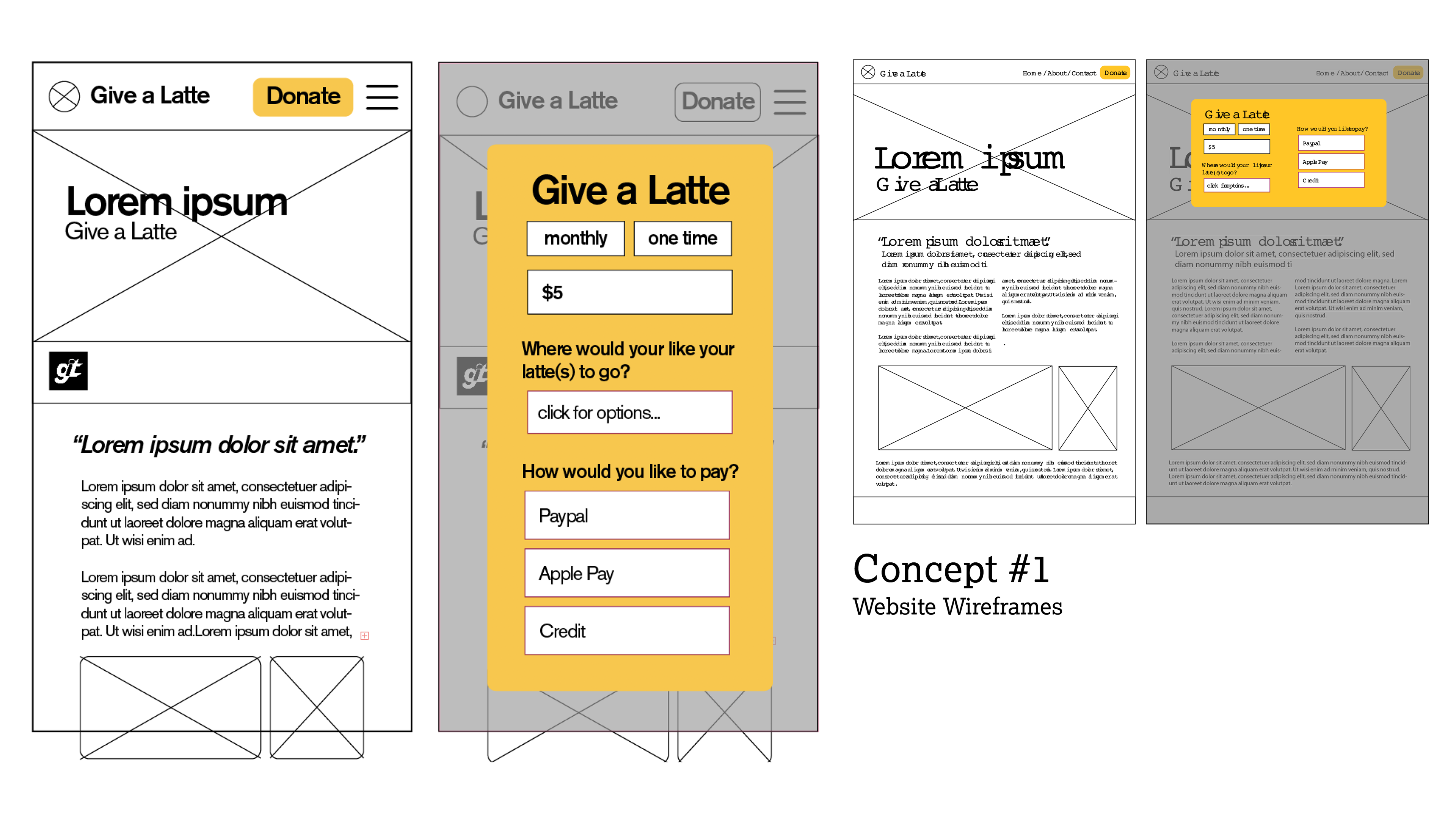
Wireframes and mid-fidelity mockups
With an agreed-upon content strategy, we could refine the site layout and bring in elements of our brand visual style, especially the color and illustration style.
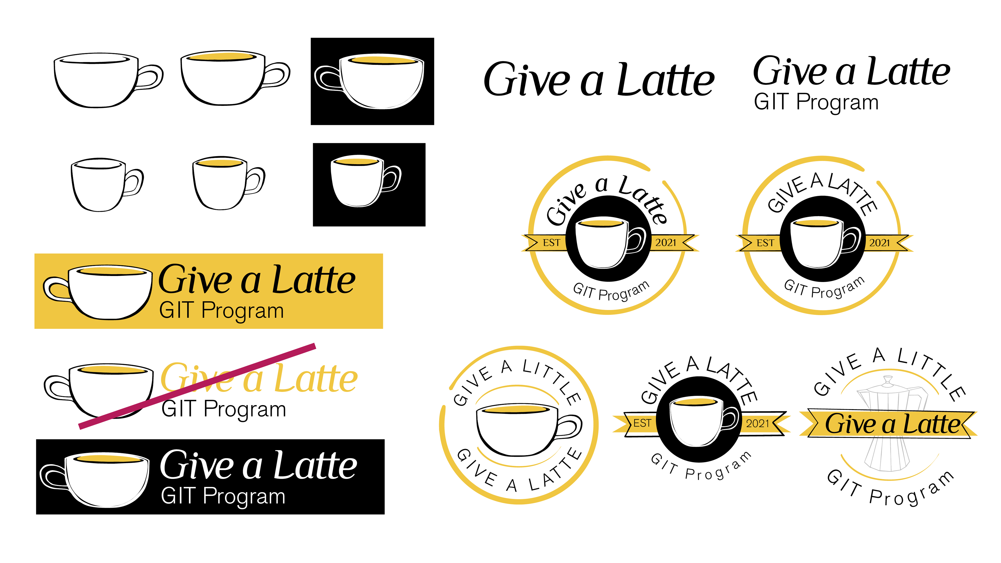
As the illustrations and site were being developed, we refined the main logo system, working up several alternative arrangements. More refinement followed, including some customizing of the main wordmark, and the ultimate system coordinates nicely with the illustrations.
TEAM
Katrina Hammon & Maddy Greenly, Designers
Gabe Hofer, Illustrator
Prescott Perez-Fox, Creative Director
Gabe Hofer, Illustrator
Prescott Perez-Fox, Creative Director