Overview
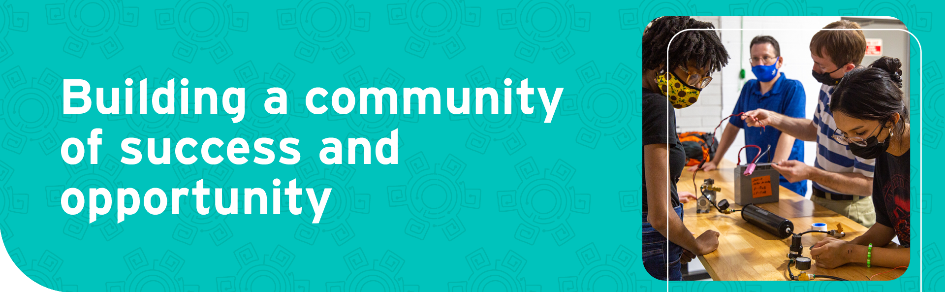
Si Se Puede Foundation is a community bridge builder and leader in providing educational opportunities and services that improve the quality of life of under-served populations. One of the goals at Si Se Puede Foundation is to provide an opportunity for underserved populations to be exposed to and become more proficient at Science, Technology, Engineering and Math, (STEM). In order to fulfill this goal, the foundation has embarked on a new mission to successfully launch a new community workshop in Chandler, Arizona.
The Challenge
The Si Se Puede Foundation STEM Center already had a very strong robotics program and now with their new space, they want to introduce more subjects, such as video production, design, and other aspects within the STEM umbrella. That being said, the term STEM can be very intimidating, especially to interested students just entering the program.
Along with a new identity, the Si Se Puede Foundation was also in need of a new website. Their current site is out of date and they needed to organize their navigation system so it wasn’t so complicated.
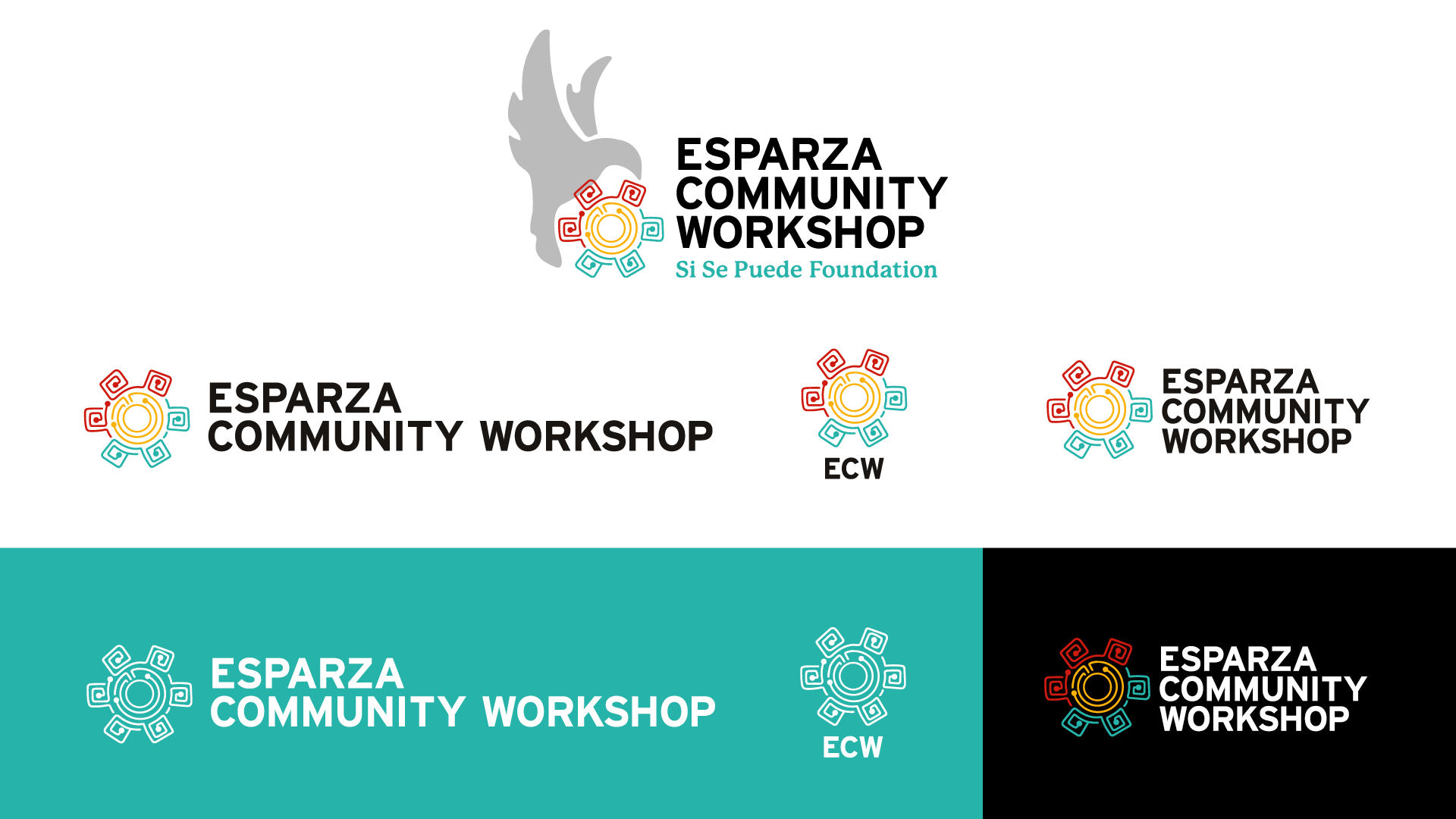
Logo system for Esparza Community Workshop
Our SOLUTION
The Esparza Community Workshop was created with the idea that this would still be a STEM center but with a more welcoming community touch. This community workshop would have its own physical site that will hold all of its robotics meetings. As well as provide for those who need this place for education, 3D printing and other workshop needs.The Esparza Community Workshop will have its own unique branding that also still ties in with Si Se Puede Foundation to still show that they are still connected. While this new branch of The Si Se Puede Foundation will have its own unique webpage and branding style.
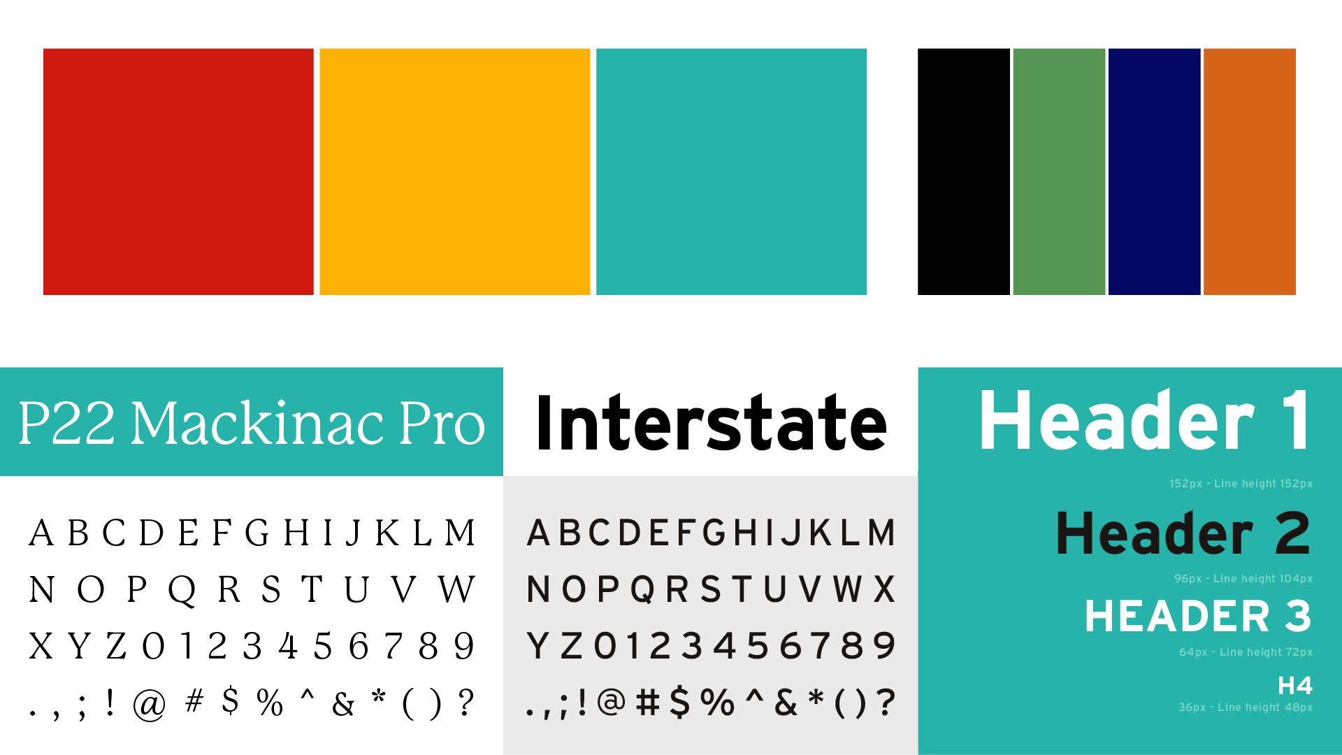
Colour system and brand fonts
An entire branding guide will be implemented for The Esparza Community Workshop. A logo will be provided, as well as many variations for small and large print. That will be for all different purposes such as merch, website uses, social media and more. A color palette will be implemented from the logo all the way to the branding style so that everything will be cohesive. These will also play well into the personal Esparza Community Workshop website where there will be information about the location and what this community workshop will provide.
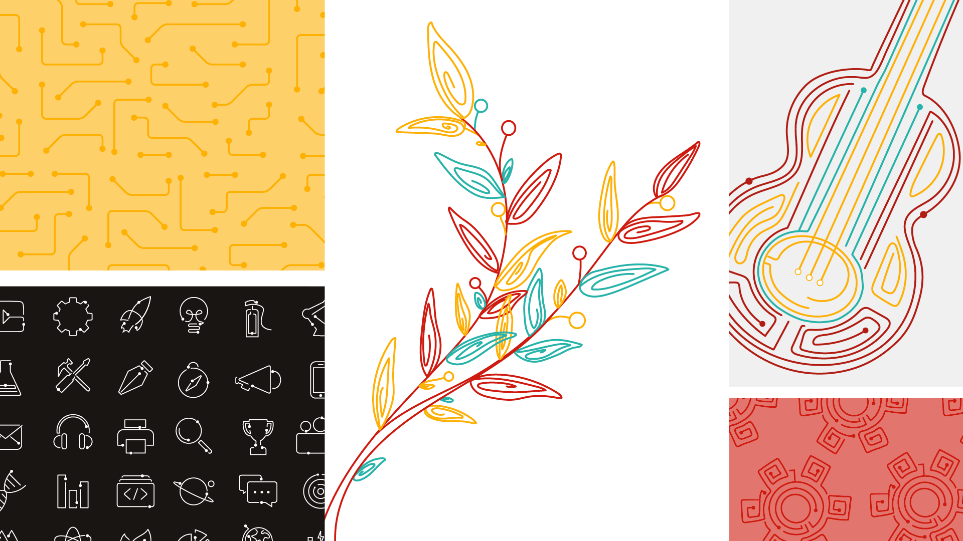
Illustration style and pattern selections
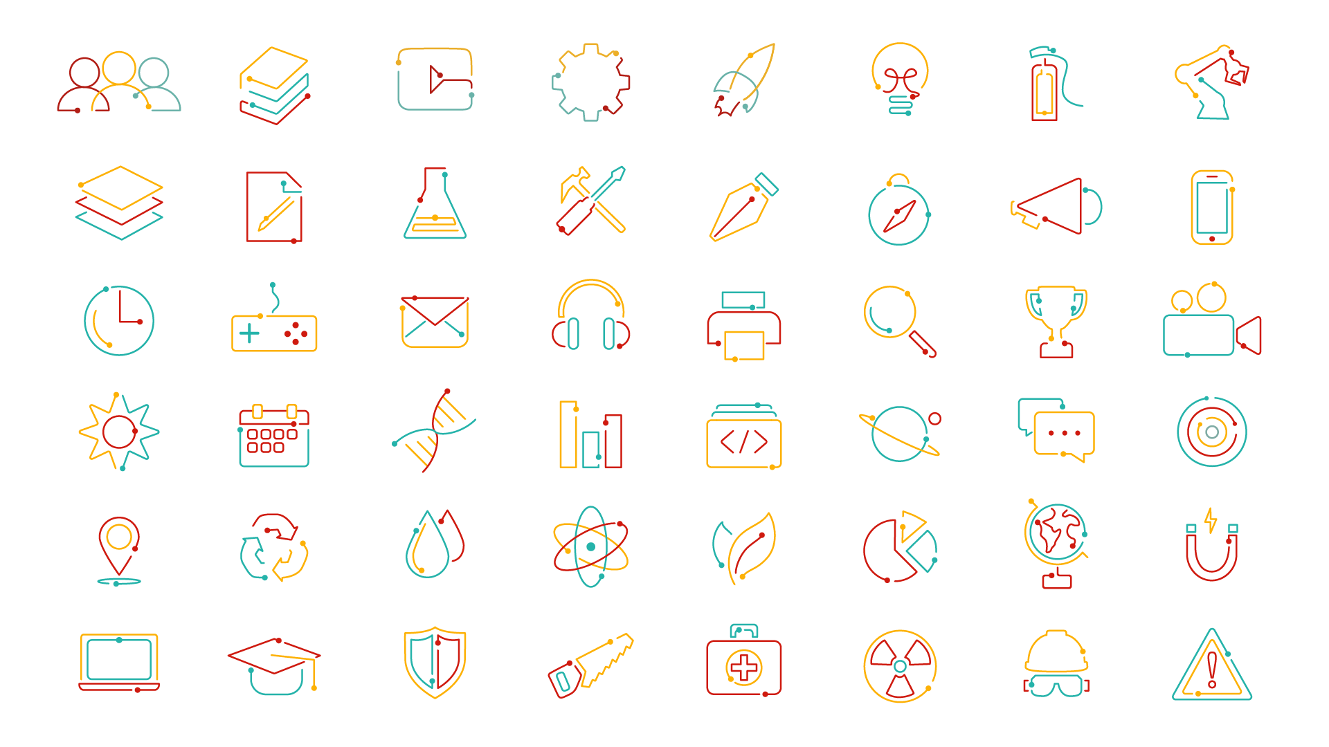
Communication icons created for the brand
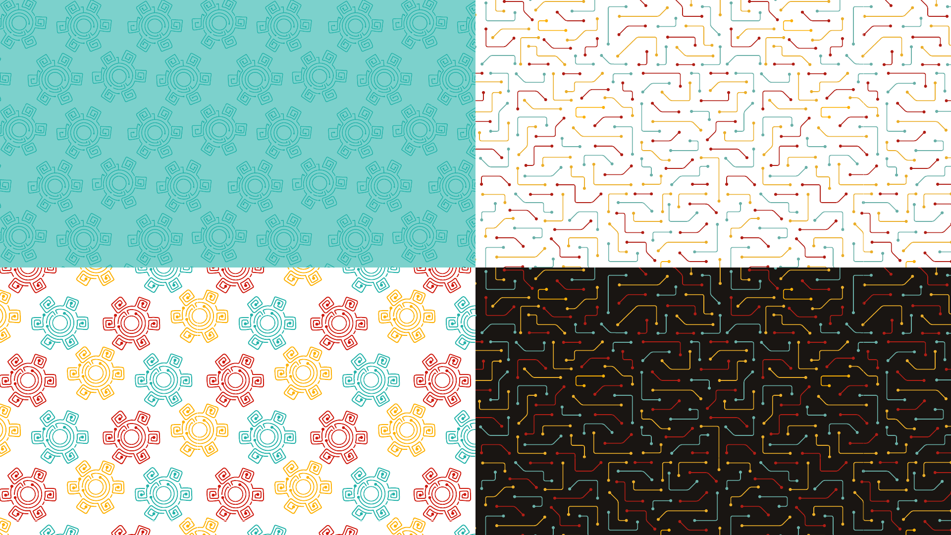
Brand patterns in selected colour combinations
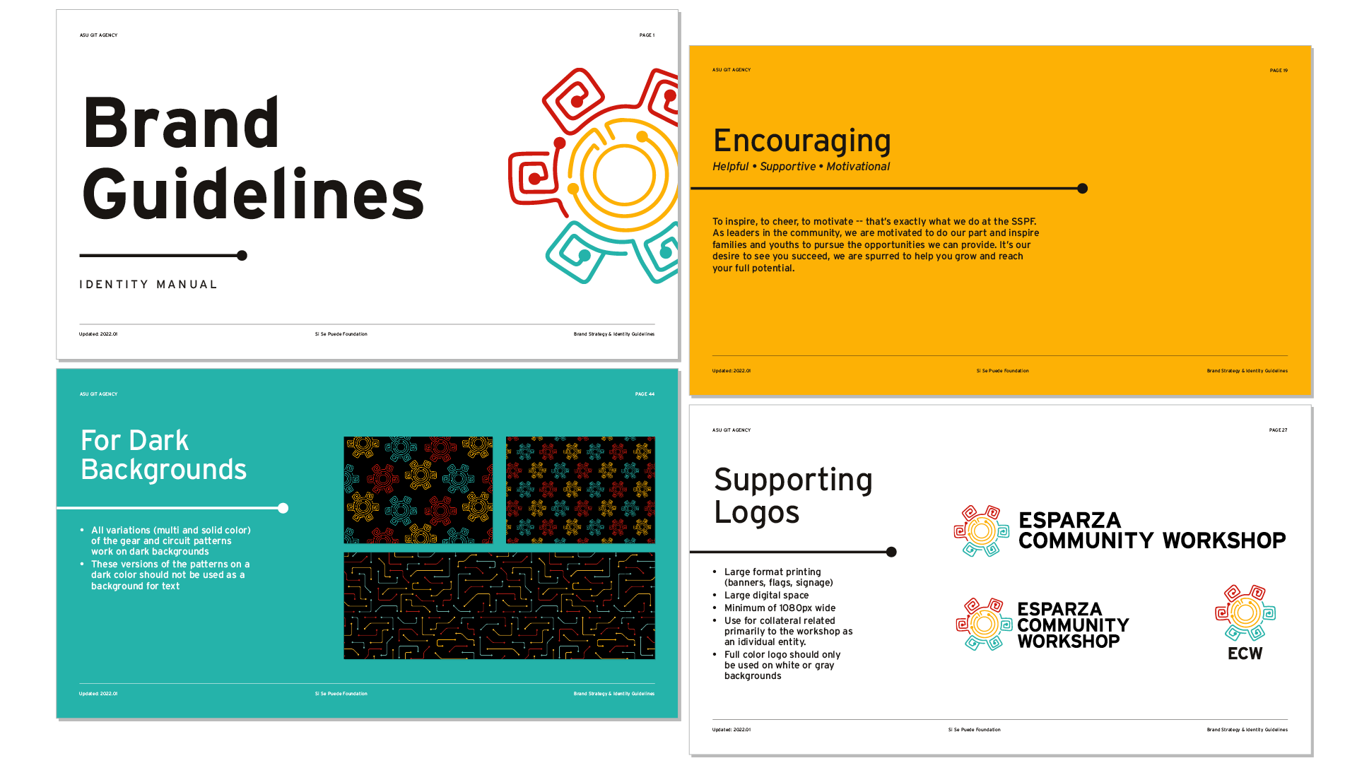
Selection of Brand Guidelines document
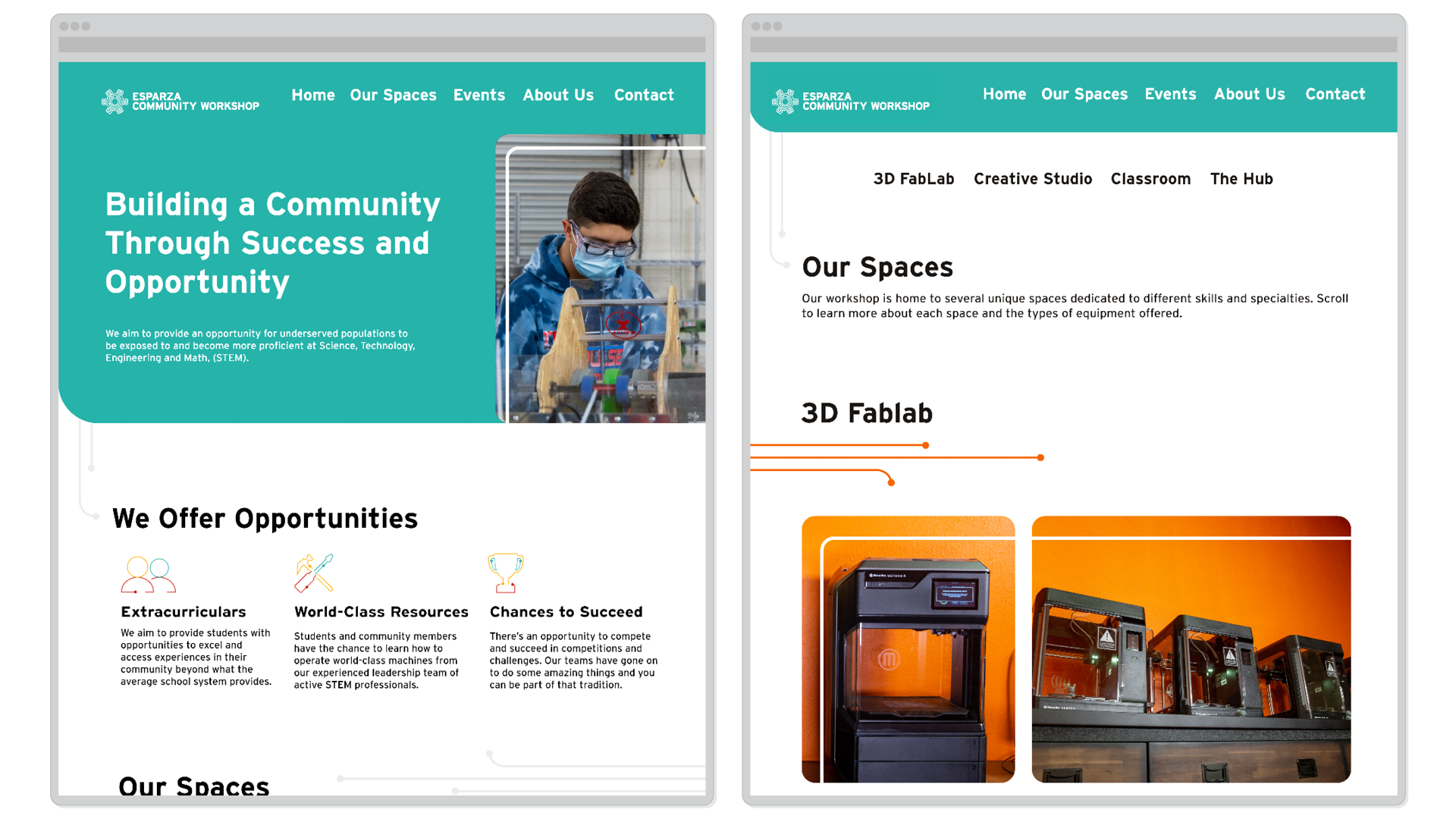
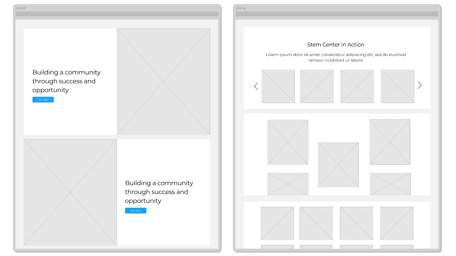
Esparza Community Workshop website (desktop view)
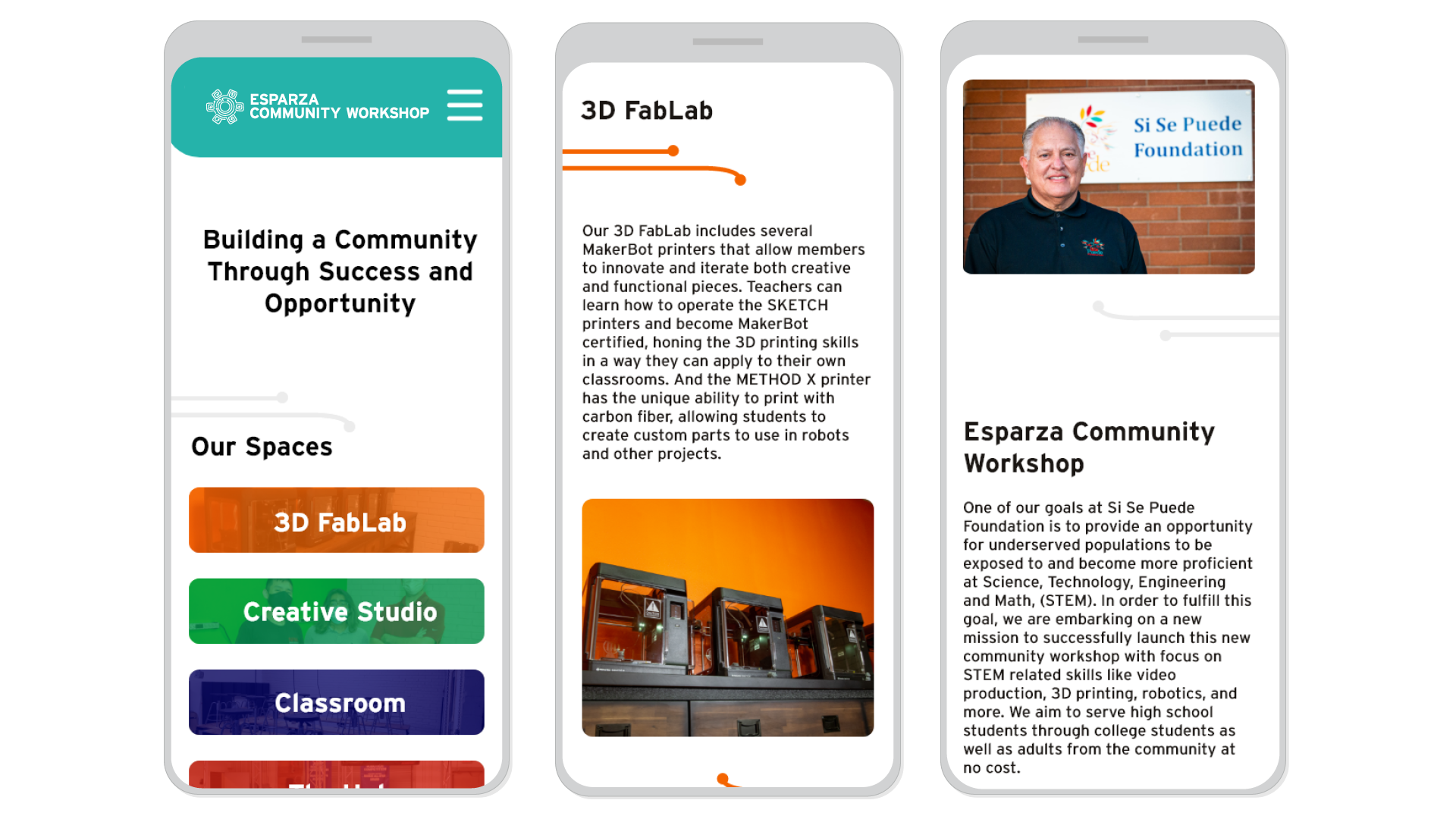
Esparza Community Workshop website (mobile view)
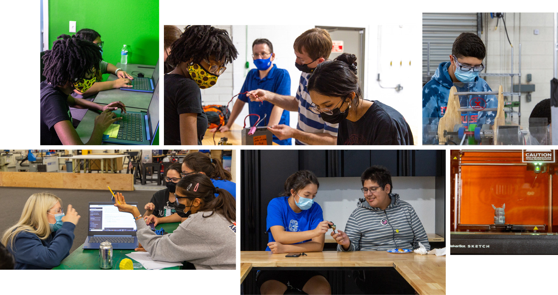
Original photography for Esparza Community Workshop
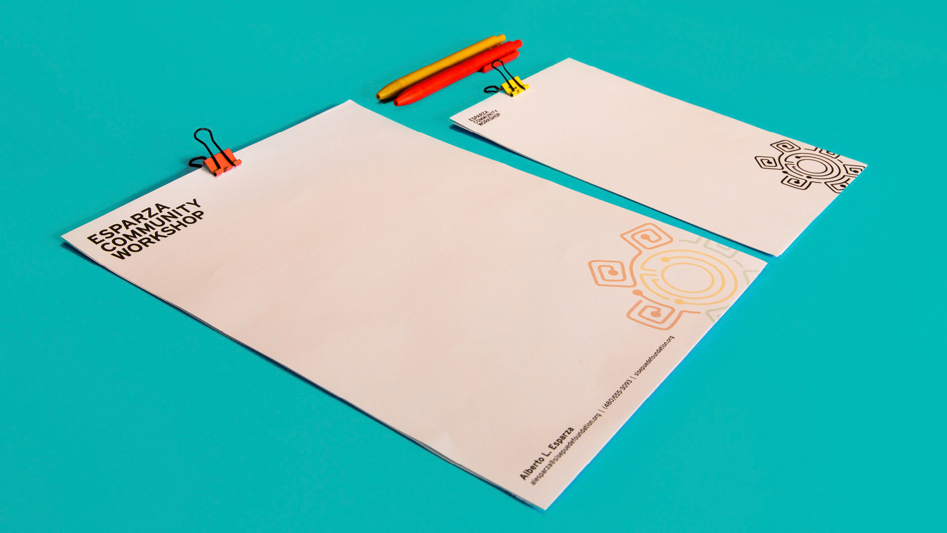
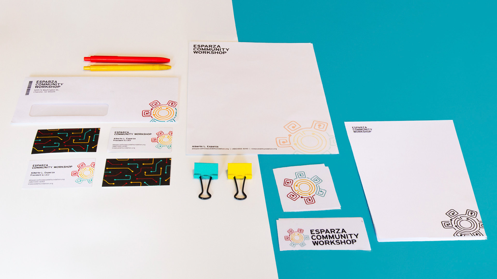
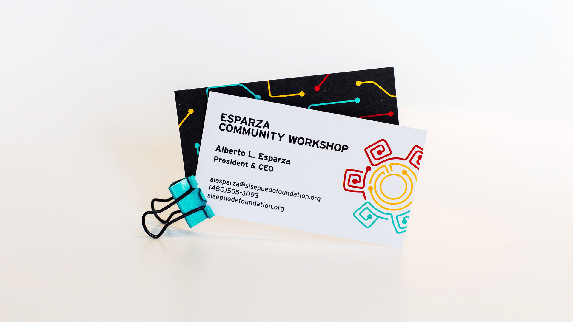
Stationery and print materials
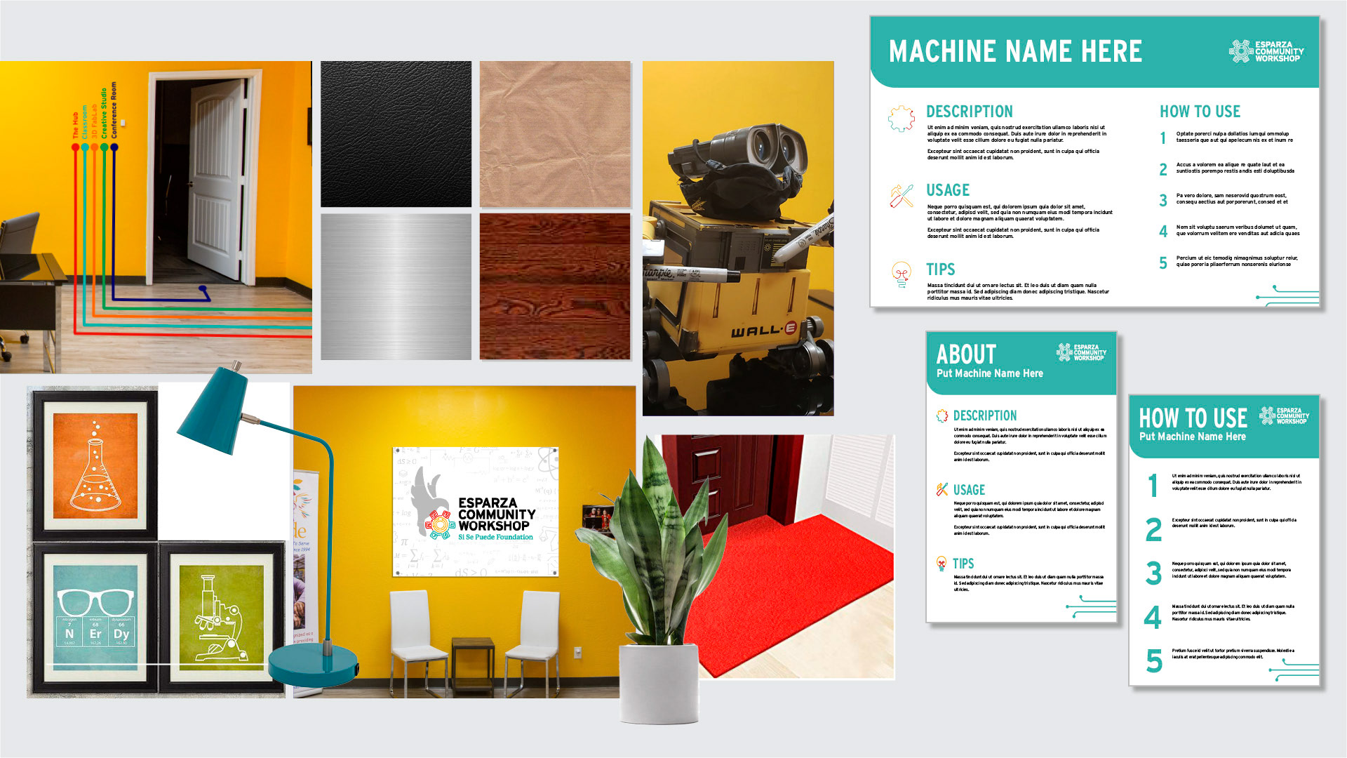
Interior design guidance and signage system
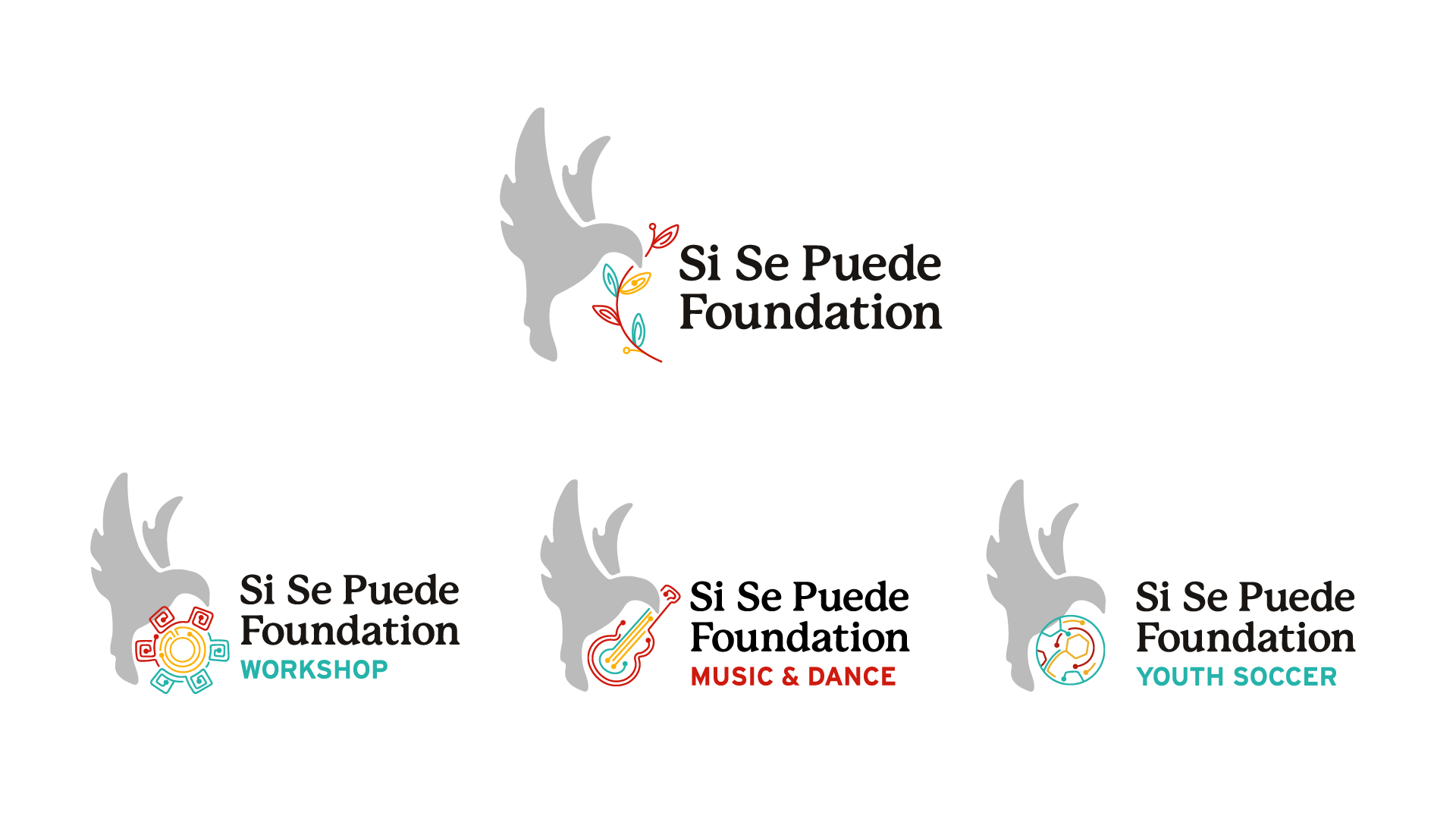
Logo system for the parent organization, the Si Se Puede Foundation, and sub-brands
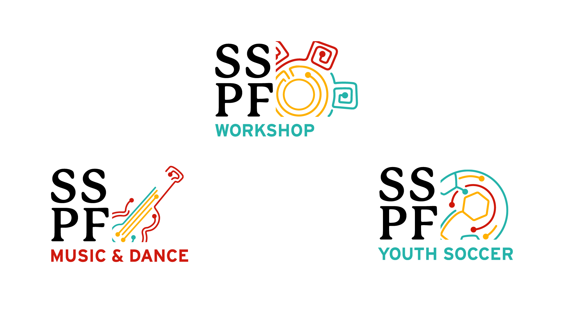
Short-form logos for SSPF sub-brands
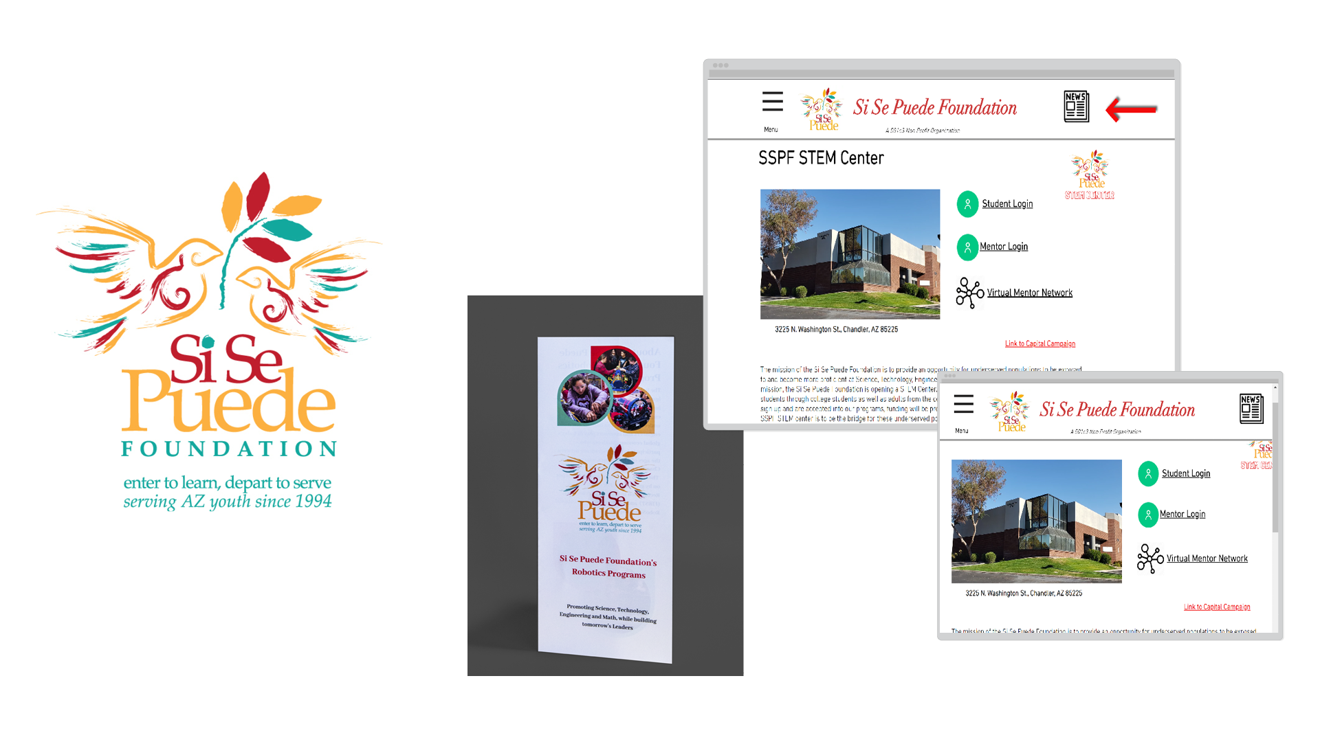
Original "before" Si Se Puede Foundation brand: logo (left), brochure (center), and website (right)
Our Process
The project began with a meeting with the Si Se Puede Foundation’s CEO, Alberto Esparza, as well as other key members involved in the development of the community workshop. They shared their vision for the space as well as what the types of deliverables they needed, primarily the branding and website. Using this discussion as a starting point, we began to refine the brand strategy and identify the core values, traits, target audience, and brand message. The strategy took several conversations and some additional research into the foundation to take shape.
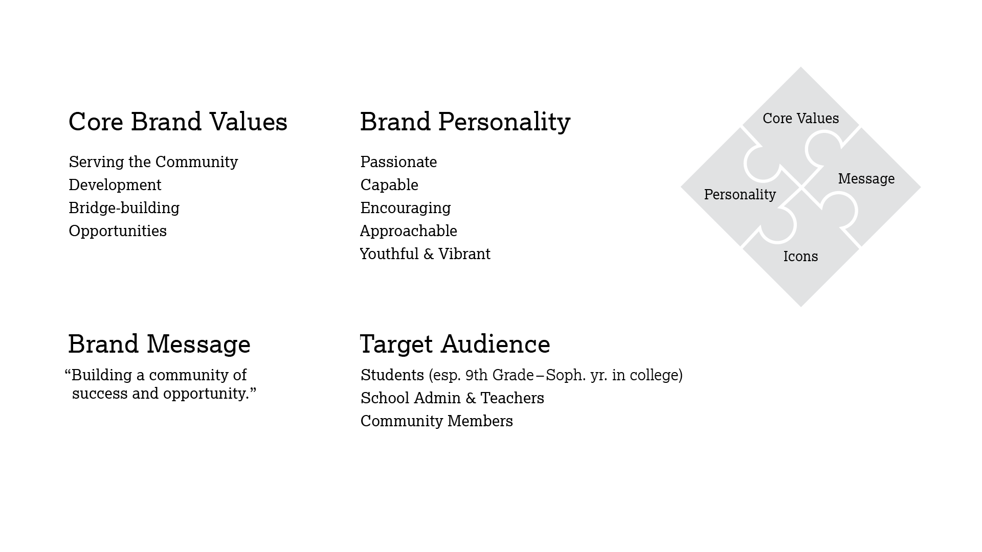
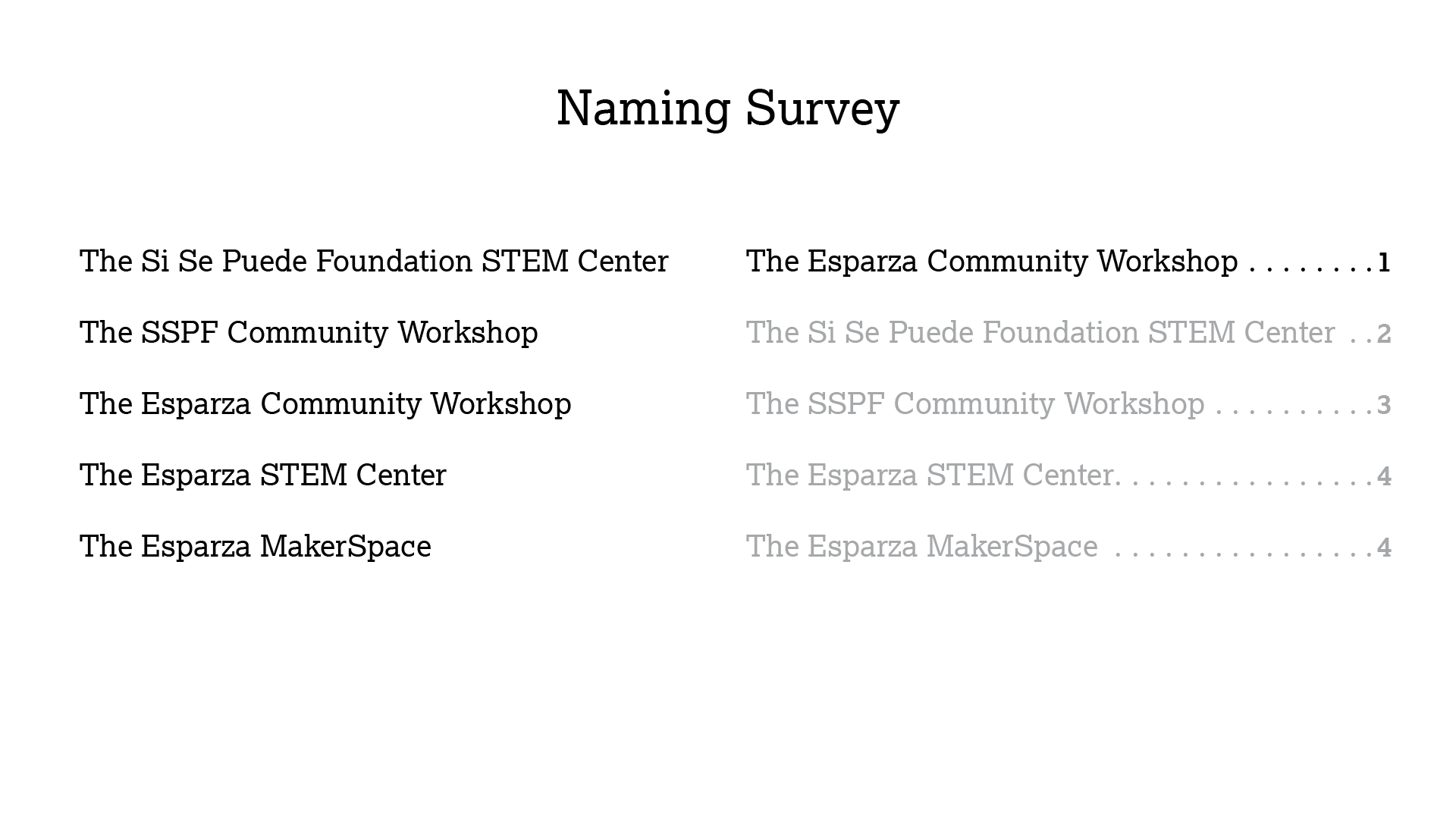
Selections from our Brand Strategy presentation, showing identity planning and naming
At the same time, we began our visual research to brainstorm what The Esparza Community Workshop would become. We searched a variety of broad categories, including scientific imagery, nonprofit branding, makerspace interiors, and more. We collected inspiration from numerous sources for logo design, iconography, typography, photography, web design, and more. As our visual research took shape, we began to notice common threads start to emerge and created a refined mood board to inform our designs and communicate our ideas with the clients.
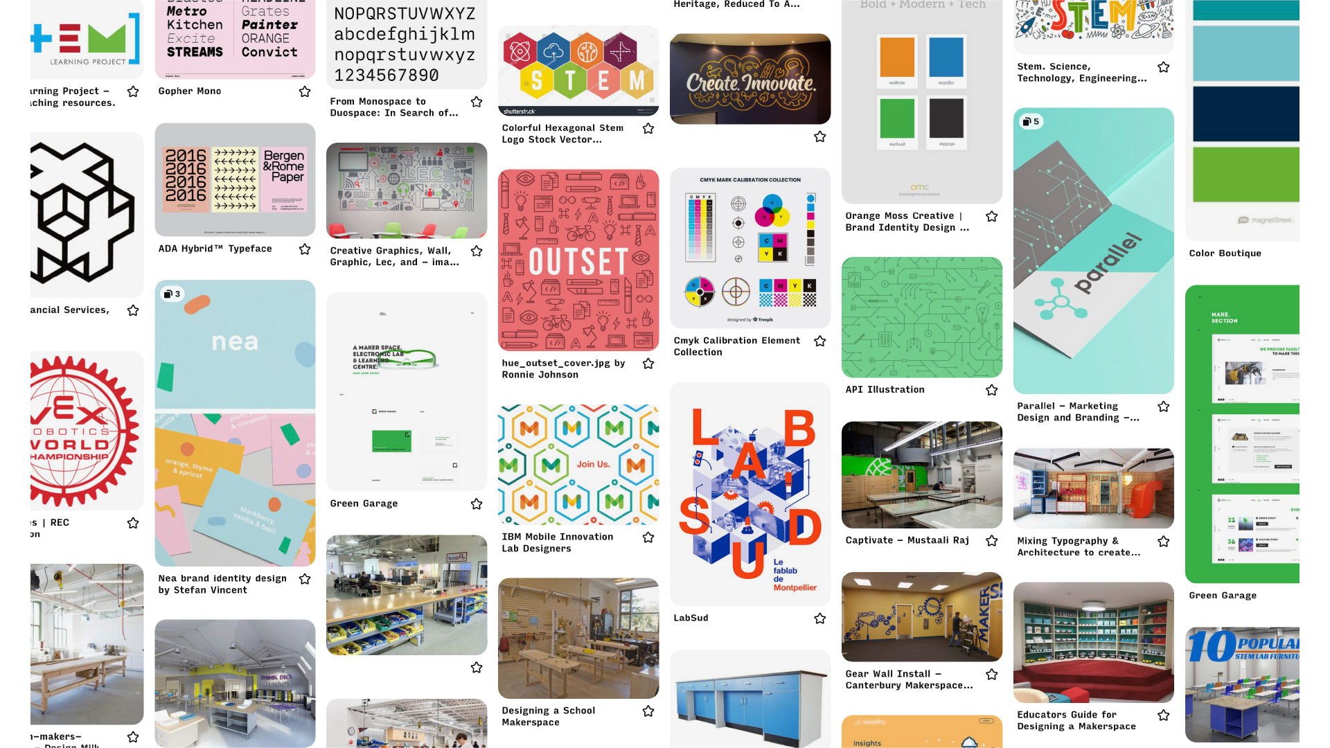
Visual Research went wide — from typography to interiors to materials
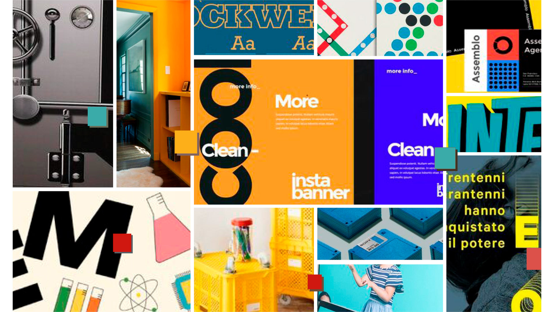
Resulting Mood Board distilled our different ideas
Common themes we found in our moodboard were vibrant colors, bold typography, and unique iconography. Aside from these general ideas, we didn’t have a clear starting point for the visual identity. We sketched some initial ideas, iterated, and created four concepts to present to the clients.
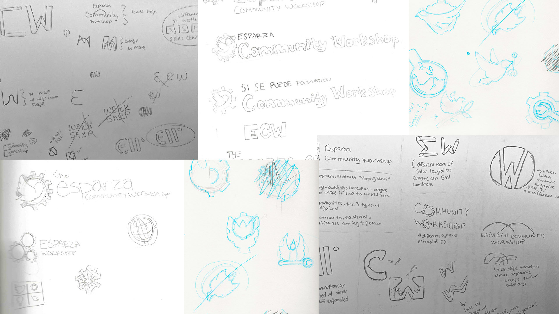
Sketches and early identity concepts
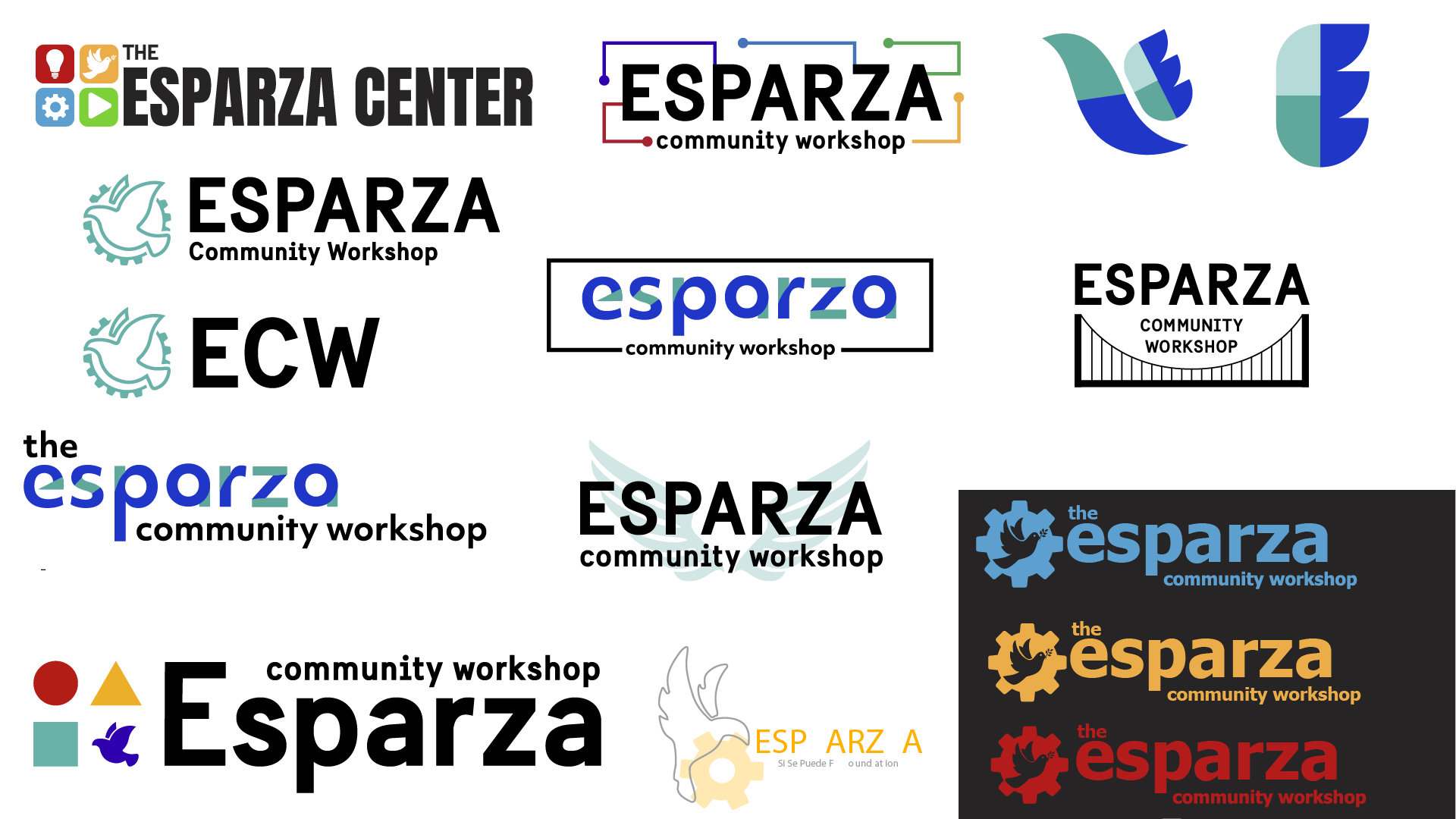
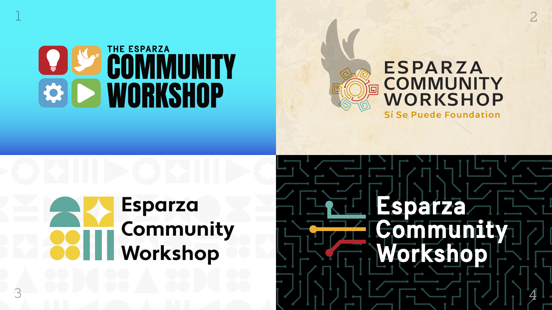
Identity concepts in development. Four approaches at initial presentation (right)
Based on our discussion with the clients following the initial presentation, we reached our chosen direction. From there, we began refining the logos and iterating to reach the final typography and color palette. We took inspiration from the line-art and connective node elements of the gear symbol and began to develop a distinct icon system and visual style that we also used on the website.
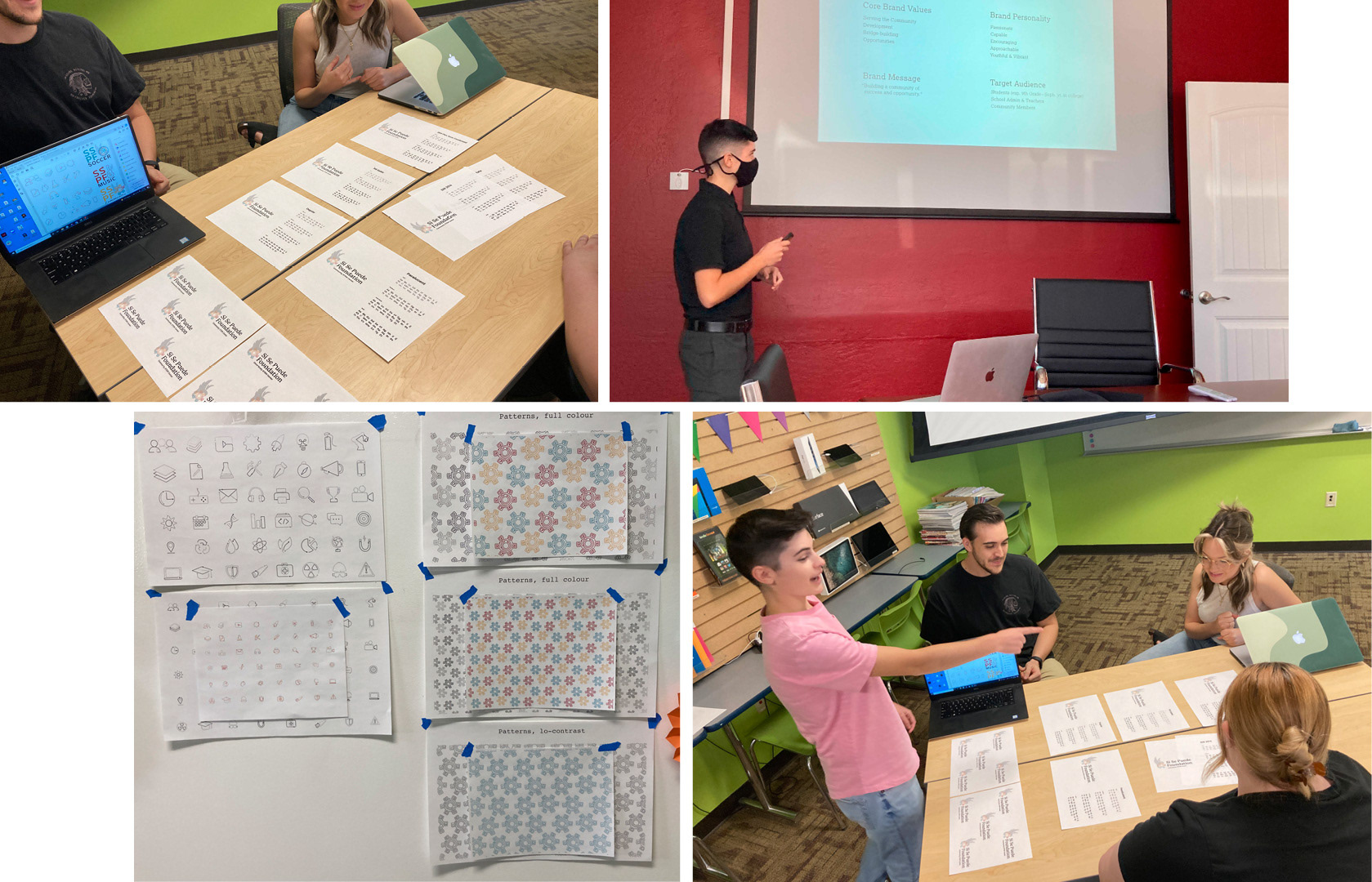
Team collaboration and works-in-progress.
We also conducted competitor and user research to develop the website. While the workshop is an entirely unique premise, we examined websites that served similar purposes of providing STEM resources and community experiences. The clients expressed their needs for the website, and we combined this with our research to determine the essential content for the website. A card sorting exercise that surveyed a representative population helped us design the information architecture to ensure it was logical. Following this research, with our strategy and hierarchy established, we created rough wireframes and refined mockups for each of the main pages.
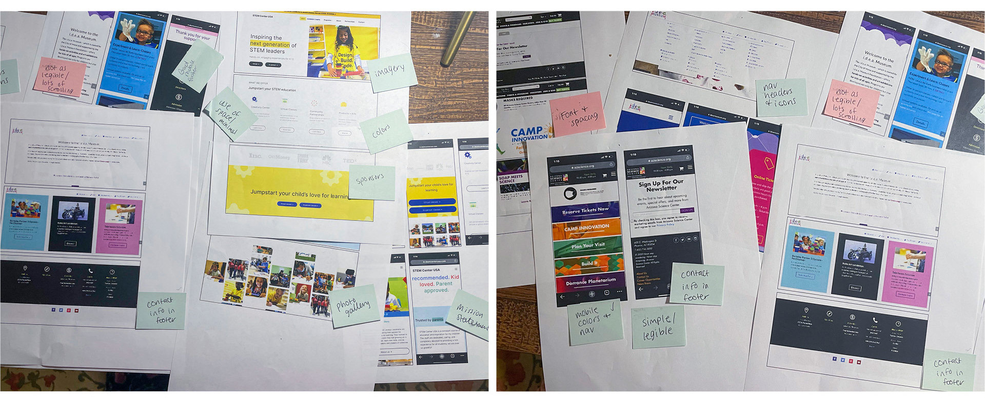
Website research and competitor audit
With the look and feel of the website finalized, we began to build the content for the website. Most of the copy and photography were compiled from events and resources the foundation already had, but it wasn’t enough to tell the full story of the workshop. So, we conducted a small photoshoot of their different spaces and interviewed the clients to expand our photo library and generate more informative and descriptive copy for the website. Our last step was to develop the final website in the content management system Wix, the clients were already familiar with.
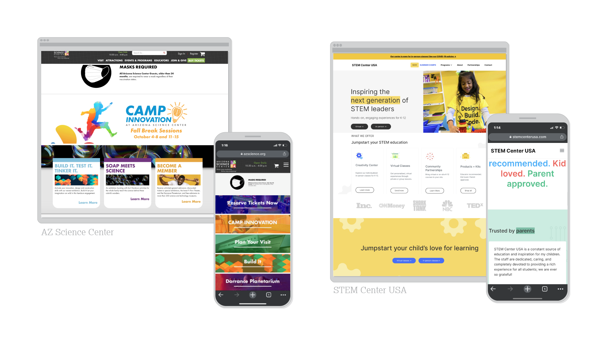
Competitor websites which receive closer analysis
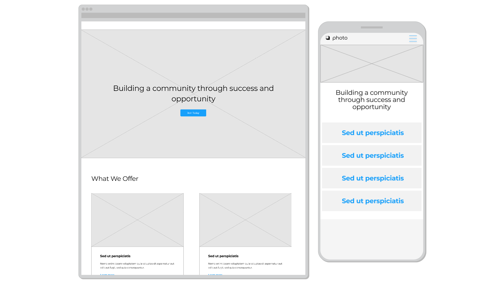
Website planning via wireframes, desktop & mobile
Team
Lauryn Armstrong, John Blair, Sarah Huffman, Designers
Amy Hector, Photographer & Web Designer
Prescott Perez-Fox, Creative Director
Amy Hector, Photographer & Web Designer
Prescott Perez-Fox, Creative Director