THE CHALLENGE
Empire State Indivisible is a part of the grassroots progressive movement formed under the Indivisible Guide. After spinning off from predecessor NY Indivisible, the group needed a new identity in all its parts — logo, colours, icons, patterns, type, and more. In this era of mass communication, every group needs a refined, versatile brand identity that can stand out and be recognised online, in print, and in person.
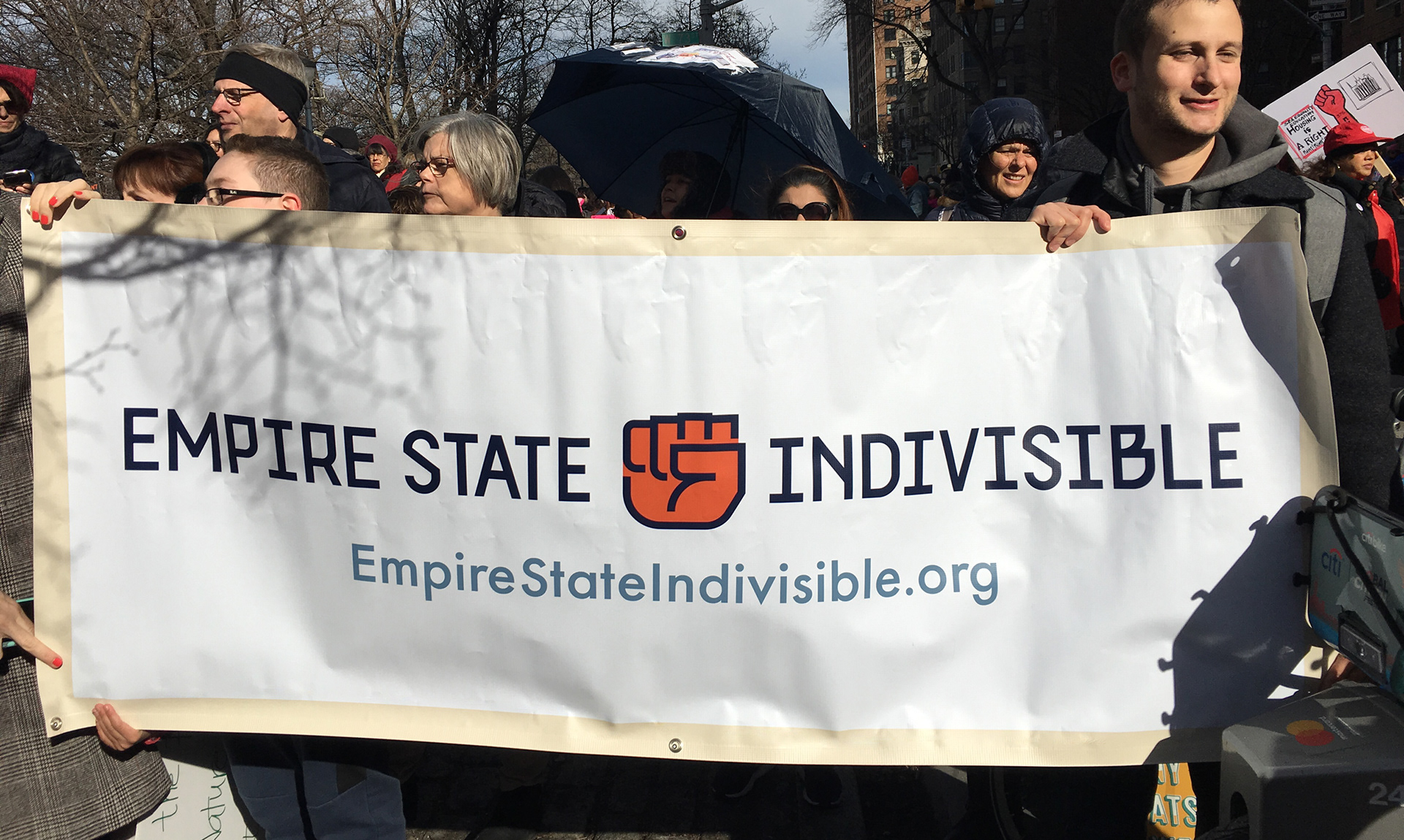
Example of the identity in action. Vinyl banner with main logo lock-up and supporting text URL.
The Solution
The brand’s name opened the door to exploration. No longer a New York City-focused group, we built a more inclusive, versatile visual identity, infusing the boldness and straightforwardness of The Empire State with a taste of the unexpected, reflective of all New York politics.
The identity is built upon a sturdy wordmark, crafted from a custom alphabet, as well as a modern colour palette, and an icon system built from hands.

Logo system, all based on custom wordmarks, with or without the fist symbol
The logo system allows us to use different wordmarks for appropriate applications. The stacked version is the most compact and used when a rectangular logo is expected. The wide version fits nicely on applications such as social media, and the wide version with fist celebrates our rebellious and protesting spirit, while allowing us to make best use of space in ultra-wide graphic formats.

Colour system for the Empire State Indivisible brand identity
For colours, we wanted to break away from the Navy-and-Gold of the NY State flag, but still make use of familiar themes in the Empire State. Instead of cutting, we added — two neutrals complement the two shades of blue, with two orange tones serving as highlights, and a variety of skin tones used where necessary. Together, this feels more modern than a simple corporate identity built around navy and maybe something else.
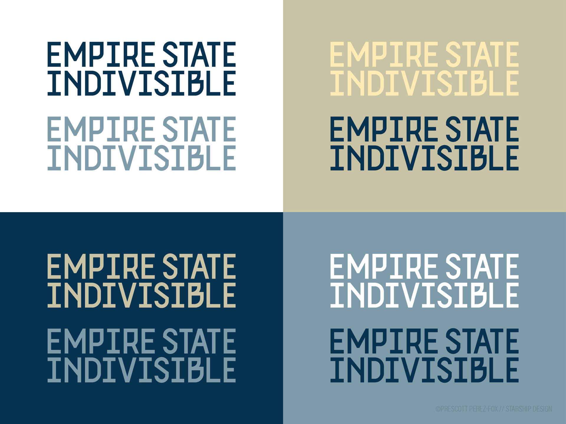
Example of colour variations for the single-colour wordmark
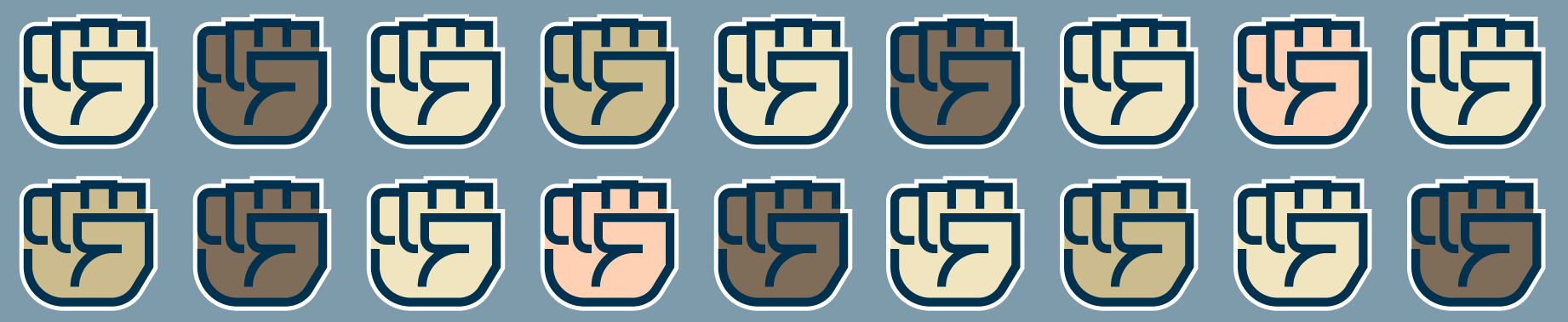
Outside of the logo, the identity hinges on a series of hands to serve as icons. No cutesy drawings of computers and notebooks — we are a group made of people. Hands are expressive, a universal symbol of our humanity, and a timeless way to signal one another.
Hands can represent our expanded focus on the regions of New York State, as well as actions such as call, march, write, unite, look, or resist.
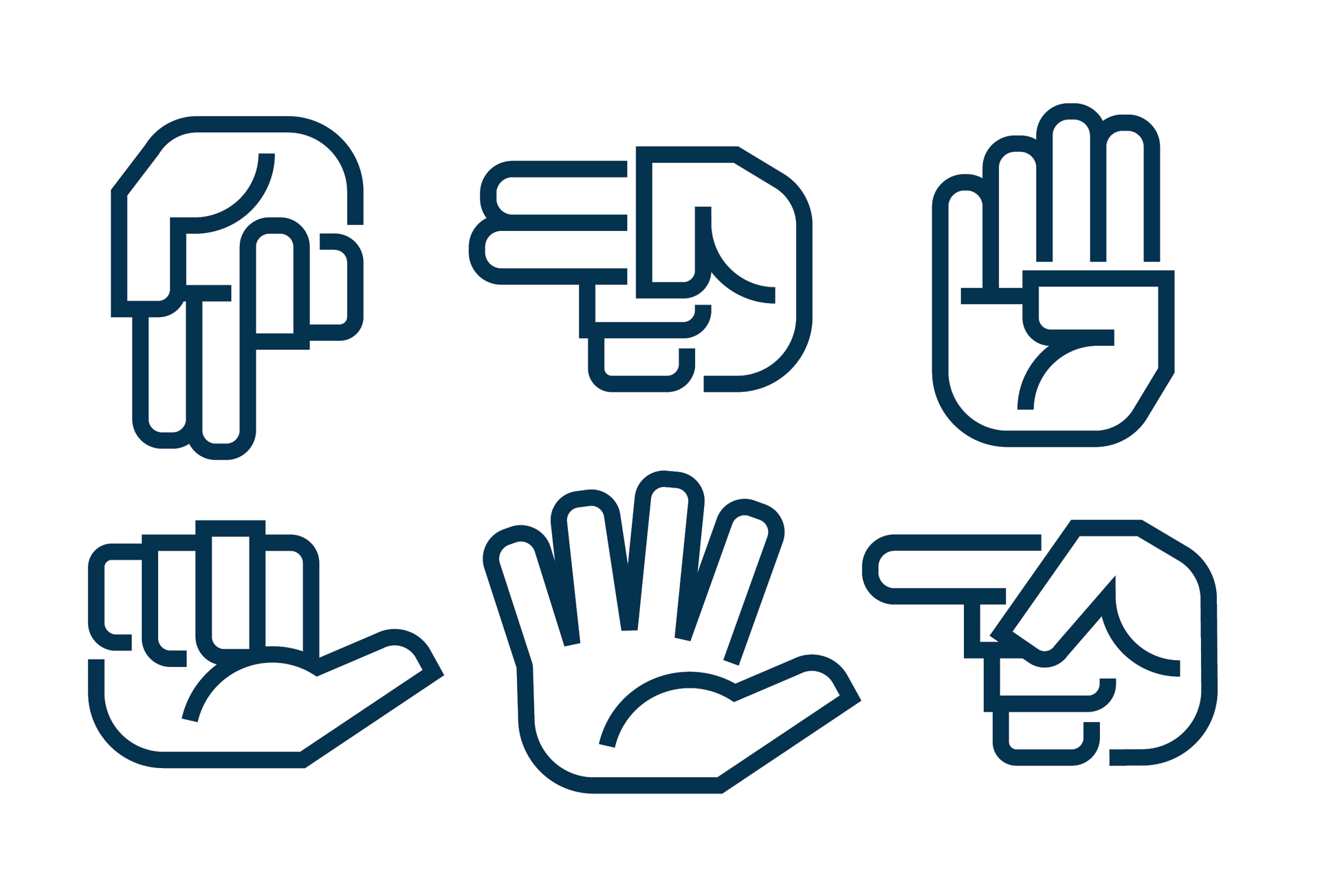
Multiple versions of the hand symbols can be used in the brand communications. Shown here as single-colour outline versions.
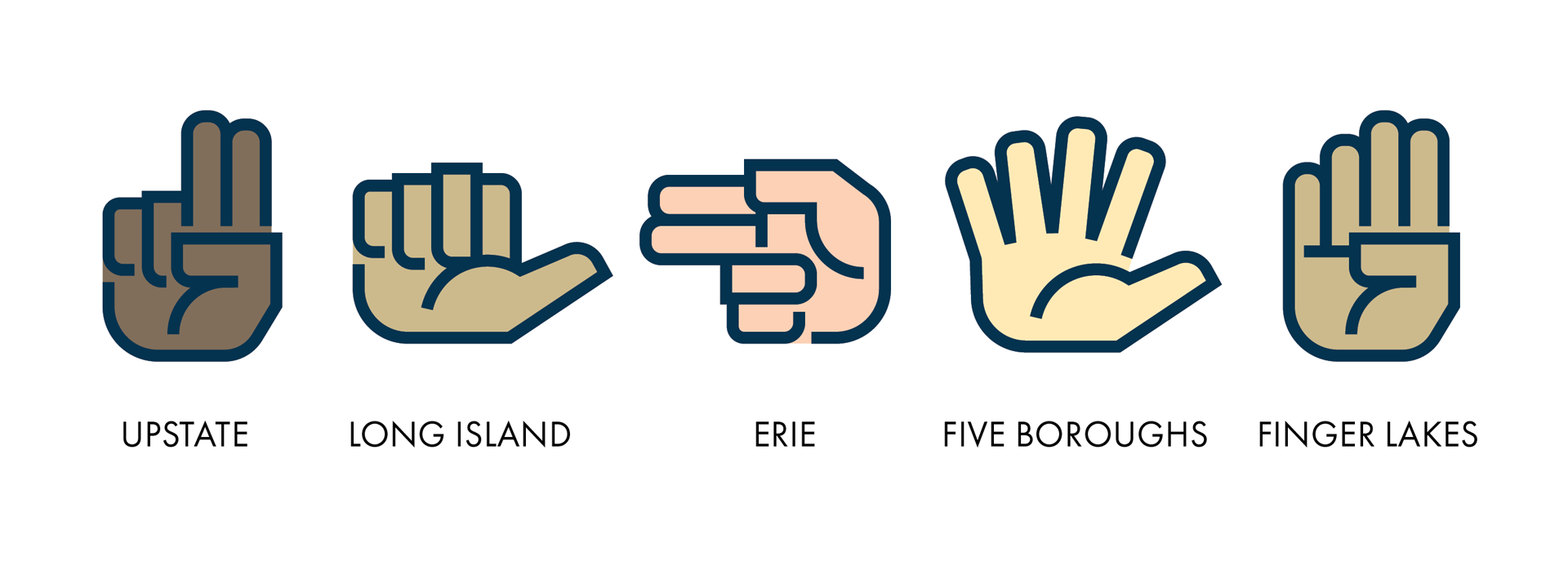
Different hands can represent different regions in New York, or distinct actions.
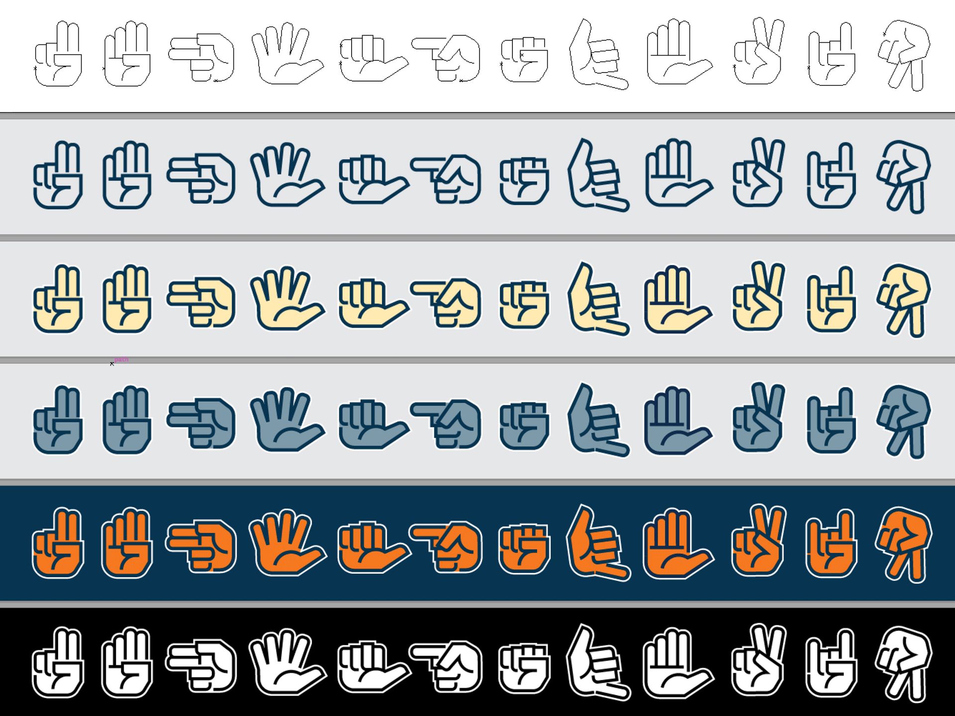
Hand symbols in different colour combinations and complexities
Combining our colour system with the hands graphics allows us to create patterns, whether by simple repetition and rotation, or by decimating the fist icon itself, forming more abstract forms. These patterns offer us depth and complexity in our graphics.
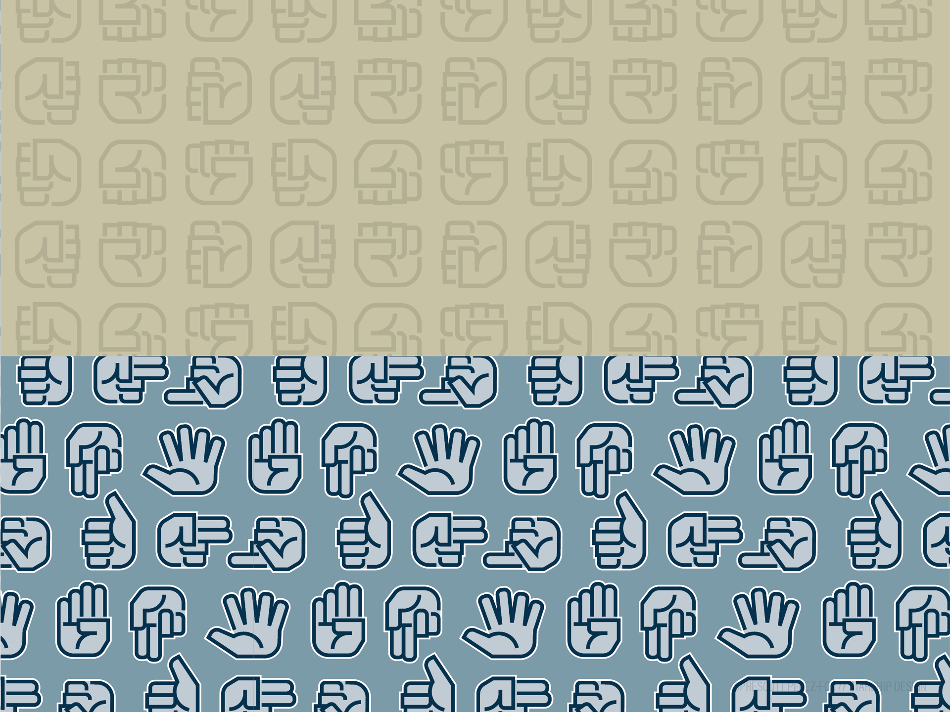

Brand patterns made from the hands symbols and fragments of the custom typography
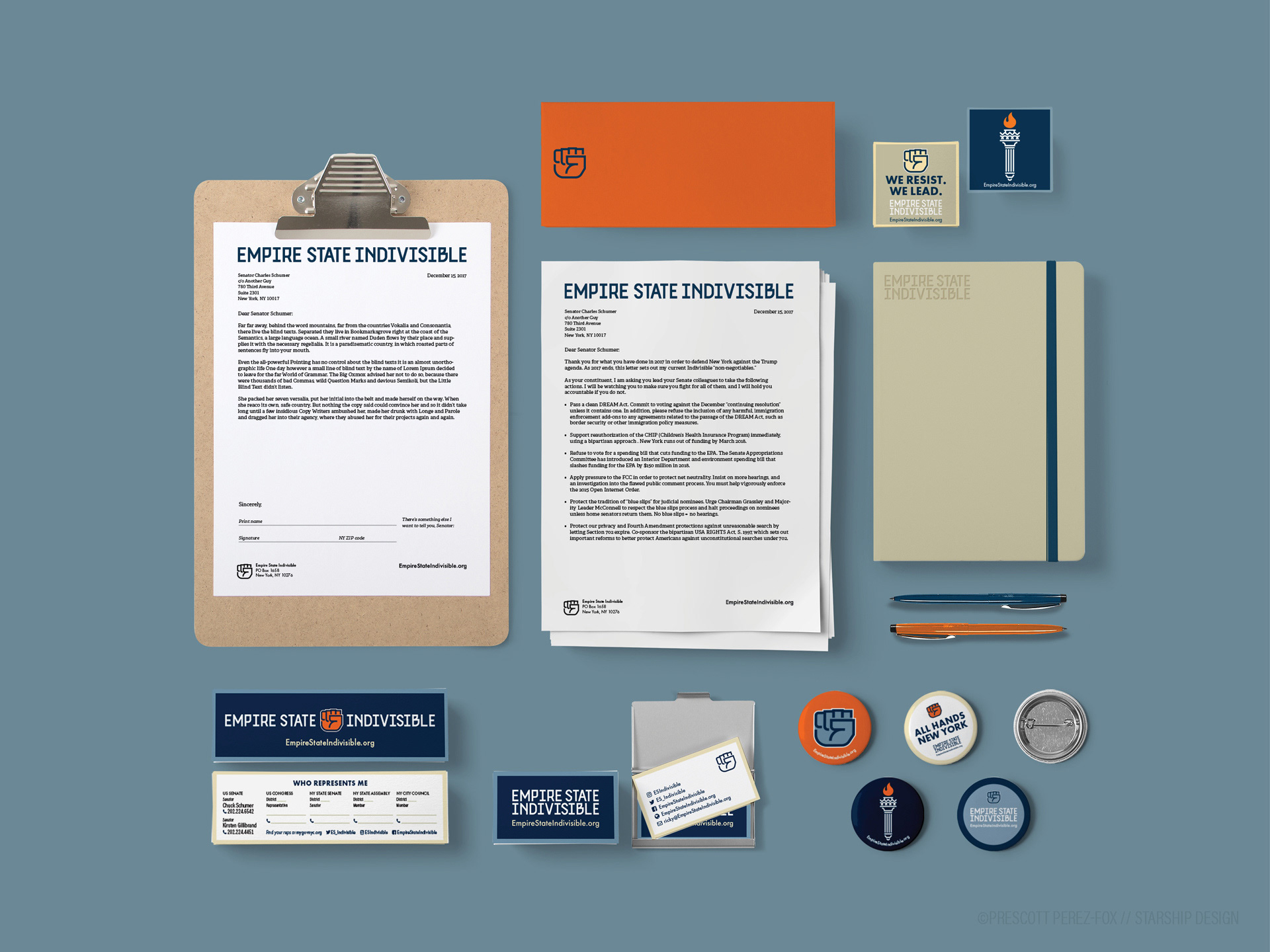
Stationery system and promotional printed items
Putting the pieces together, our visual style takes shape in the applications. Even in this digital-first era, stationery is important; we write a ton of letters! We give out buttons and stickers. We bring new members to meetings one business card at a time. Even our pens and clipboards reinforce our brand.
One of our first giveaway items is the bookmarks. NYC residents can look up their elected representatives and keep their contact info handy. This helps keep our community active and ensures that our own brand is a permanent part of their lives.
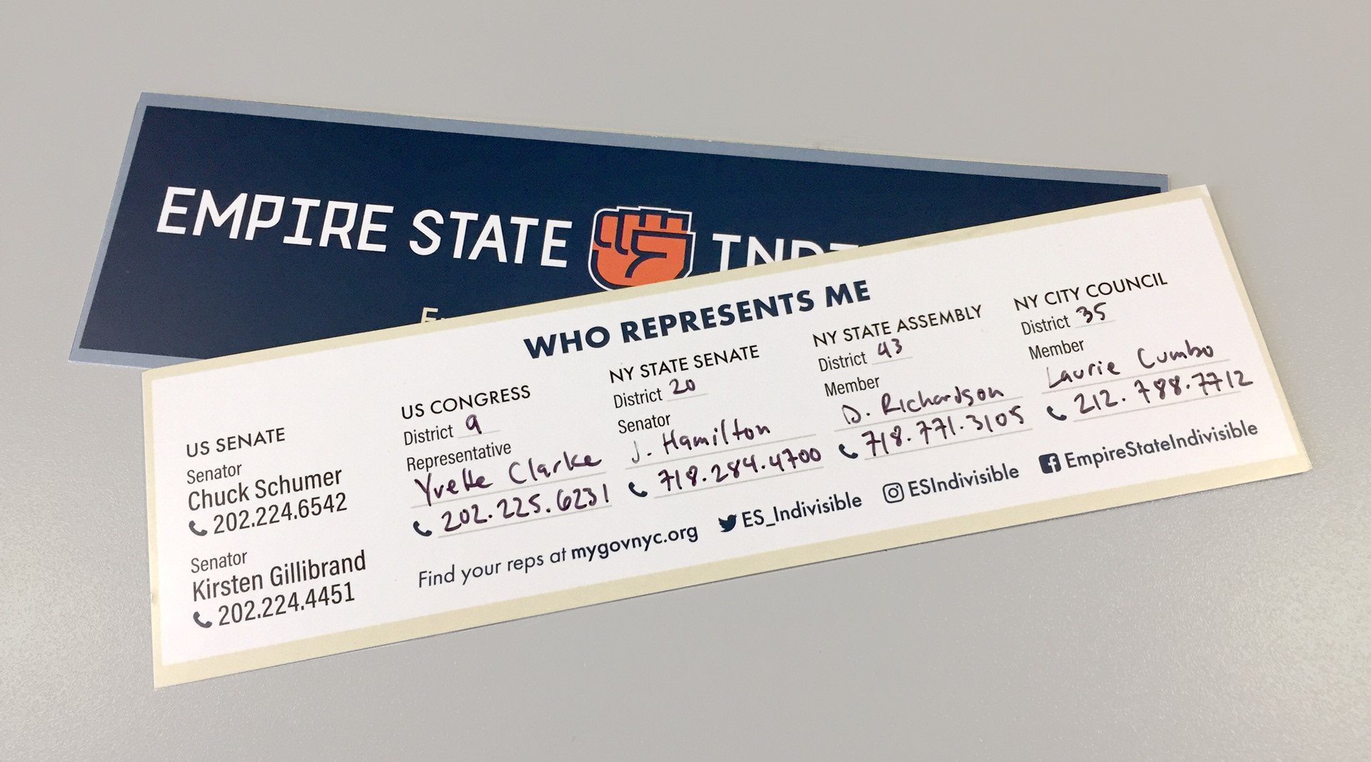
Fillable bookmarks were an early and popular promotional item
This continues to our web and social media presence.
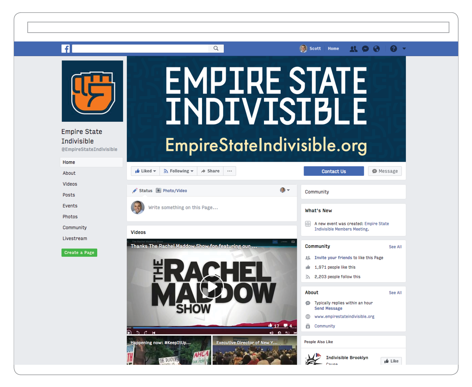
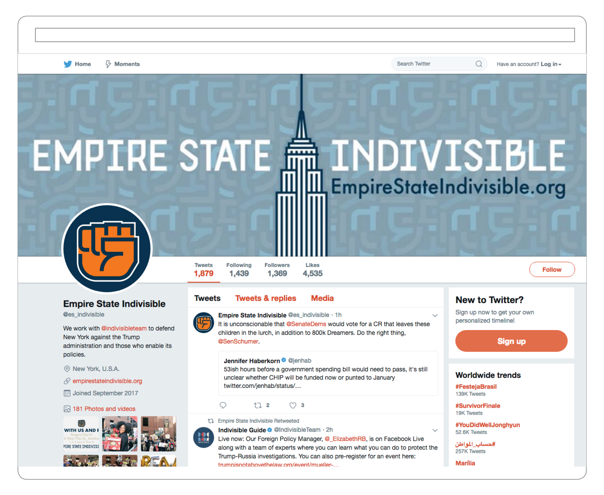
Examples of web and social presence, on Facebook and Twitter
The principal application of the brand visual style is online, especially on social media, to promote our events and spur action. For this, we created a layout style which can be replicated across platforms and updated for the message of the week (or day!). We use blue and white backgrounds for ordinary messaging, varying colours to keep our audience intrigued, but only use the orange images for the most critical, most time-sensitive communications.
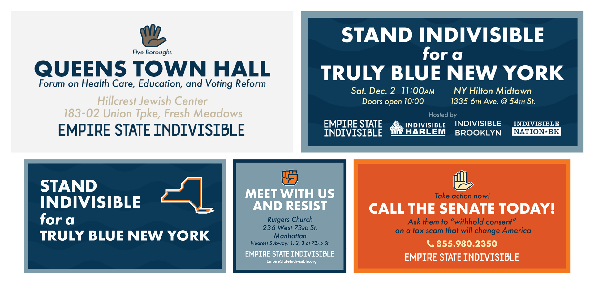
Social media graphics, showing event and action promotions, in our brand visual style
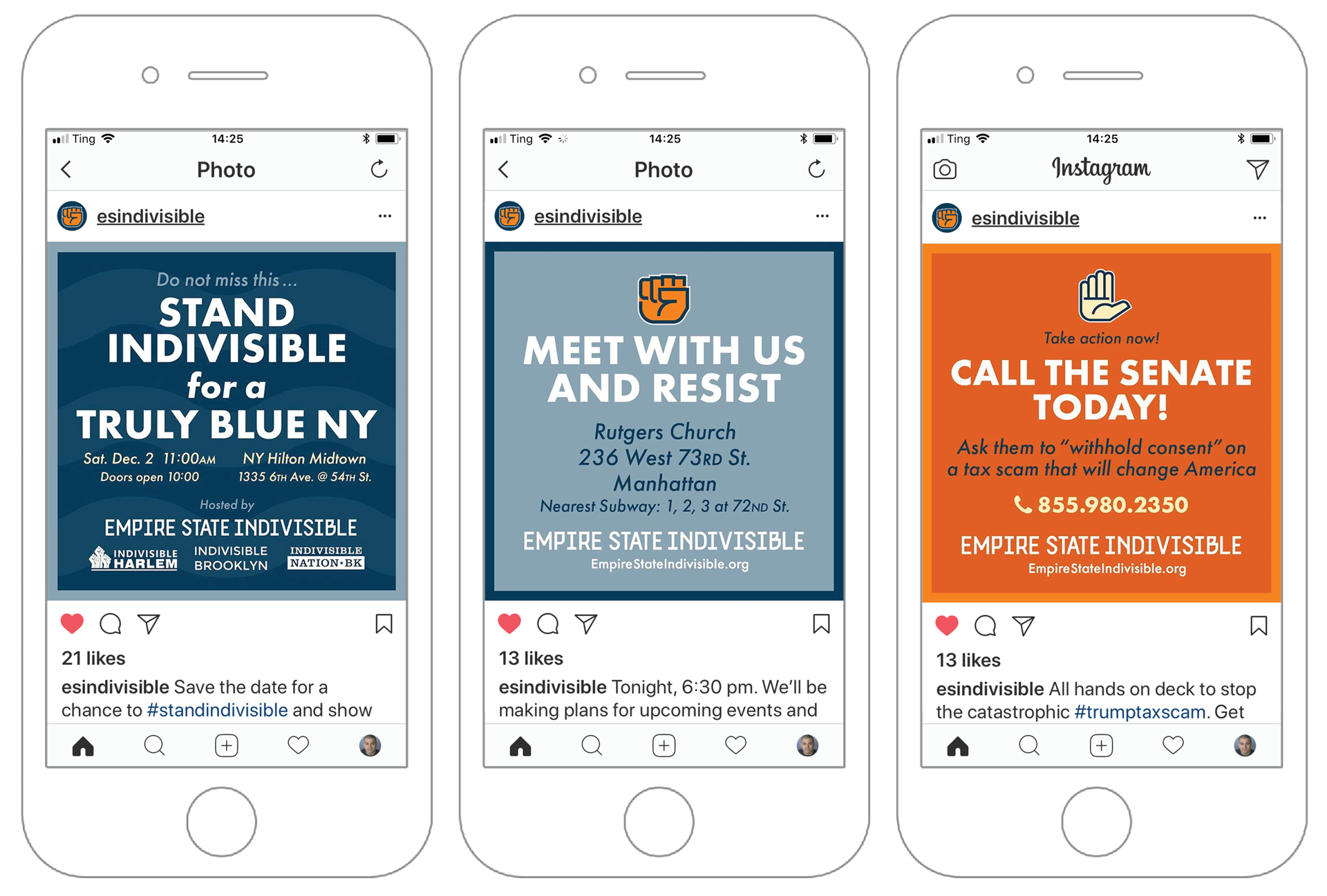
Instagram graphics, showing event and action promotions
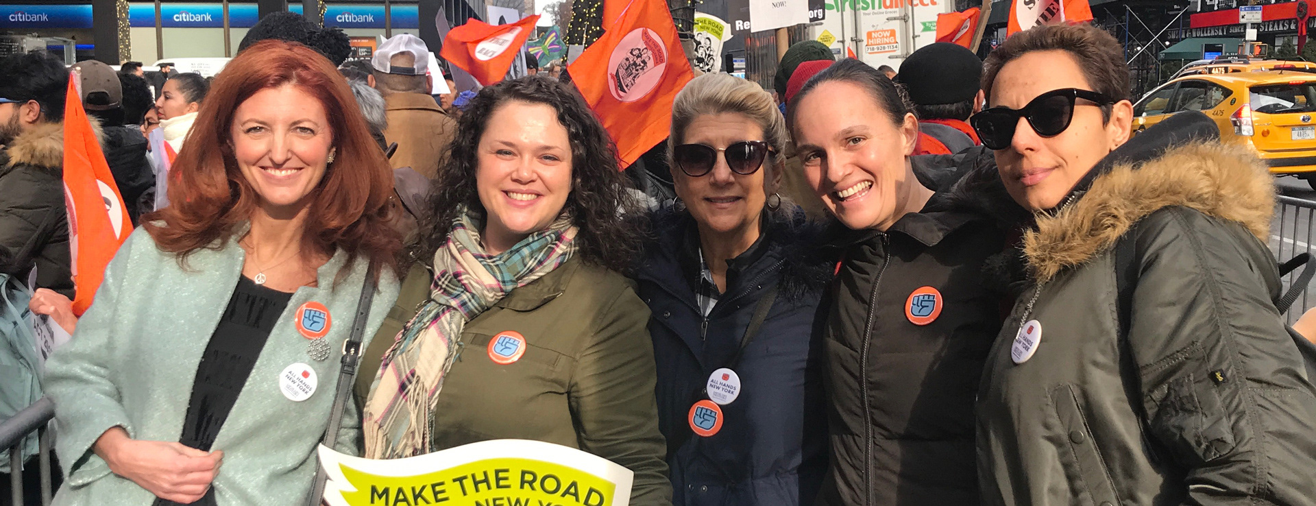
As a grassroots organisation, we have to operate on a shoestring budget, using what we’ve already got to reinforce the brand in person. We use “kiosks”, or in-person stations, to collect signatures and spread our message. Thinking beyond the printed page or screen, the new identity encourages members to dress the part, leaning in to colours, items, and materials they may already own!
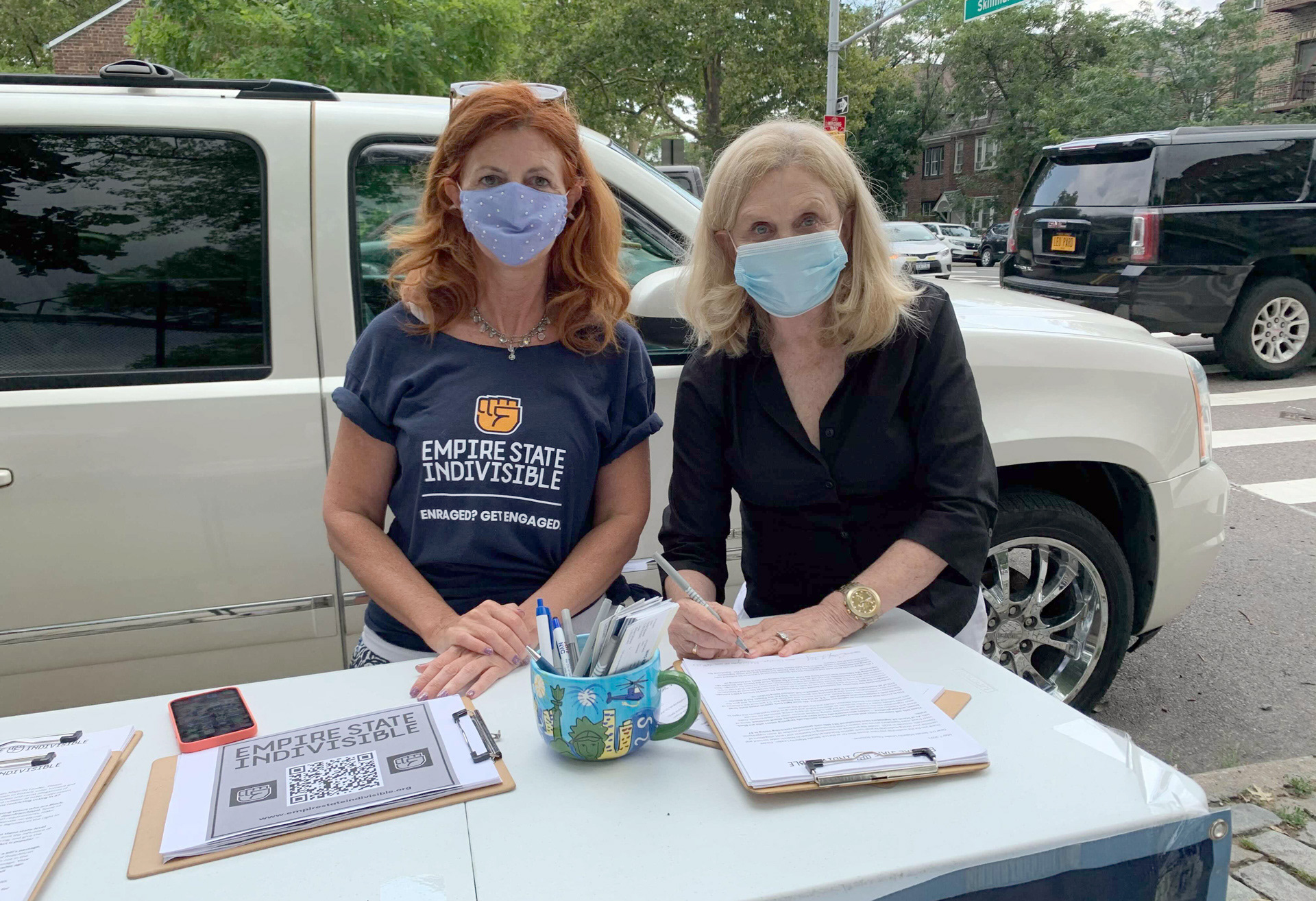
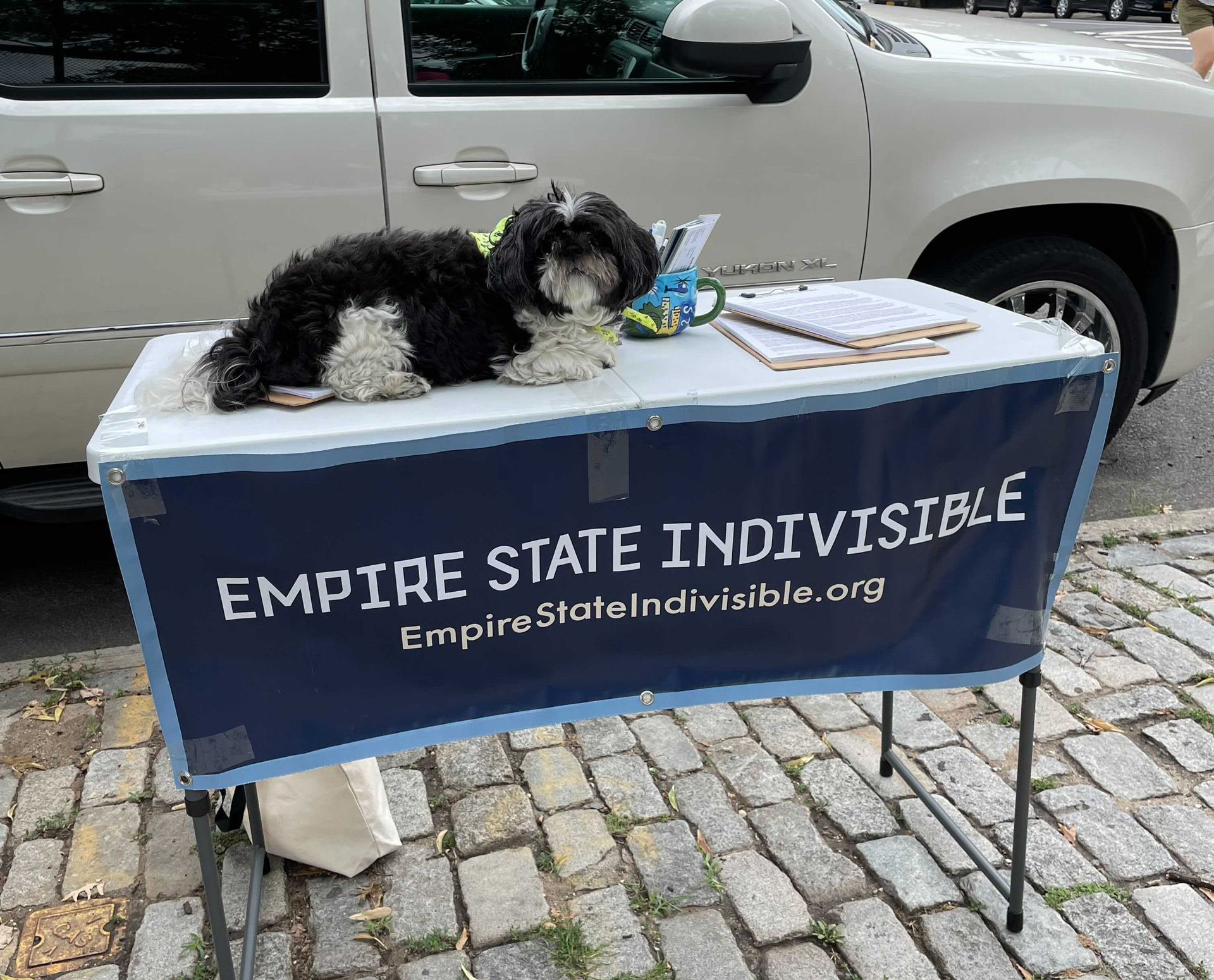
T-shirts, printed materials, and vinyl banners (and a dog) make up our "kiosks"
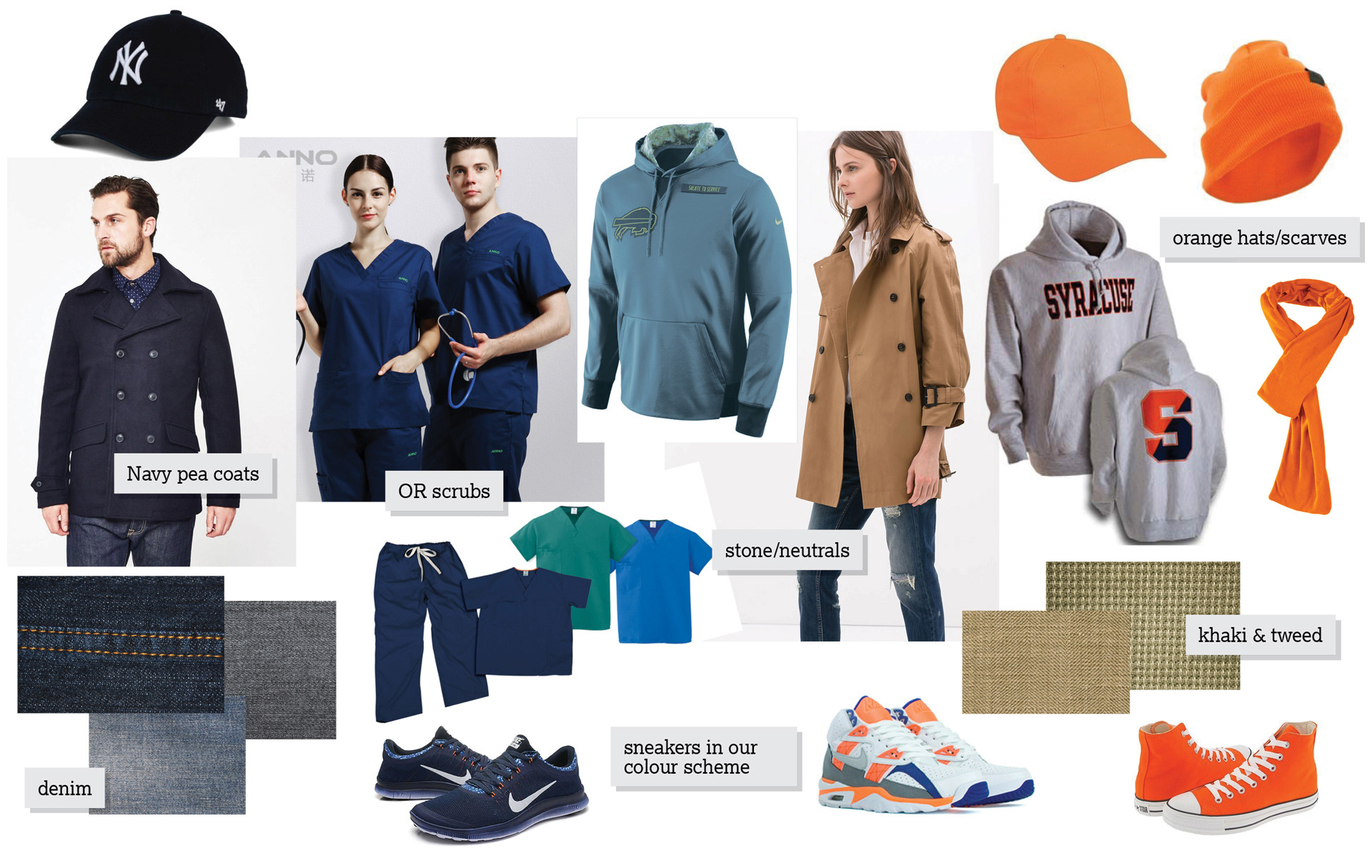
Branded and colour-coordinated clothing, guide
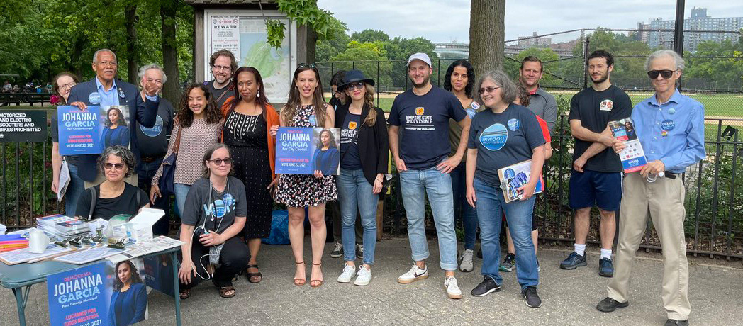
Branded and colour-coordinated clothing, real-life examples
We produced t-shirts and other merchandise as a fundraising efforts, as well as to identify our members in public.
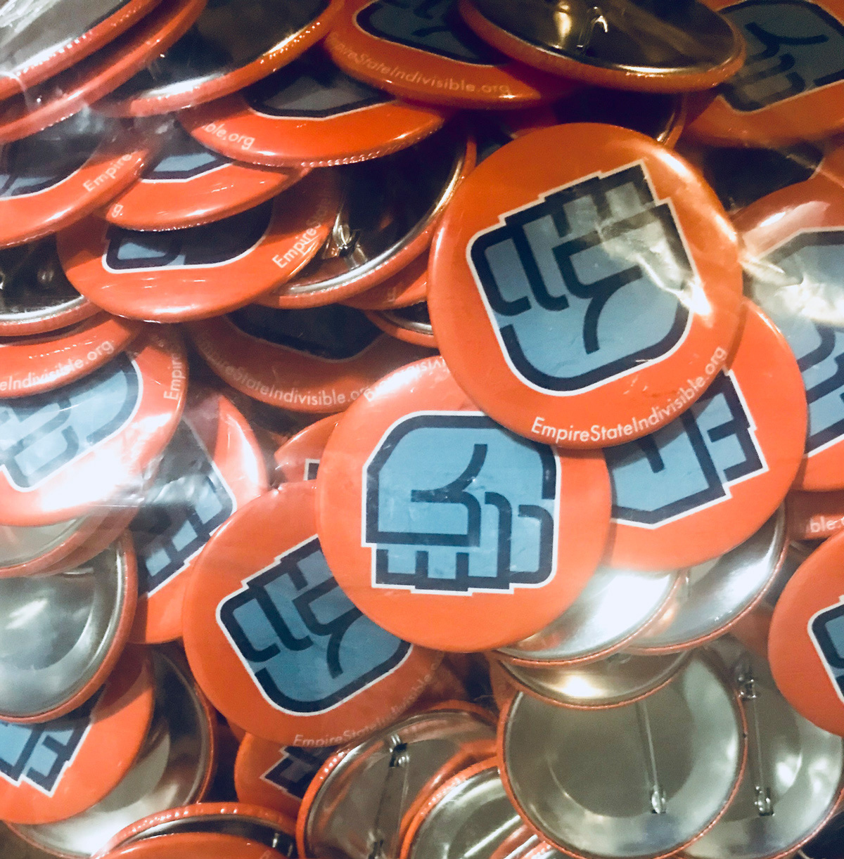
Buttons were produced as a fundraising tool ... and to represent the brand!
The Results
The effects were immediate. When repeated and purposefully used, our identity helped unify our members and reinforce the brand. The identity was quickly featured on social media and traditional print & television. Empire State Indivisible was able to raise over $10,000 by selling buttons, which we used to print & mail voting-awareness postcards ahead of that season's primary.
In 2018, Empire State Indivisble, working with a coalition of other New York progressive organizations, was able to endorse candidates for NY State Assembly, State Senate, and US Congress, who won their primaries and general elections. The awareness and promotion efforts helped unseat State Senators within the IDC, ending that experiment in obstructionism, and returning those seats to the people via an aligned representatives.