Overview
American Table Tennis Association (ATTA) is a non-profit organization dedicated to promoting table tennis by supporting elite athletes, hosting tournaments and play events, and providing access for young players to learn the game. The San Diego-based association aims to provide a ground-up community to counter the top-down management structure of most national sport associations.
The Challenge
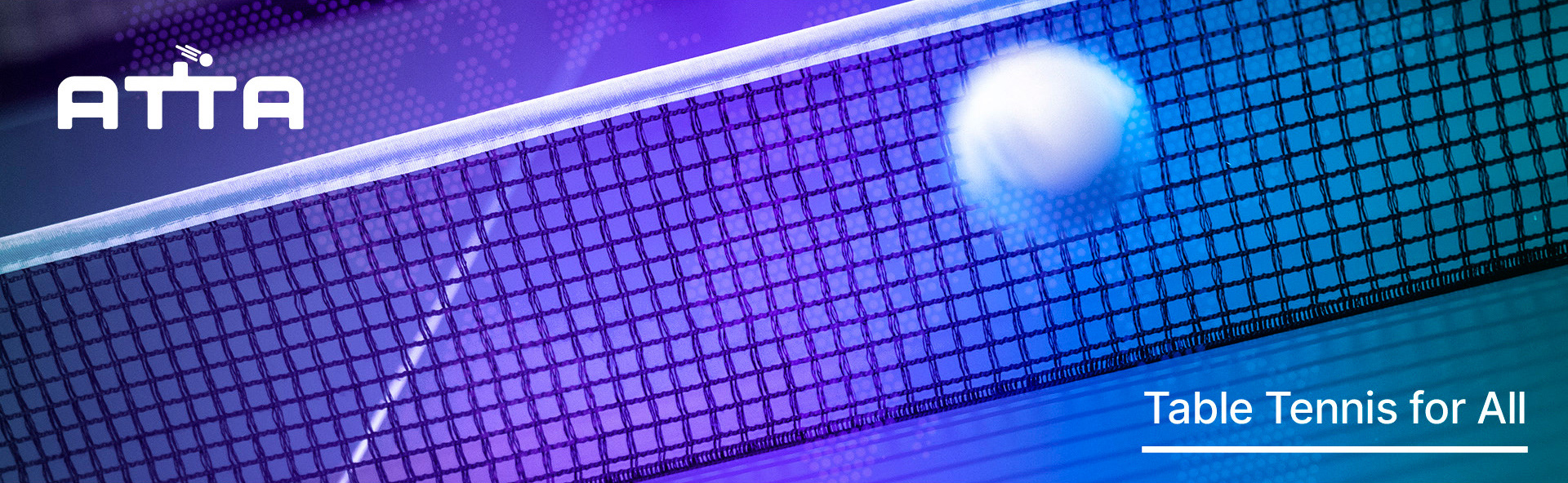
With plans to change the face of table tennis, ATTA needed a modern brand to match. To reach a diverse audience spoiled by choice of media and sports, we were challenged to craft a strategy and brand design system that can be supported across multiple touchpoints, including online, social media, and in-person events.
The 2021 ATTA website was only in the preliminary stages of its development focusing on visual design. Without the UX design basis, the user experience was difficult to gauge. Thus usability tests were conducted to help us discover how to create a a seamless website experience.
The 2021 ATTA website was only in the preliminary stages of its development focusing on visual design. Without the UX design basis, the user experience was difficult to gauge. Thus usability tests were conducted to help us discover how to create a a seamless website experience.
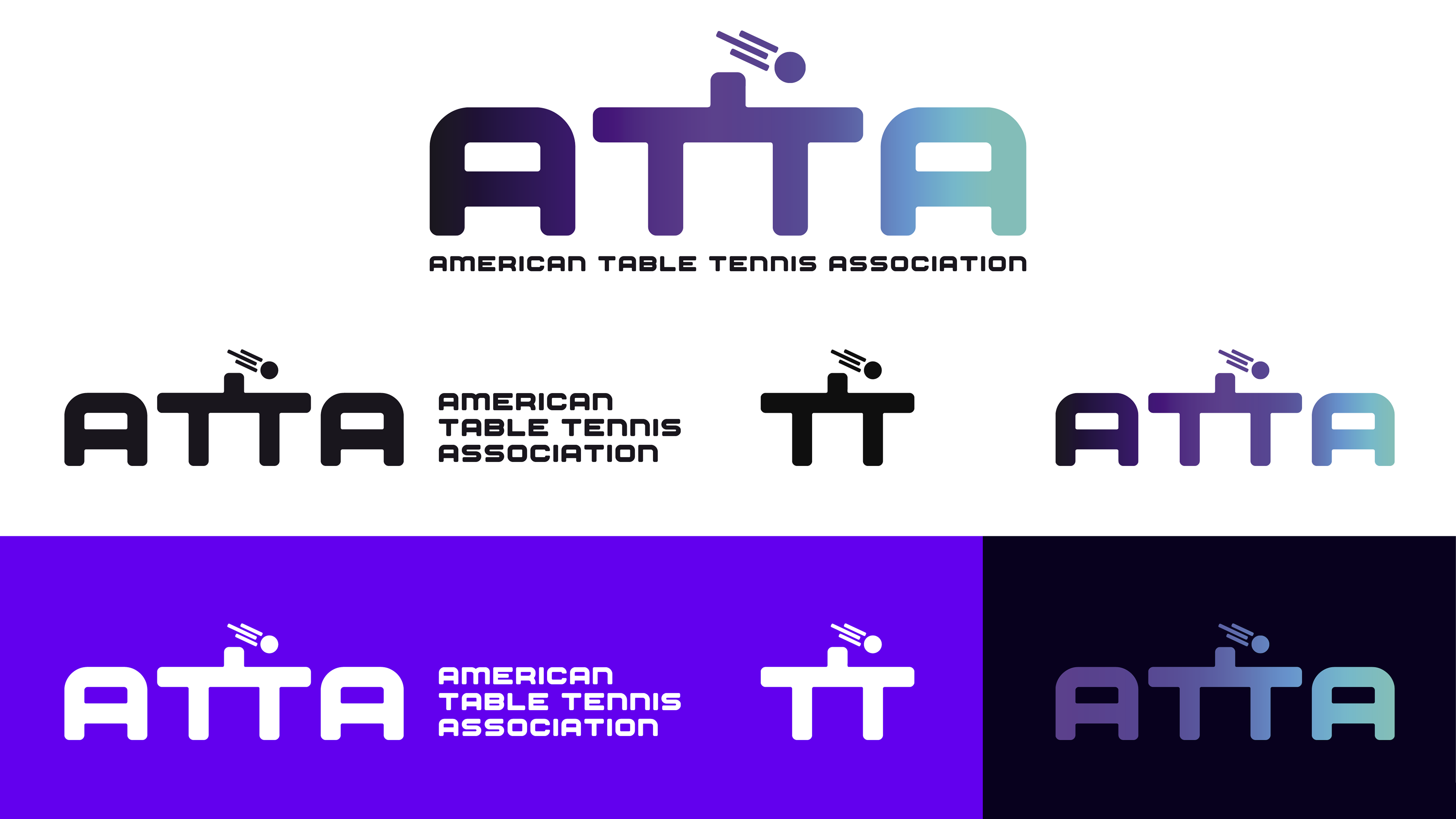
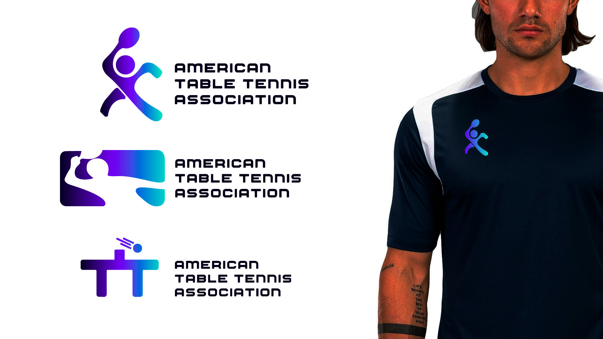
ATTA logo system, color variations and lock-ups
Our Solution
The resulting identity system boldly reflects our first principles of accessibility, community, innovation, and competition, with a system that feels youthful, energetic, flexible, and modern.
The system begins with our logos, centered around the ATTA initials. In multiple arrangements, we can attach the full Association name, vary the colour combinations, and reduce the complexity for small sizes.
After the logos, the unique color combination and gradients allow us to build recognition and positive associations on all communication materials.
Building a seamless website experience will be a direct result from our usability test. Testing will help provide us conclusions of the dos and don’ts within the current sitemap and how to adjust the navigation accordingly.
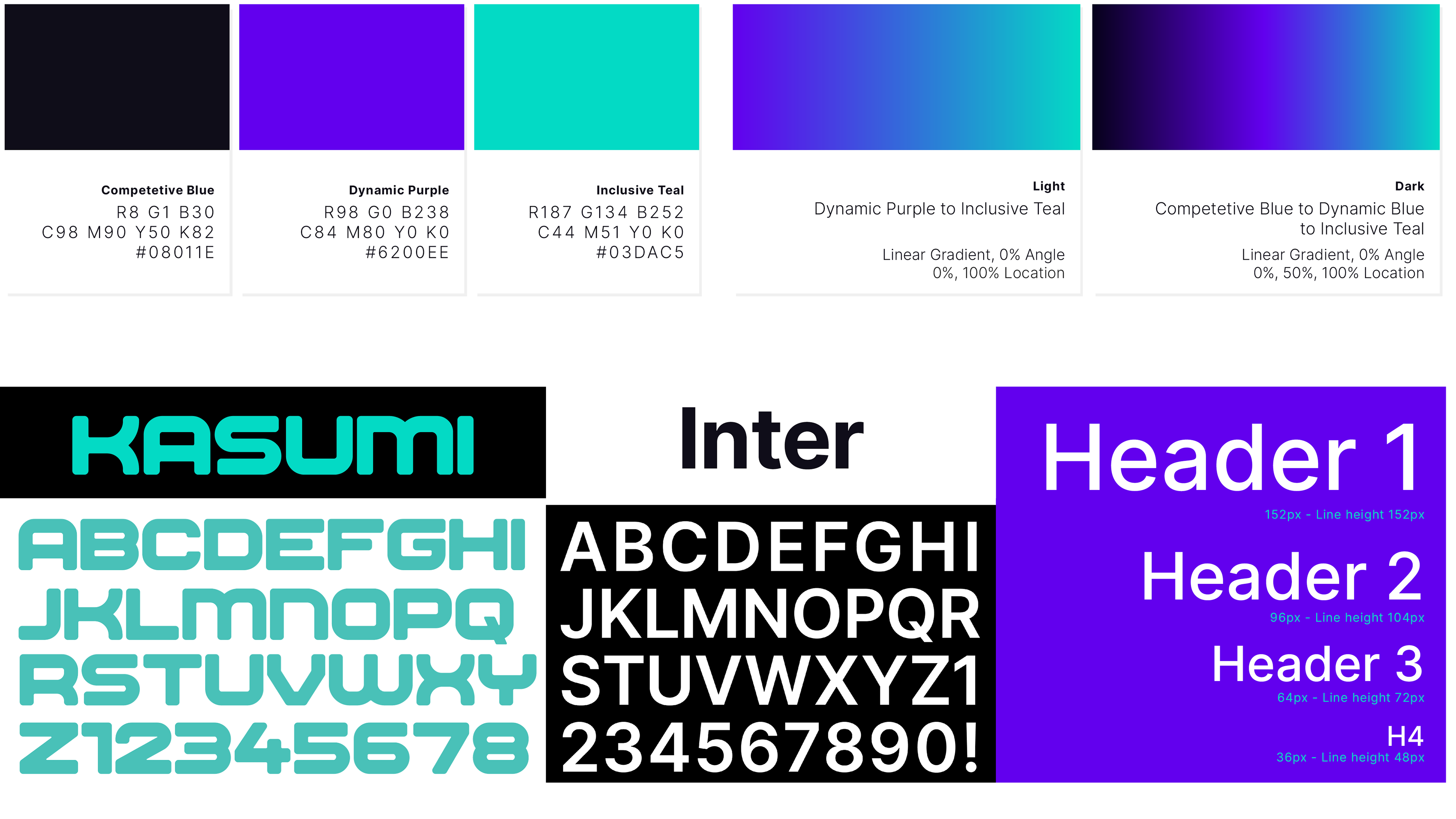

Expanding the identity: Color system, brand typefaces, type system, brand pattern and map in several color combinations.
Along with colors and typography, we created a world map, built from a pattern of close-packed circles. This serves as an additional tool in the ATTA brand toolkit, and works as both a featured illustration element as well as a background texture.
We wrote and designed a multipage guidelines document which the Association can use. This lays out the key brand design assets and instructs future designers how to use the kit of parts to ensure a consistent design system, while still allowing flexibility across formats and functions.
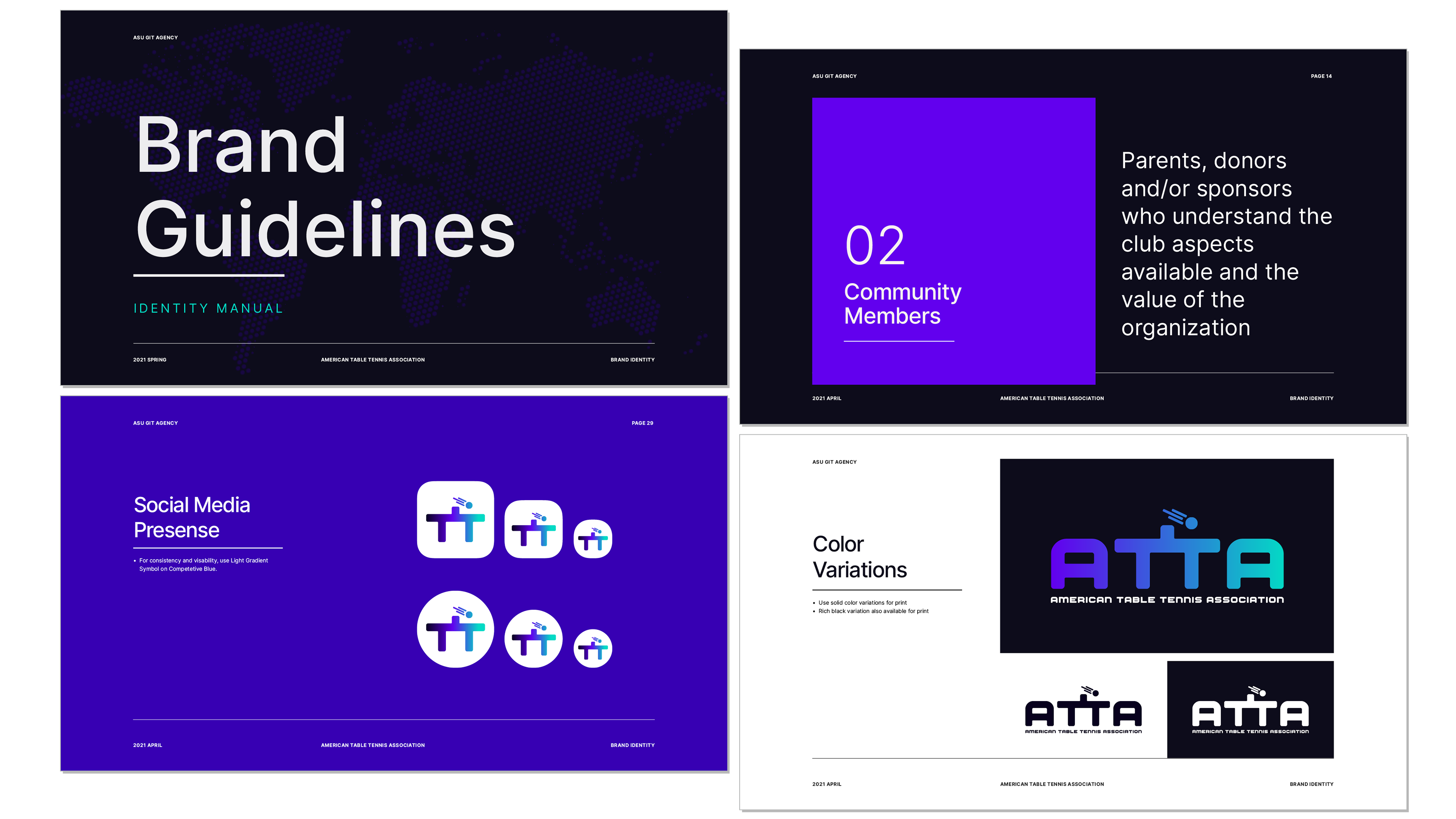
Samples from the Brand Guidelines. Document discusses strategy, design, and communication.
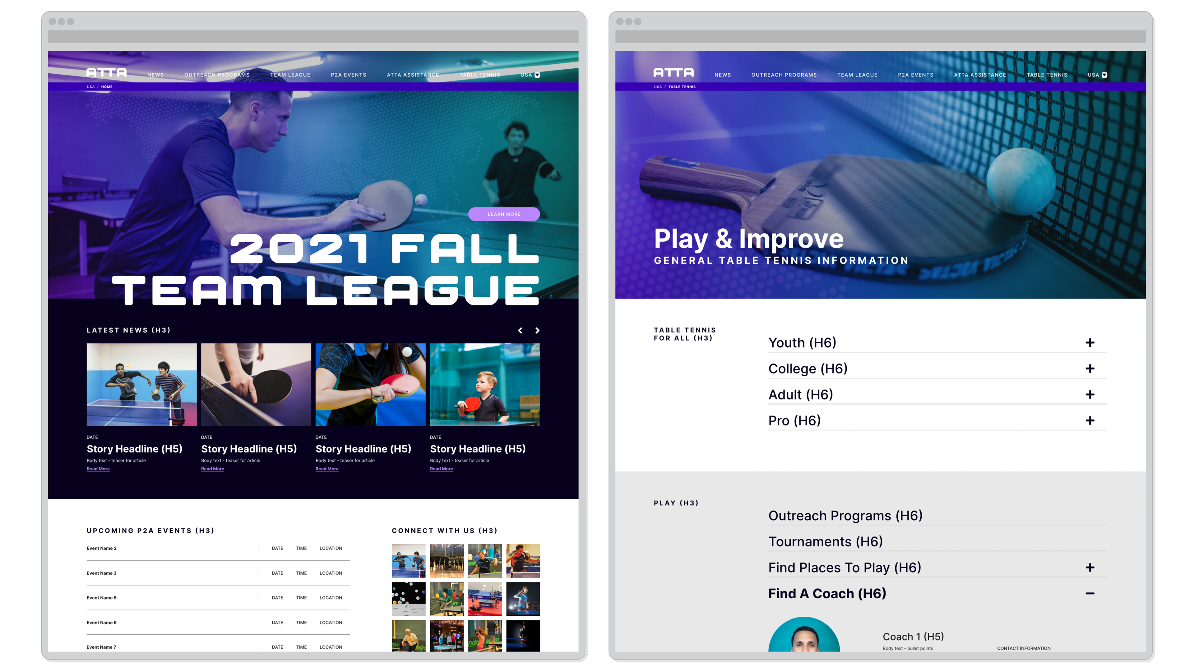
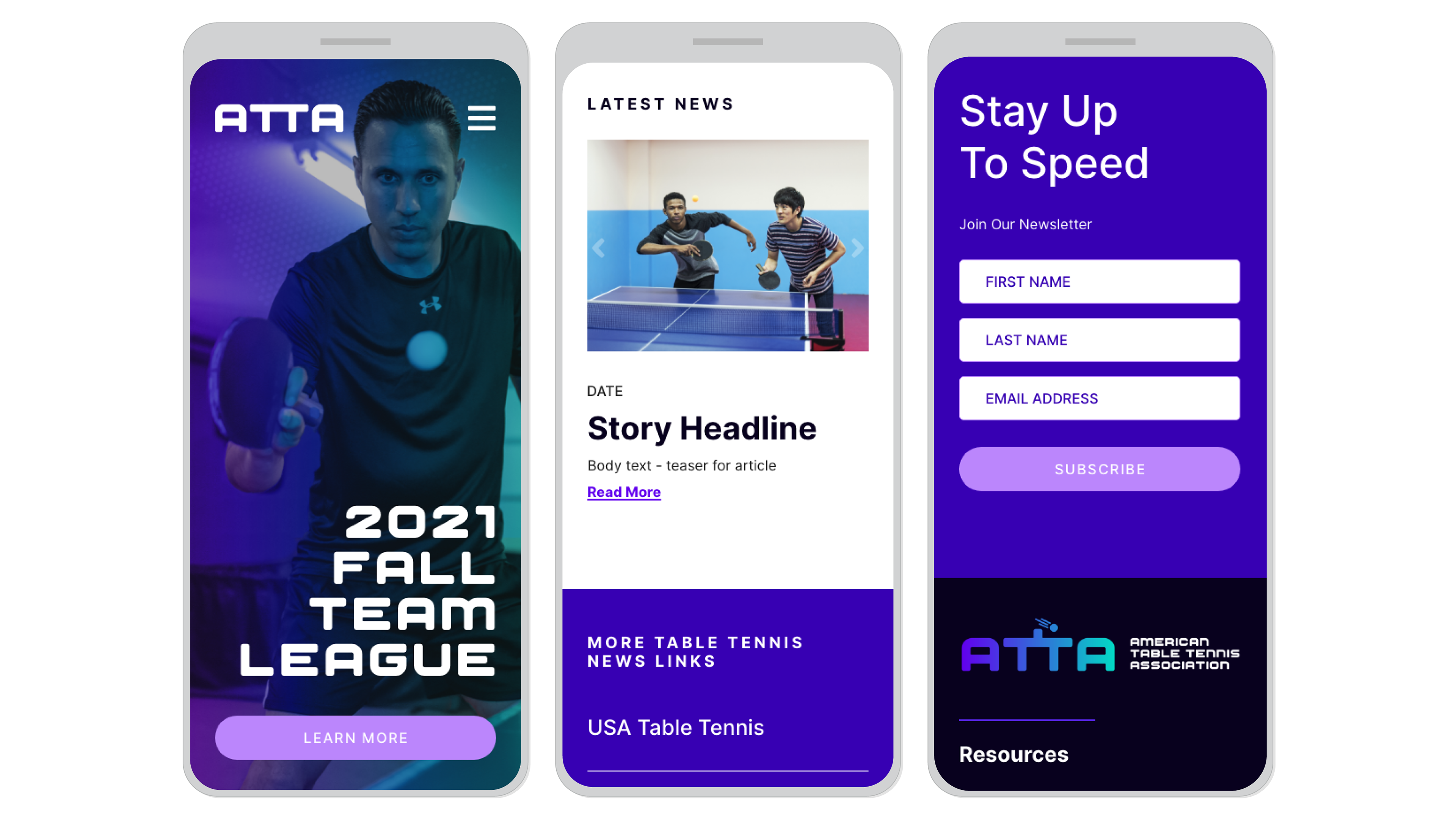
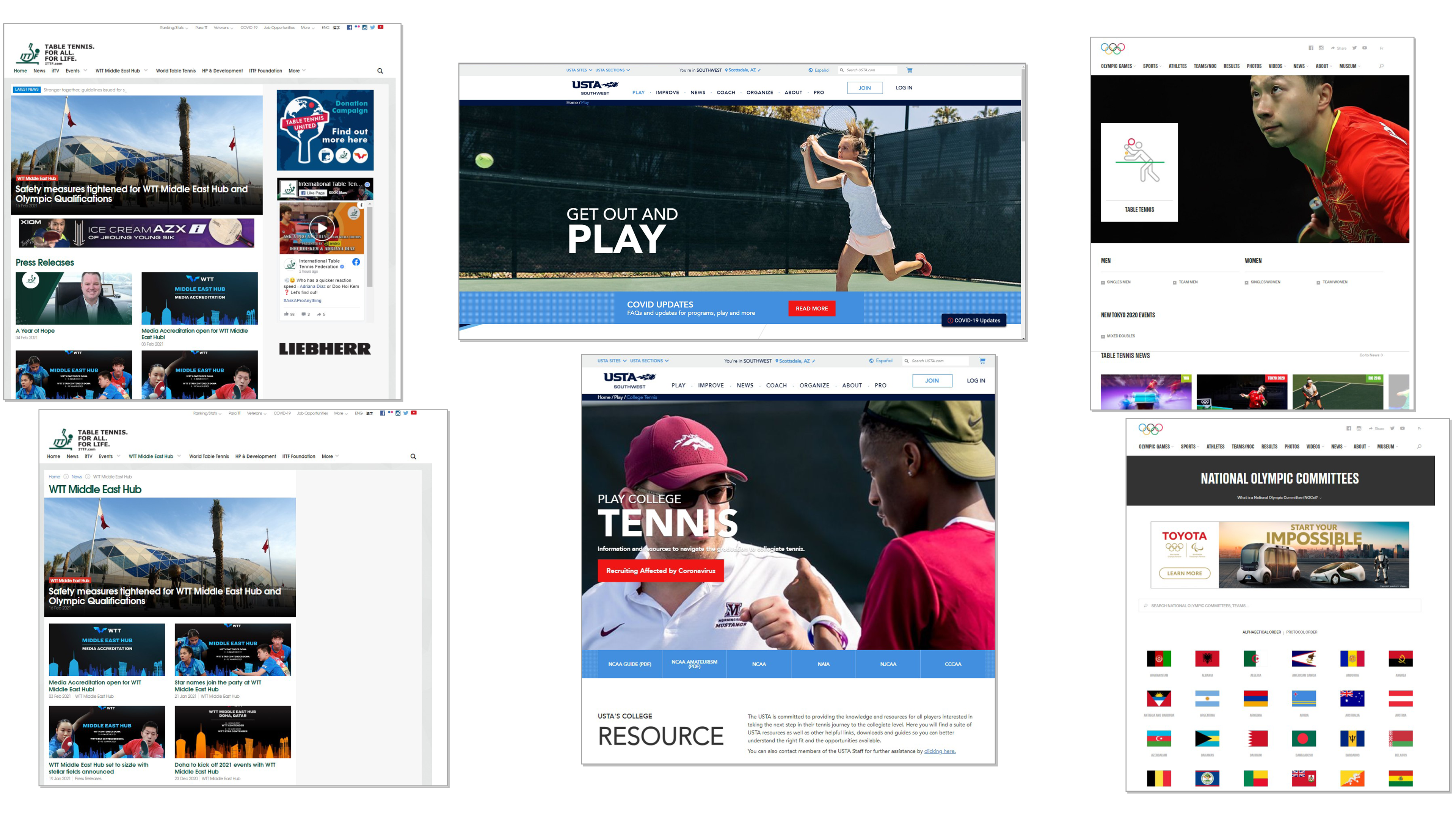
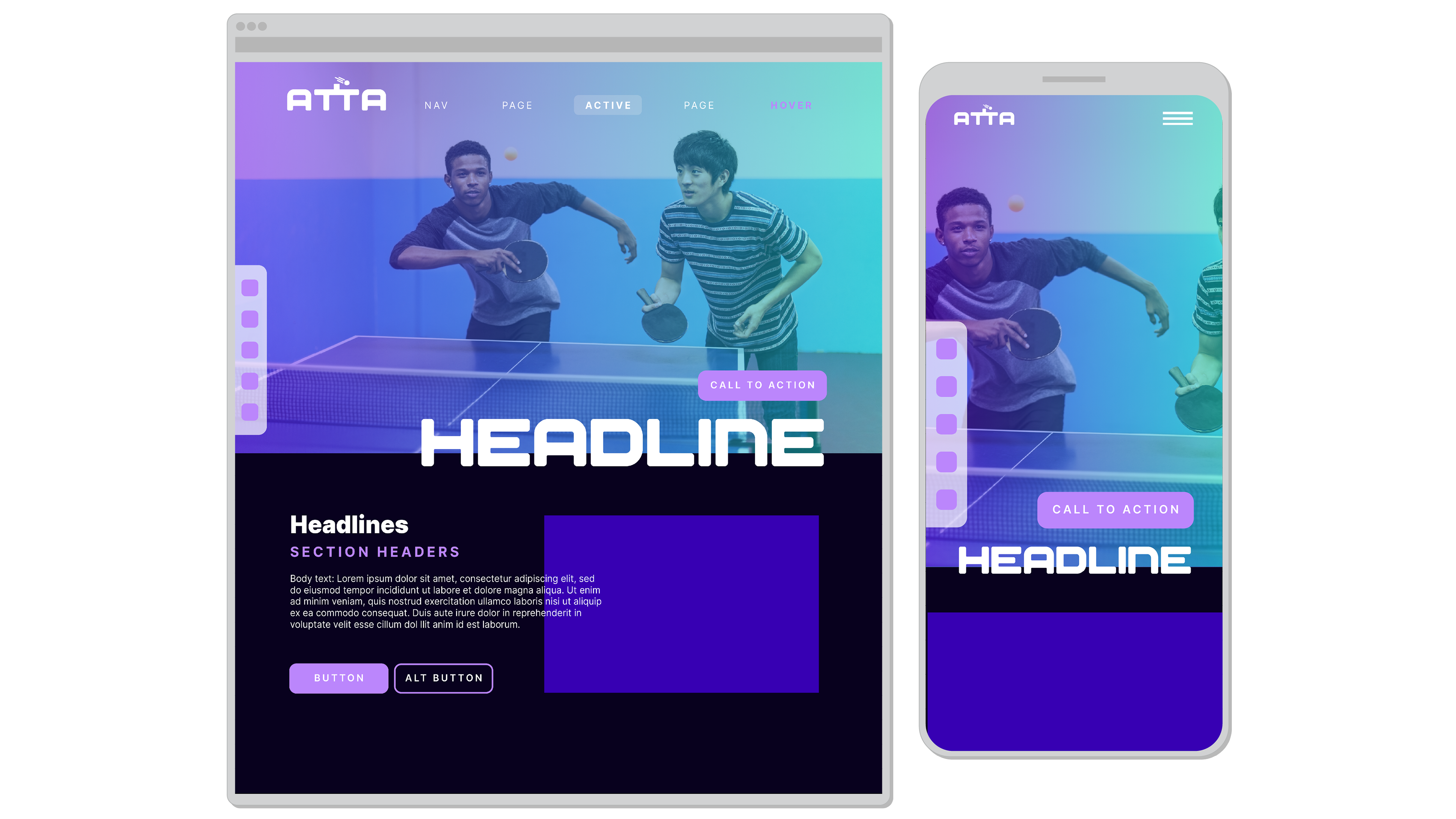
Website design for Desktop and Mobile. Layout uses original photo assets and branded colour scheme.
The website is a major part of the Association’s presence. It will provide general information, inform the community of events and opportunities, and serve as a platform for sponsors and partners. Our design reflects ATTA’s brand visual style, and delivers information in a straightforward, easy to navigate layout.
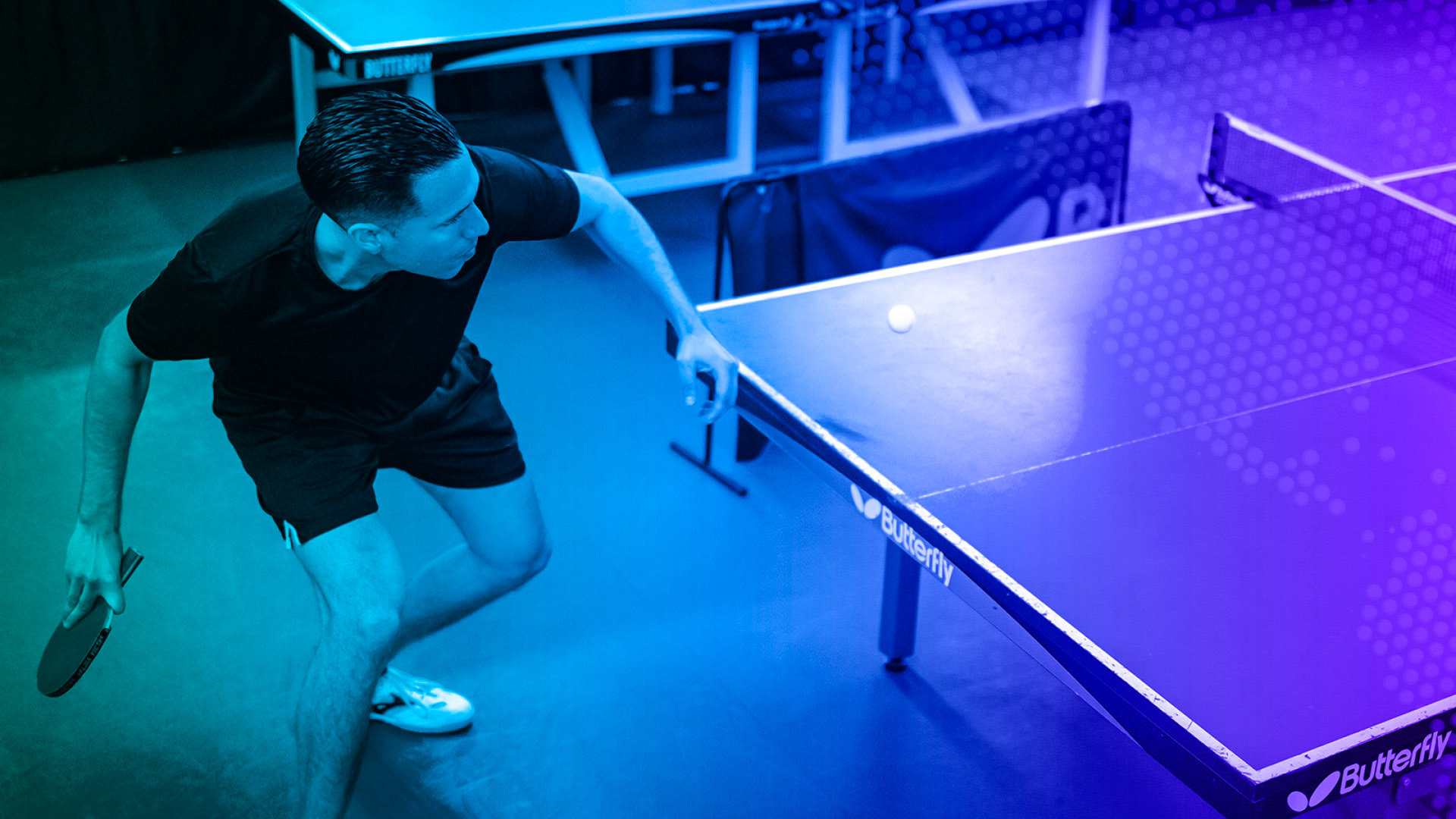
To better serve the Association’s marketing efforts and brand presence, we organized a photoshoot and captured original images of players and scenes. This will allow ATTA to move away from stock photos, and present a more cohesive image to the public.
The resulting photo library includes action shots, lifestyle images, portraits of athletes and Association leadership, video clips, and guidelines for retouching and art directing future photo efforts.
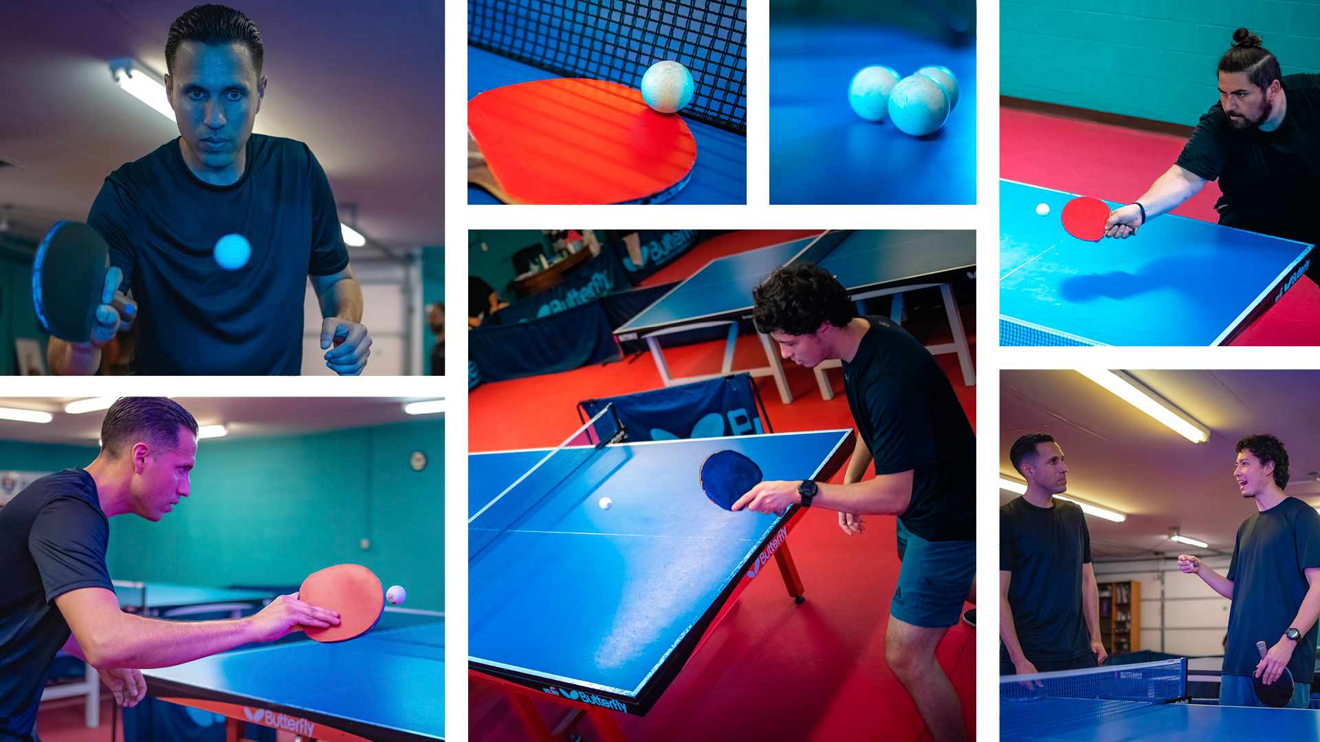
Original photography showing athletes in action, as well as lifestyle shots
Portrait style for athletes and Association leadership
In addition to photos, we provided video clips which can be looped on the website or shared on social media
Our process
The project began with conversations. ATTA’s founder, Jeff Ruiz, shared his vision for the Association, as well as his journey as a top-flight athlete in this particular sport. Following our discussions, we were able to refine the brand strategy, and write core values, personality traits, and brand message.
From there, we got to work on visual research. This meant looking for inspiration in unconventional sports campaigns and governing bodies, careful to avoid heritage symbolism or anything exclusionary. We collected inspiration sources across identity, illustration, photography, and more. As we refined our research, we crafted a mood board to summarize our findings, as well as to direct our next moves and share our plans with the client.
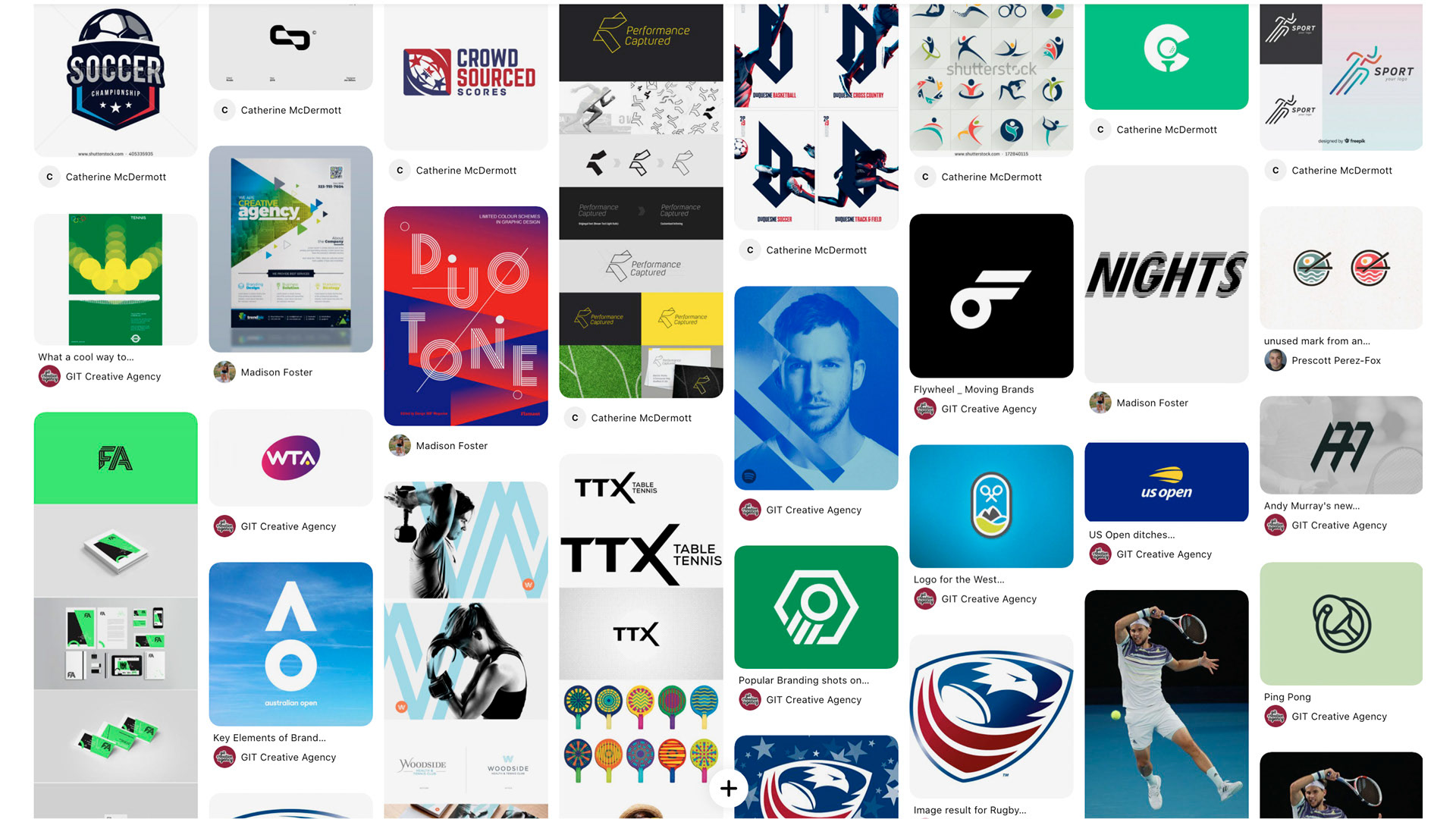
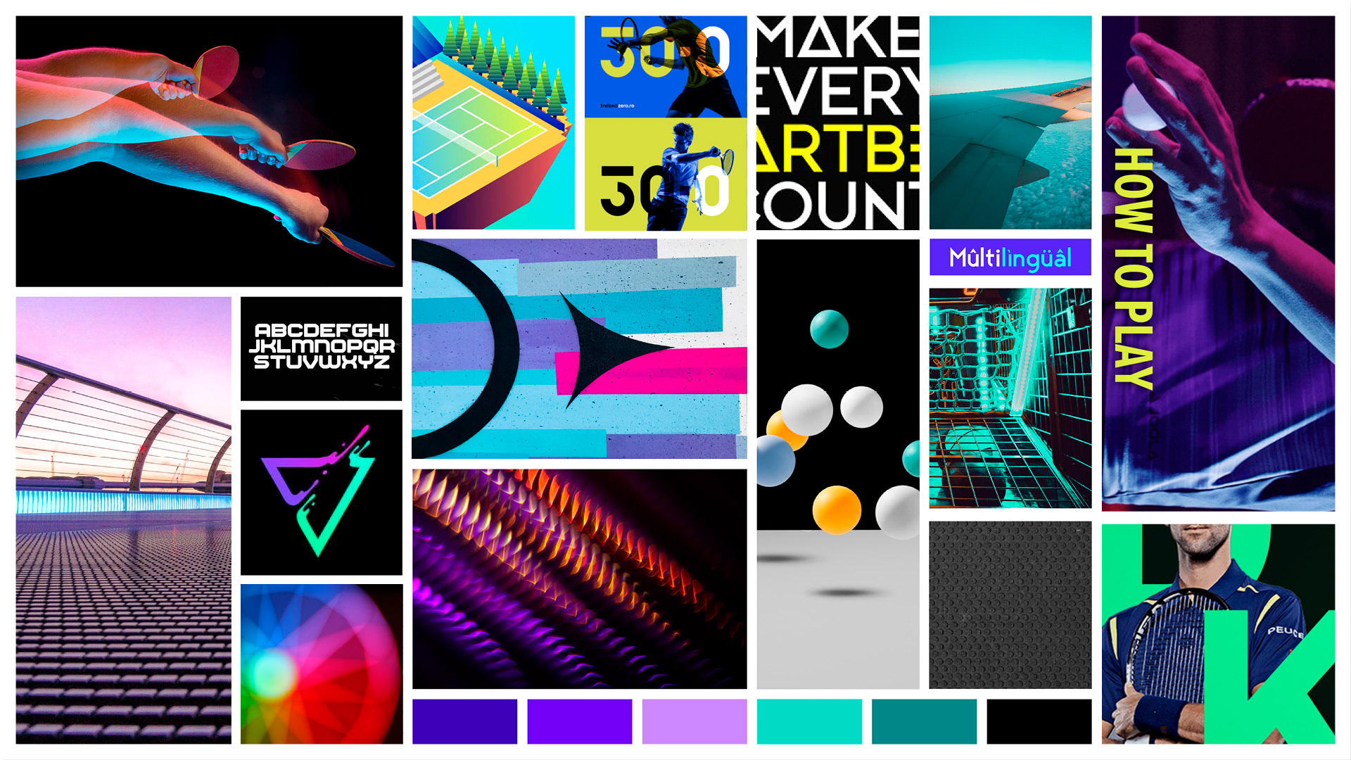
Visual research and resulting mood board.
The identity itself actually had a starting point. The paddle with map idea felt far too conventional to suit the strategy, not to mention hard to see and altogether a bit forced. But the colors and typography emerged early and received support from the client. From there, we iterated and arrived at two main concepts aside from the chosen route.
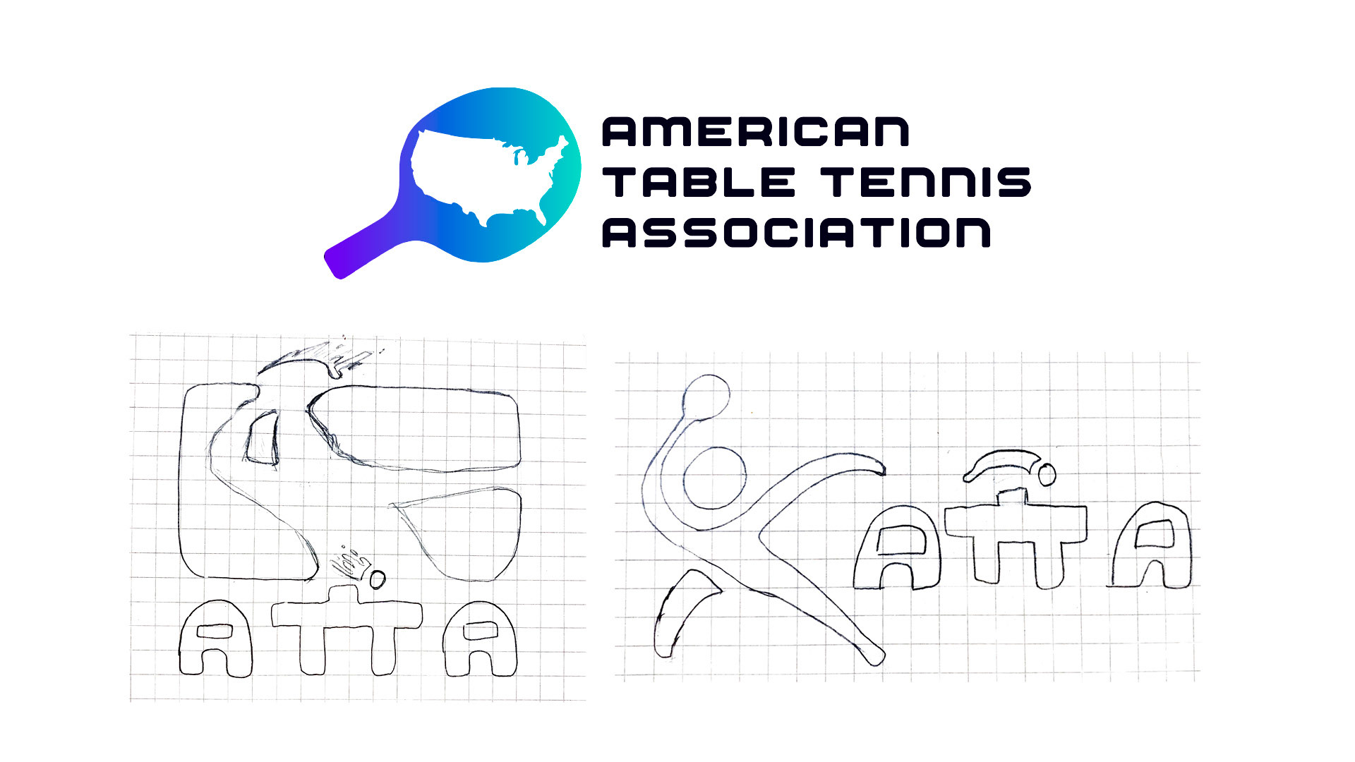
Identity Concepts: Starting points, sketching, and logo progress
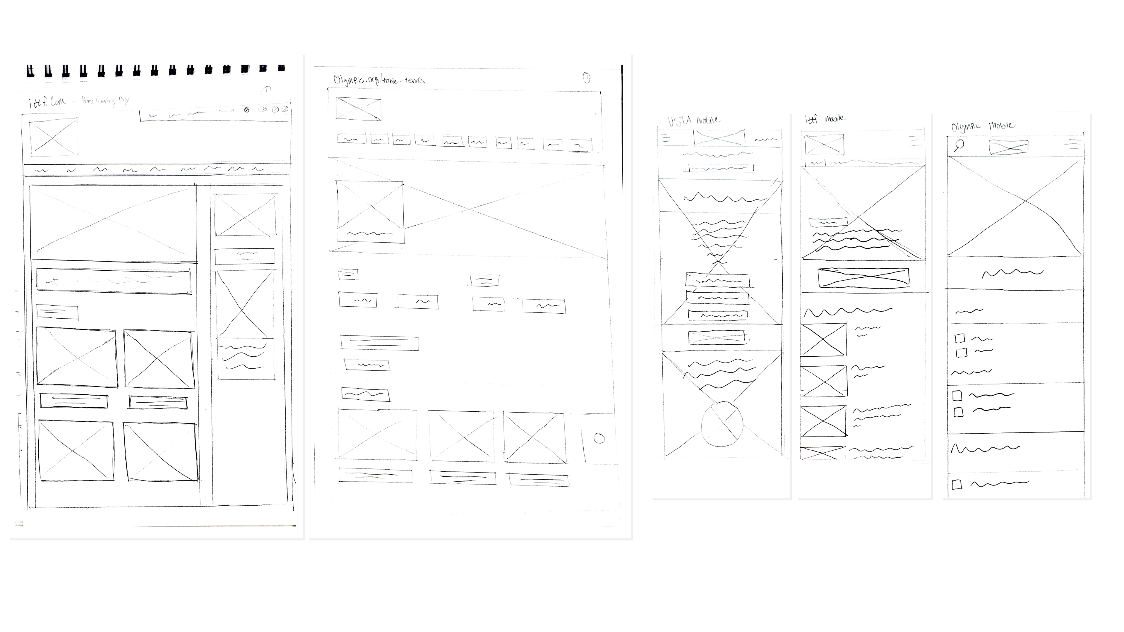
Website research and early wireframes
For the website, we worked with the client to determine the essential content and proposed a logical information architecture. At the same time, we researched successful websites of other sports bodies, global non-profits, and media outlets. Combining the two efforts, we sketches wireframes, and refined them in software, discussing with the client along the way
Website Design: Wireframes for each major page, with type styling and content structure
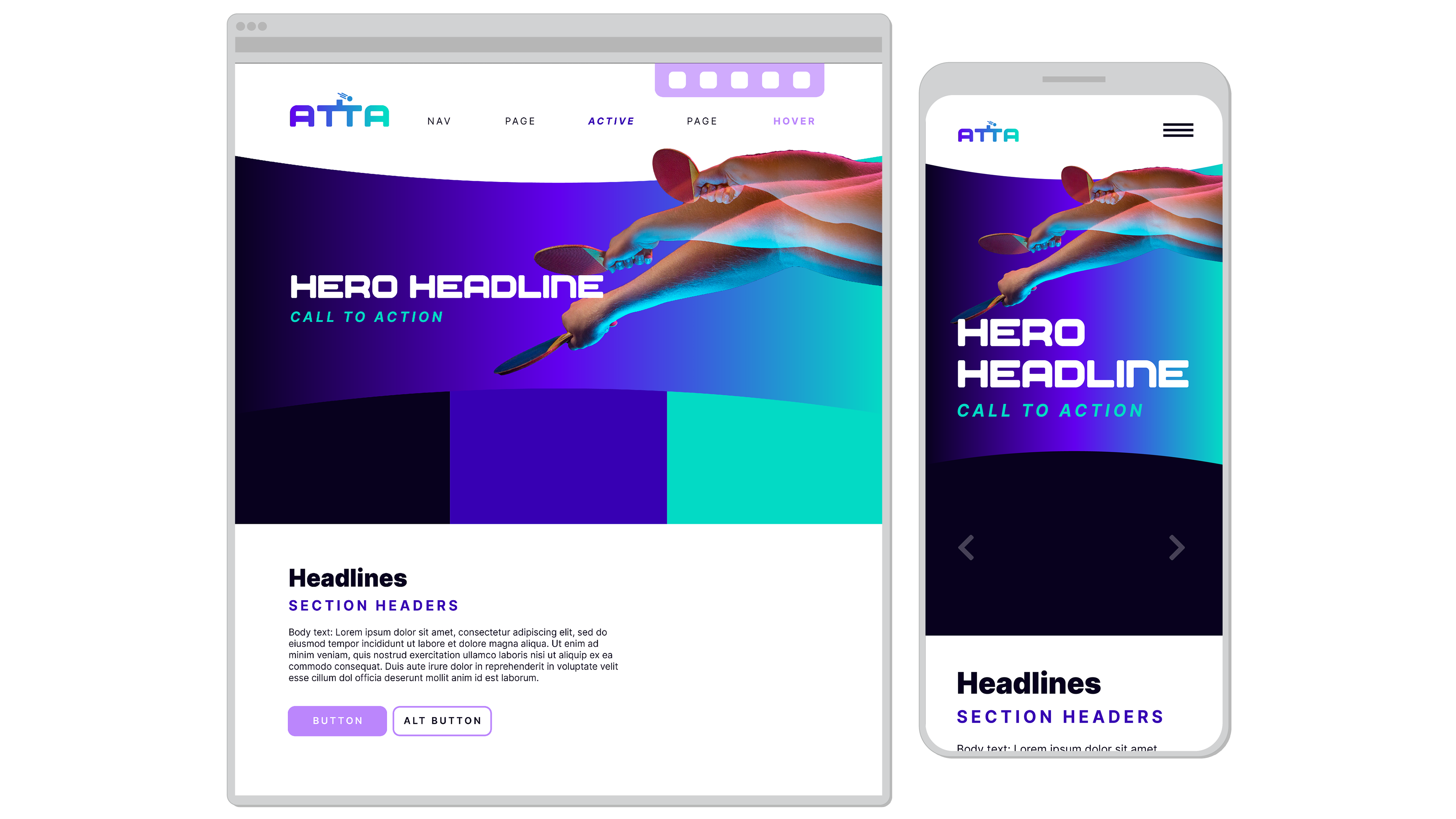
Website art direction concepts on desktop and mobile.
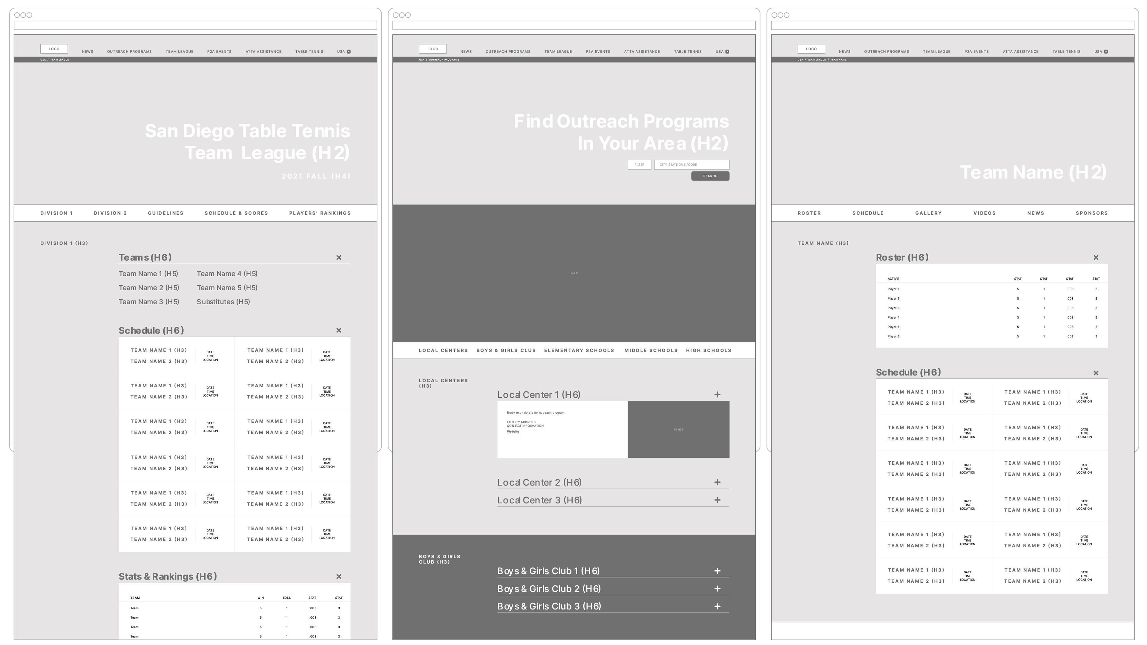
The ATTA website project was revamped in Spring 2022 by the front-end web development team that planned to execute the website’s soft launch.The initial talk with Jeff Ruiz mentioned creating a desktop and mobile friendly application based on the previous visual mockups.
Usability tests were conducted on the mockup sitemap to ensure the user experience was smooth and seamless. We discovered several conclusions hindering a smoother user experience, such as using too many sub categories and ambiguous acronym terms.
Website development was the final stage of testing. The foundation of the site is built upon with html, scss, js, and bootstrap. We utilized a 12 column grid layout that would help visually align content material at its given breakpoint, also providing continuity to the flow of the page.
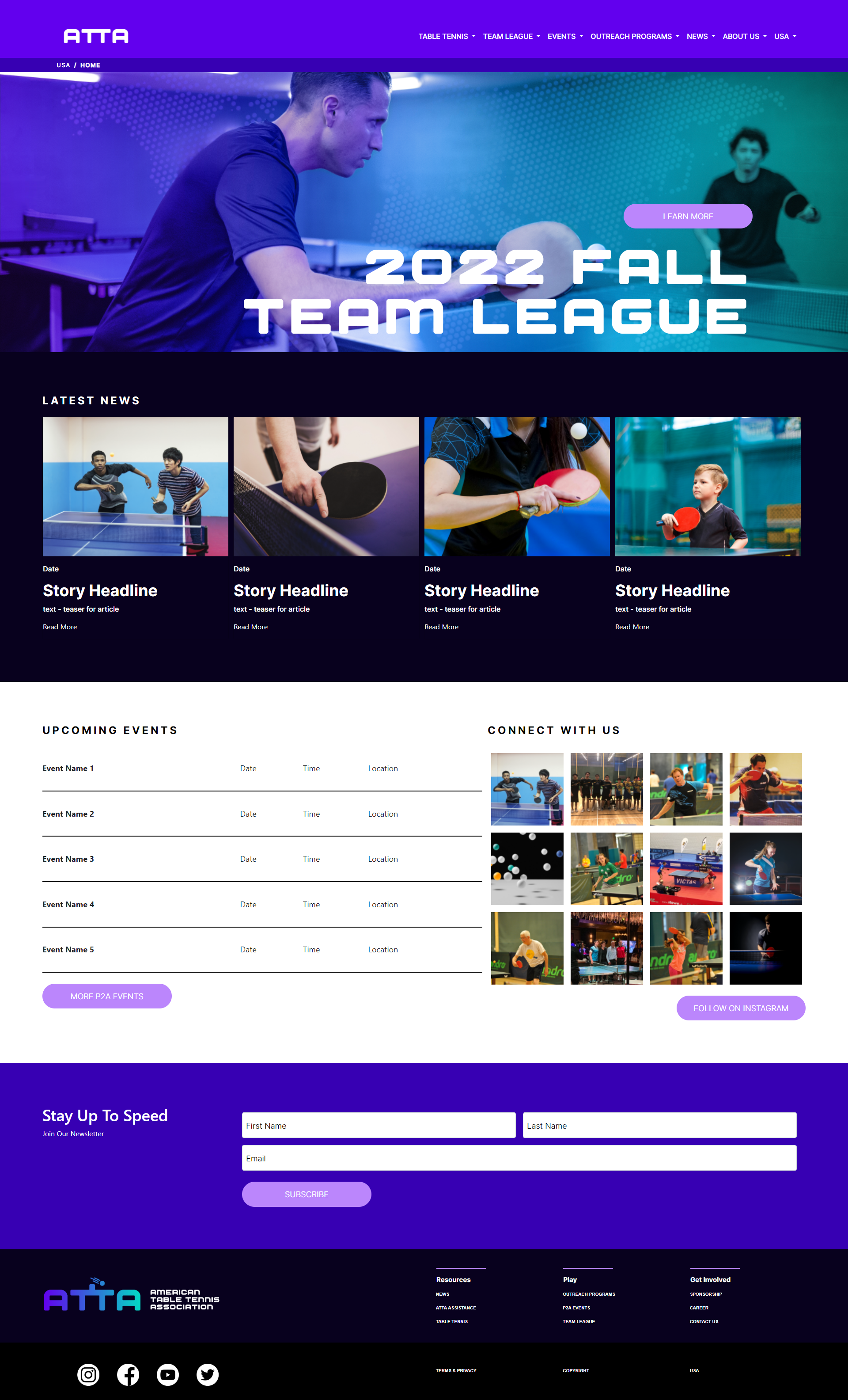
Updated website look, which went into development in 2022
For website art direction, we worked up two main approaches. Both leveraged the color combination and gradients of the wider identity. Ultimately, we decided to lean into the gradient approach, which led us toward a style of photo retouching and overlay effects.
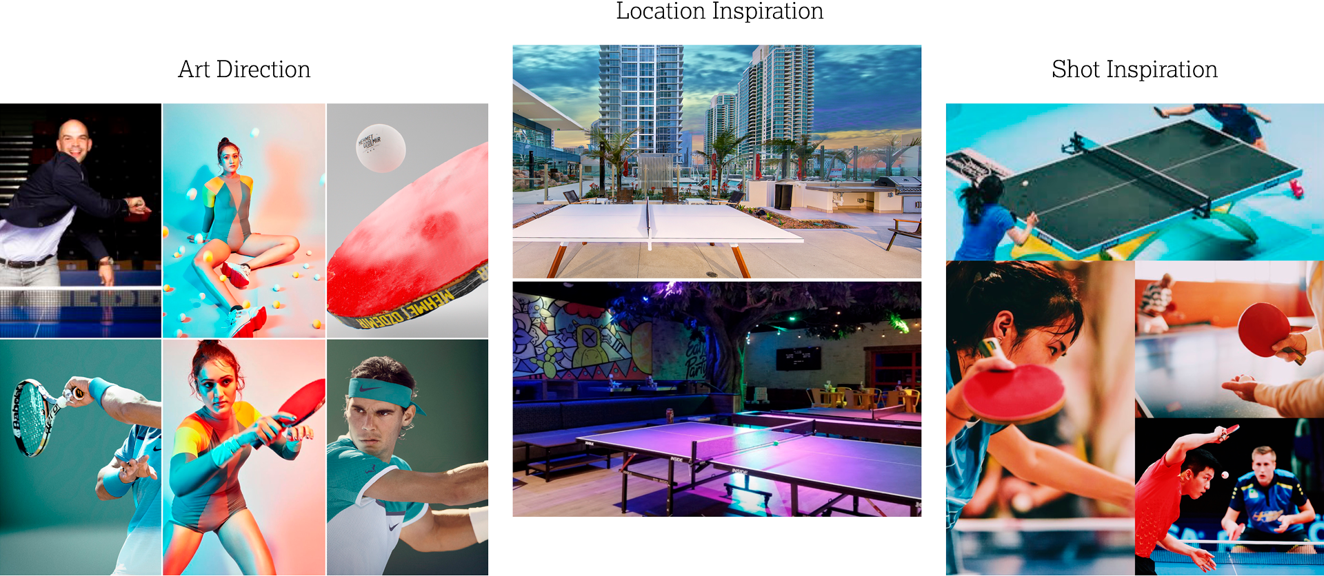
Photo research & inspiration: examining dynamism, lighting, interior/exterior scenes, and effective poses
Examining ATTA’s existing library of photos, it was clear they needed to build consistency with image content, as well as color, lighting, and overall photo style. As we arranged the shoot itself, we researched inspiration for photography, considering the locations, cropping and composition, and subject matter. After all, these had to convey how table tennis is both exciting and accessible.
The shoot itself was appropriately DIY. With minimal team, we set up colored lights, devised shots, found the angles, and made it happen.
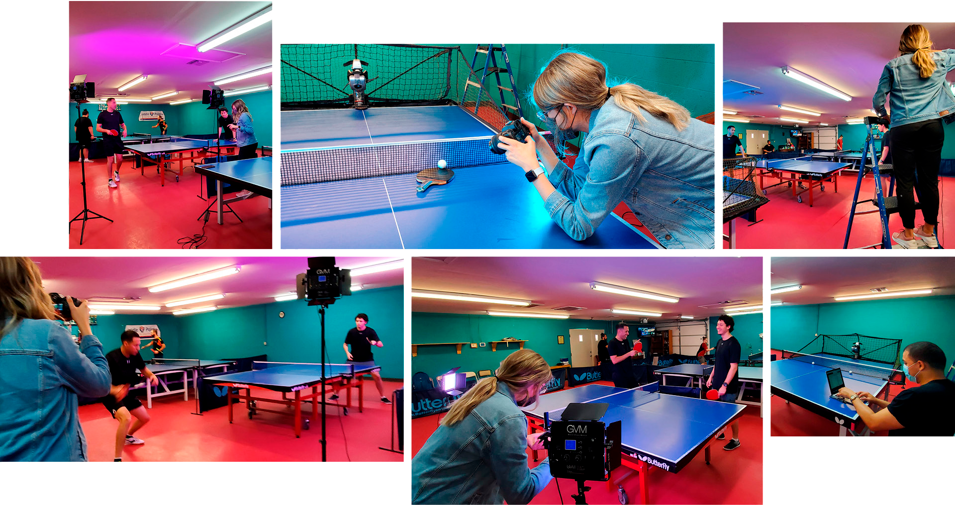
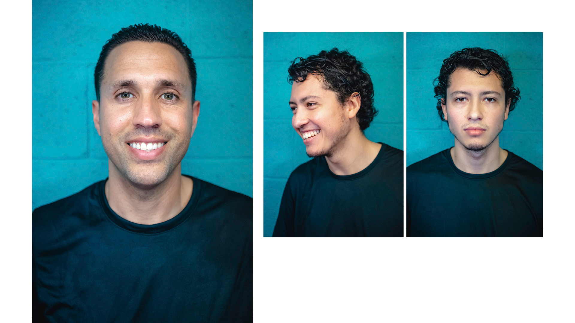
Behind the scenes at our photoshoot
team
Cathy McDermott & Alicia Frickey, Designers
Madison Foster, Photographer & Videographer
Justin Ho & Diedra Cole, Web Developers
Prescott Perez-Fox, Creative Director
Madison Foster, Photographer & Videographer
Justin Ho & Diedra Cole, Web Developers
Prescott Perez-Fox, Creative Director